Unit 1: Environment
Environment photography remains encoded within the traditions of landscape art.
Through the photographer capturing his surroundings and visualising beauty via natural and manmade structures, objects and scenery the artist can control the landscape visually, allowing it to be scaled and ordered to their preference.
Landscape Art has been developing since the eighteenth and nineteenth centuries, ranging in form and style. Recent development in cameras has further broadened the range of environment photography available and the form of art itself has drifted away from its original style of landscape photograph producing surreal, modern and abstract works from the likes of many photography which I will mention later on.
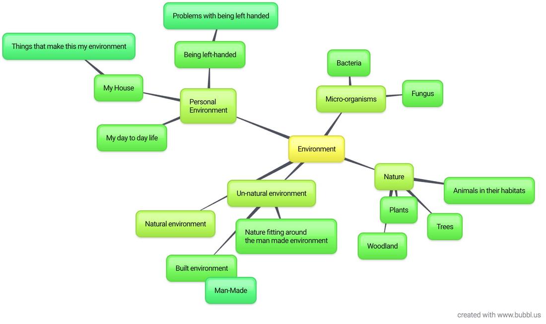
- I set about creating a mind map to begin my exploration of environment
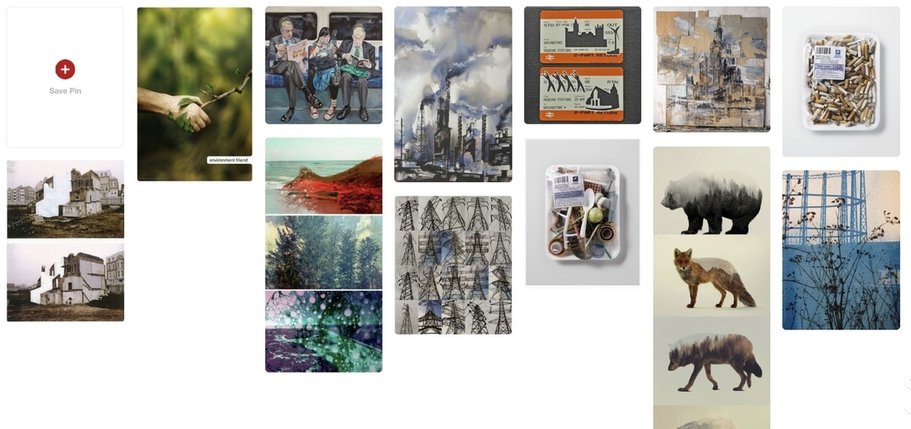
- Before i did this i decided to go onto Pinterest and gain some inspiration through some current ideas which may exist about the word "Environment"
The Formal Elements:
- The formal elements are used by many photographers and artists throughout all sub genres of art and photography.
- The elements are to be used in compositions of work in which they can be isolated or used with other formal elements as the basis of a piece of work.
Formal Elements:
Focus:
- what appears sharpest in the image? The sharpest parts of the image are most in focus.
- Parts of the image are blurred whilst other parts are sharp and focused.
- Focus can draw detail to a select part of a composition.
- Focus can bring contrast to an image.
Line:
- Use of objects/structures in the image to create a lines.
- Lines can give the image direction or form a pattern. They can show distance and depth in a photo.
- Lines can be vertical, horizontal, diagonal, or curved. Lines can be long, short, thick or thin. Lines can lead away, or move forward. They can evoke, soothing, rigid, active, guiding, threatening or restless connotations in a photograph.
- Lines are one of the most important fundamental elements of composition. Without lines there can be no shape or pattern and often texture involves lines.
- Lines can direct the viewers eyes towards something in the photo, something the viewer does subconsciously.
Shape:
- Shapes can be geometric such as rectangles, squares and triangles. often these shapes are found in inorganic environments such as cities and other man-made areas.
- Organic (natural) shapes and forms are usually irregular or asymmetrical. Organic shapes are often found in nature, but man-made shapes can sometimes imitate organic forms.
- Shapes are used in photos to give a sense of spacial awareness.
Space:
- Space in a photograph can give the image depth and a demonstration of size within the image..
- Positive space is where shapes and forms exist.
- negative space is the empty space around shapes and forms. Areas of a picture that contain 'nothing' are important visual elements that can provide balance in an image.
Texture:
- Texture exists in the surface details of your subject.
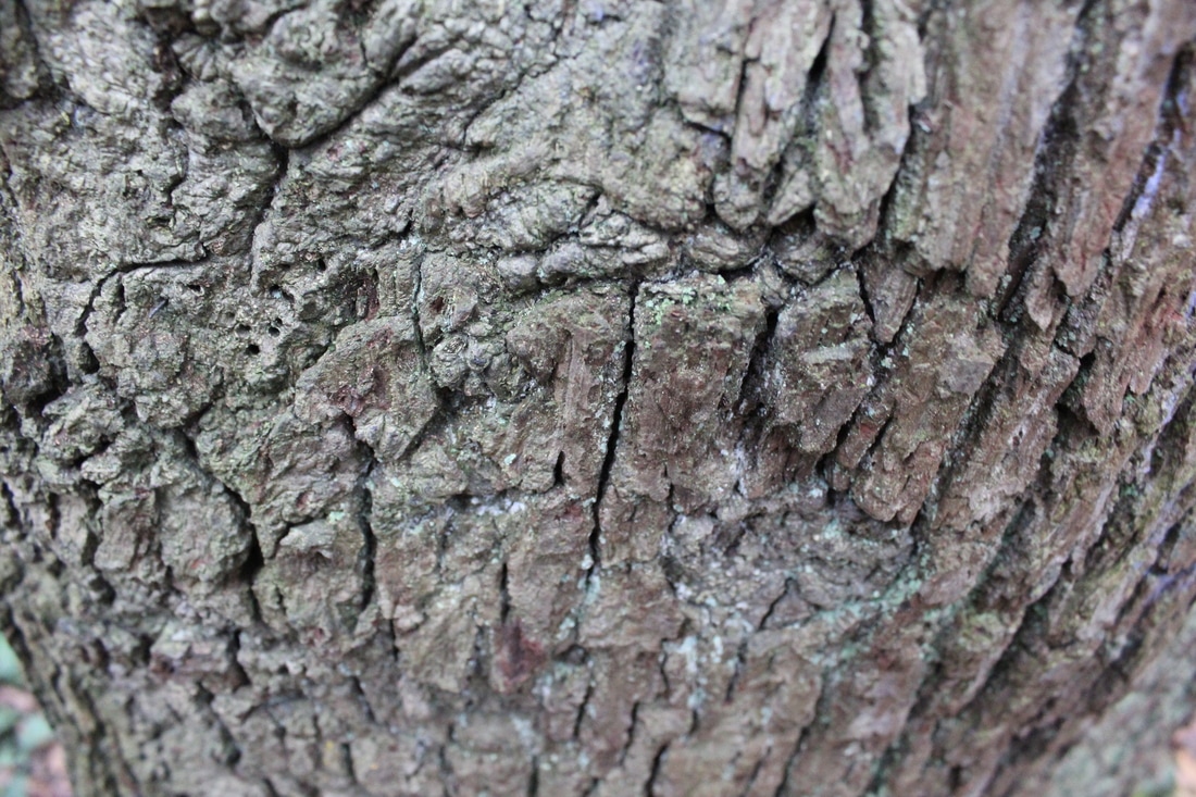
- Texture makes an otherwise two-dimensional object (an image) seem like it could be experienced through touch. Examples of subjects with strong textural qualities are peeling paint or tree bark.
- Texture can be used in different ways, depending on the message you want to convey or the particular elements you want the viewer to focus on. The simplest way to convey texture is with a detailed, close up shot. Using a macro lens you can capture just the texture of your photos subject without the context. Texture can be used as a single element of a photograph or as the sole focus.
Scale and Perspective:
- Scale gives a photograph a frame of reference in terms of the size of whats in the image
- Depth and perspective is created by wide angle lenses with elements of an image appearing at a greater distance from each other. Telephoto lenses compress thereby giving a more crowded feeling.
- Parallel lines in an image cause the brain to believe that they are moving away from the viewer.
- The parallel lines in an image never meet or touch but as they disappear an impression is given that are moving away from the viewer. Giving the impressions that there is distance in the image. It is best illustrated when using a wide angle lens.
- Using the vanishing point of a particular scene, which is the point where the lines disappear into nothing is a good method for perspective shots.
- Diminishing perspective of scale refers to the appearance of size that our eyes see. when you are trying to achieve this, look for similar, repeated objects to include in your photo which will help create the depth.
- When trying to achieve a sense of scale, choose two parts of an image with one having a recognisable height or size, e.g. a person or a vehicle. because you know the size of the recognisable person or object. This can be used so that the viewer can make comparisons of size by looking at the image.
- The lens by itself stretches the perspective naturally and this is quite dramatically increased by including an object in the foreground. When this object which you know how large it is, is compared to something in the distance such as a building or tree, the sense of scale is increased. It reveals extreme distances and gives the image real depth. This is creates a strong impression of diminishing scale or perspective.
Pattern:
- Symmetry and patterns make eye catching compositions. With a symmetrical photograph or a clean and defined pattern the image can almost seem perfect. Although it is difficult to deem a photograph visually 'perfect'.
- Patterns exist both in the man made world and in nature. Patterns can make a composition look abstract and surreal.
- They can make for very eye-catching compositions, particularly in situations where they are not expected. Another great way to use them is to break the symmetry or pattern in some way, introducing tension and a focal point to the scene.
Contrast:
- Contrast can involve colours, nature, objects or perspectives which juxtapose other sections of the composition.
- Different colours in a photo can bring different messages and can have a different type of impact on a composition.
- You can also create contrast by using lighting to create extremes of dark and light.
Focus:
- Focus develops points of interest to a viewer when looking at an image
- Using focus in an image can isolate objects or parts of a scene. Photos can be purposely blurred to draw attention to the 'bigger picture'
- Purposely making a photo out of focus can create abstract shapes from light sources within the image.
- Utilising the lenses focus to ensure the image is sharp and clear to add to the detail of an image
Layers:
- Layers are also used to give photos depth and to provide an image with another form of detailing.
- Layers can also mean putting a photo over another to create an unusual outcome.
Rule of Thirds:

The rule of thirds is used in photographic composition.
The idea is that a photo is separated into 9 equal sections,
two equally spaced vertical lines and two equally spaced horizontal lines. It is said that the most important parts of the composition should be where the lines intersect.
The idea is that a photo is separated into 9 equal sections,
two equally spaced vertical lines and two equally spaced horizontal lines. It is said that the most important parts of the composition should be where the lines intersect.
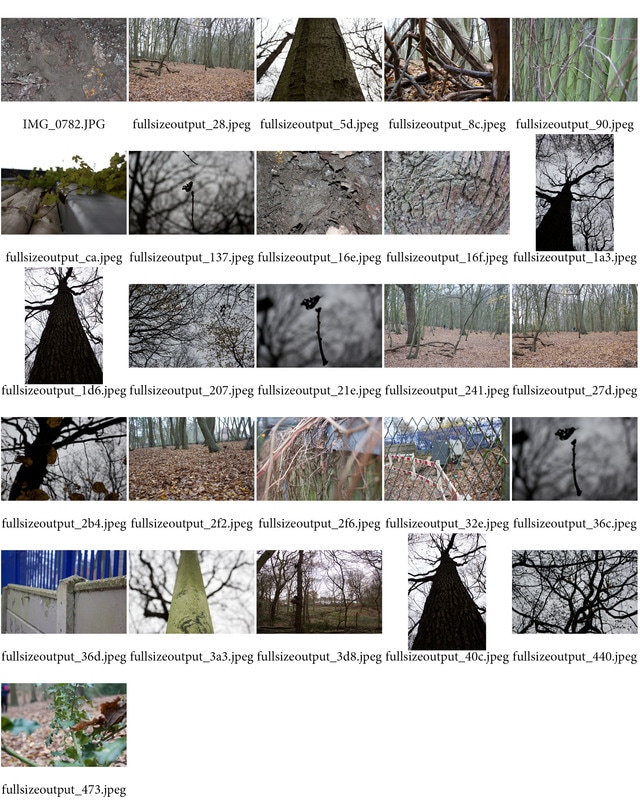
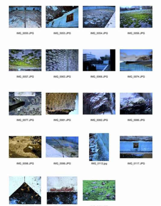
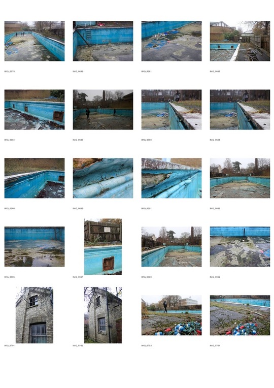
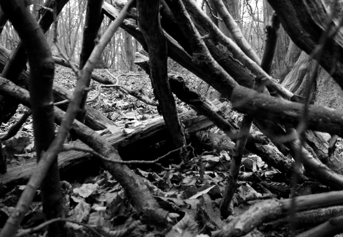
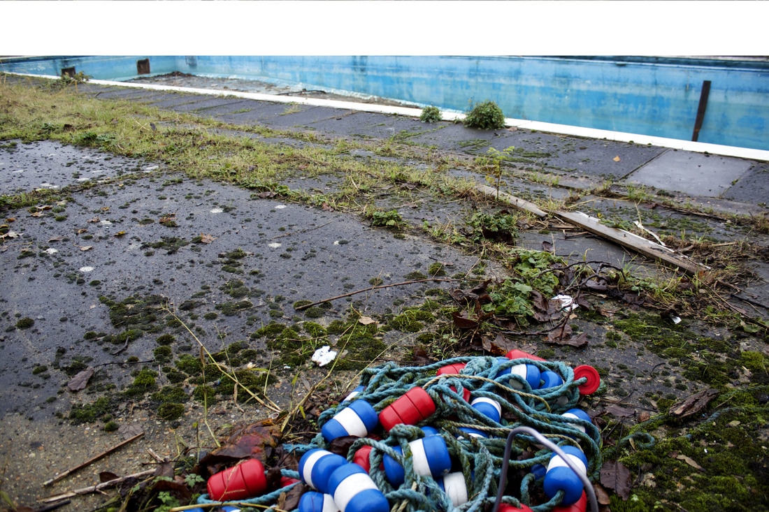
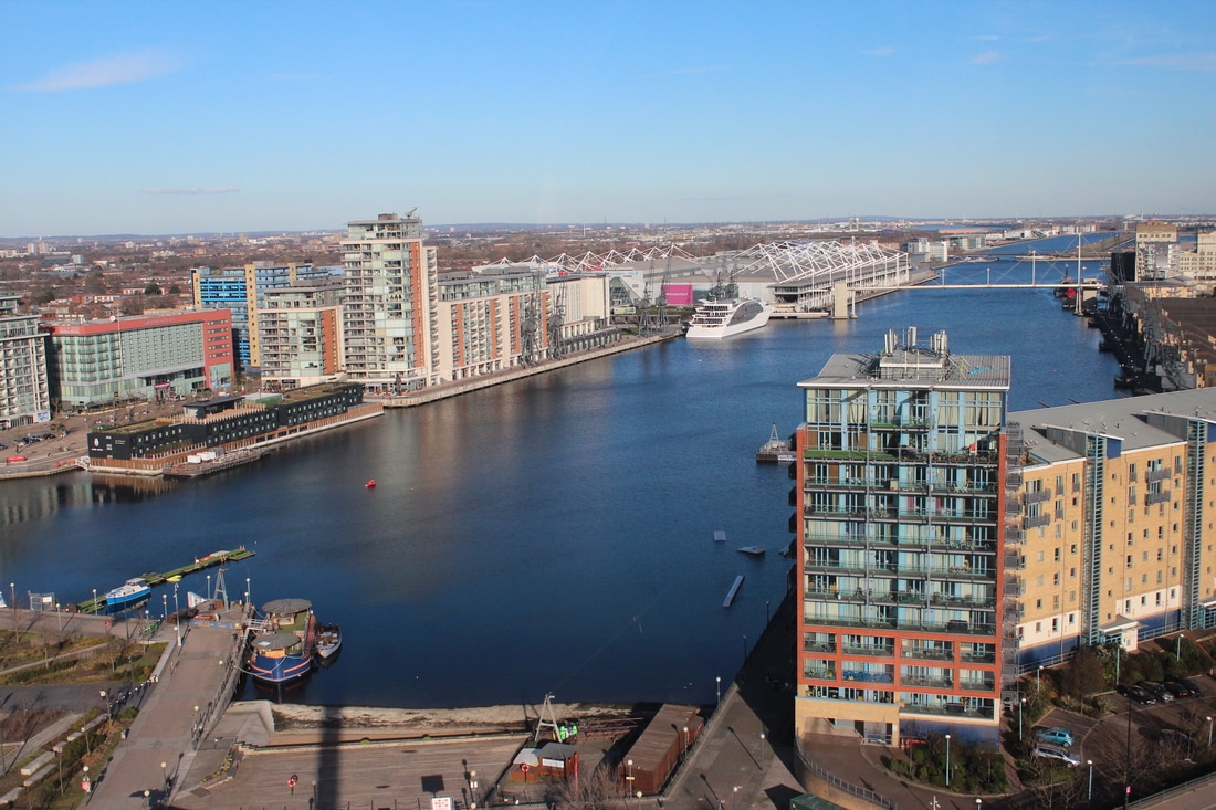
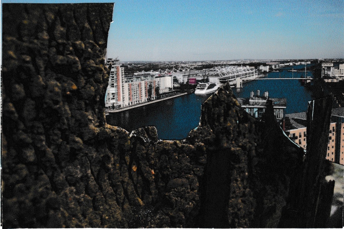
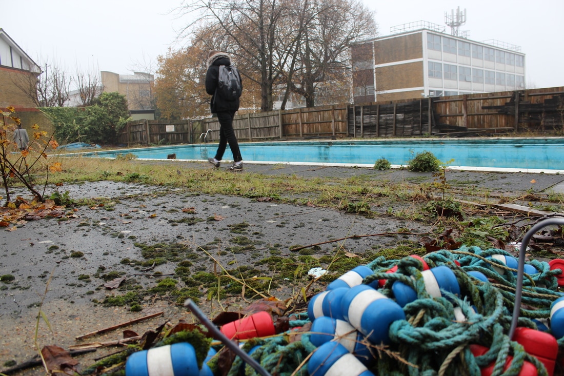
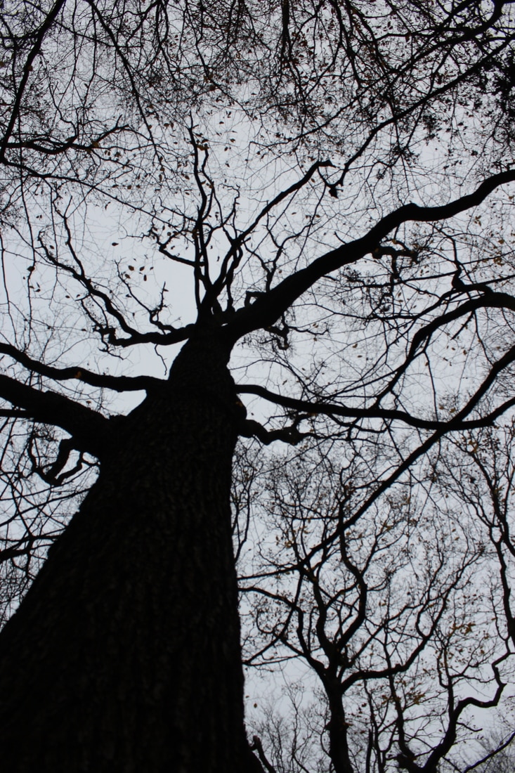
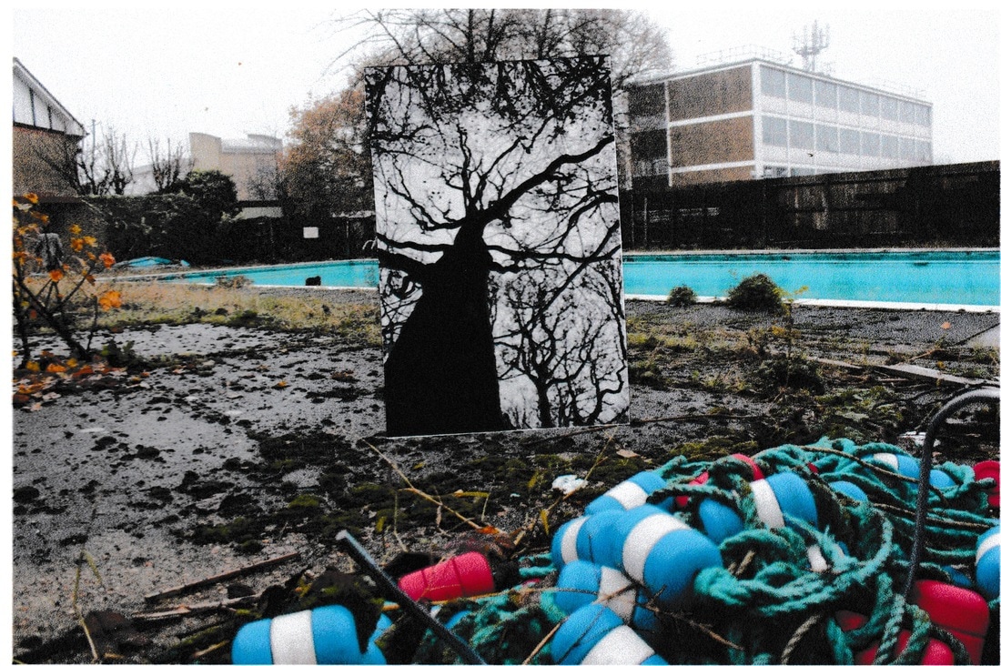
Exploring the formal element through the natural environment:
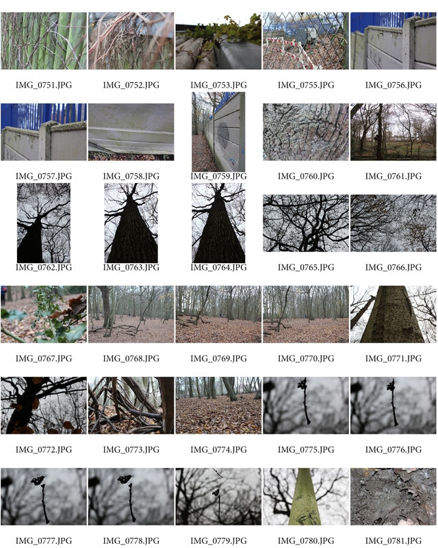
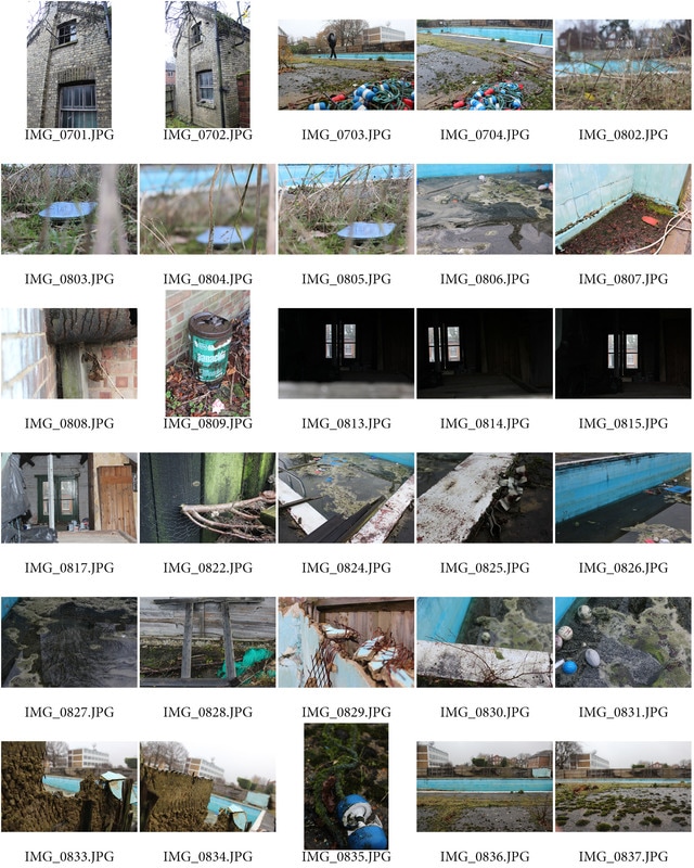
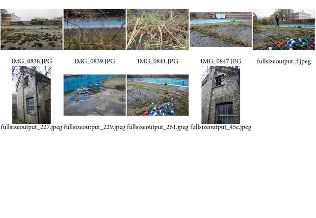
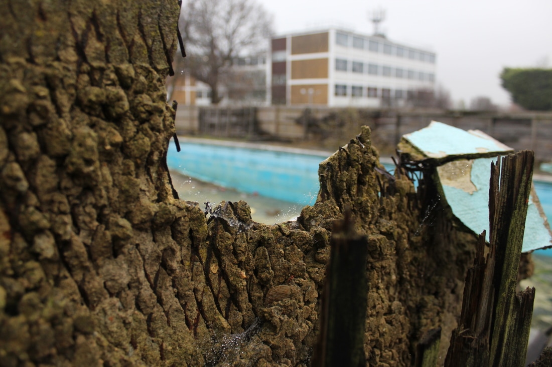
Coldfall Woods + Swimming Pool.
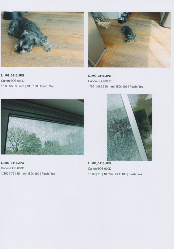
- I set about going to some woodland local to me as well as an abandoned swimming pool on my schools grounds to photograph the natural environment, paying attention to the formal elements, focusing on two particular formal elements. (Perspective and texture).


The edits and development:
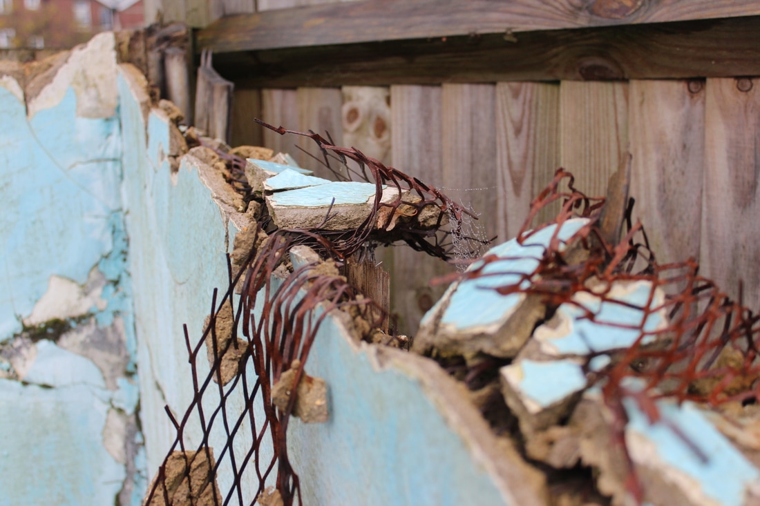
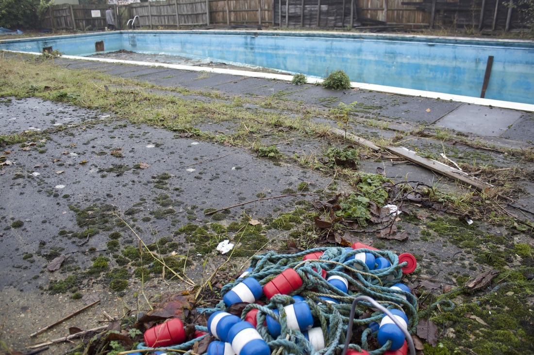
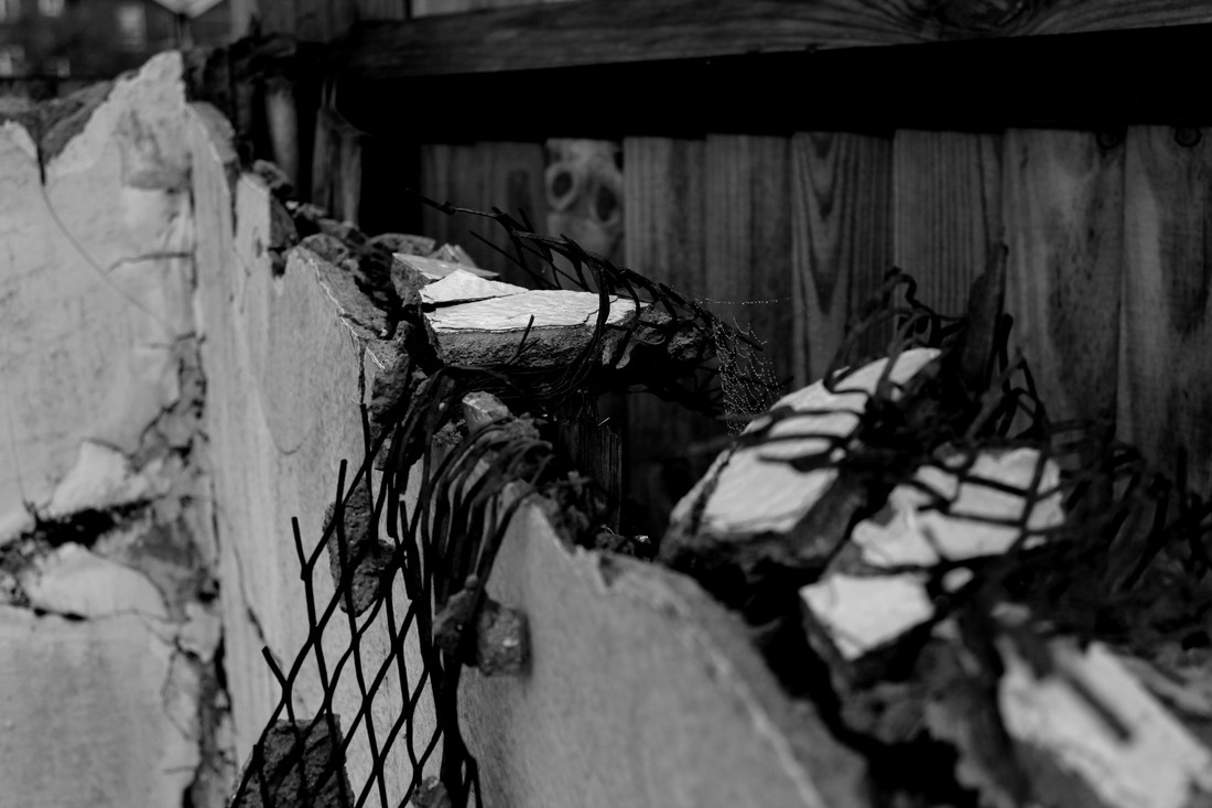
- I took this photograph in the derelict swimming pool. i aimed to capture the texture and shapes of the decaying metal and concrete in the foreground as well as the grainy pattern of the moss growing over the fading paint of the swimming pool in the background.
- I then set about editing this image in photoshop to emphasise the textures.
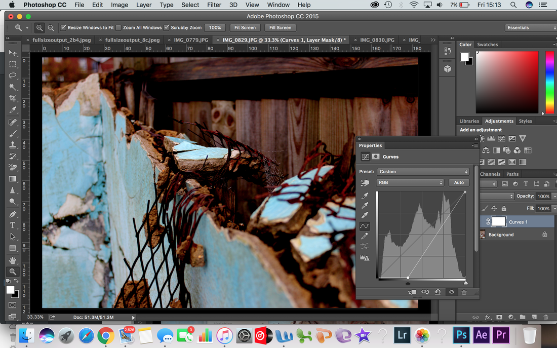
- Using the curves function on photoshop i increased the contrast on the photograph, making details and patterns within the photograph clearer and stronger.
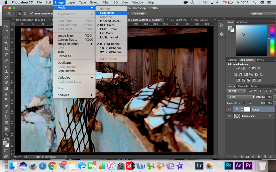
- Next i turned the photograph to grayscale, i did this because i wanted to reduce any unwanted visual 'noise' from the composition.
- The black and white draws attention towards the details shapes and textures of the concrete and rusting metal in the centre of the image.
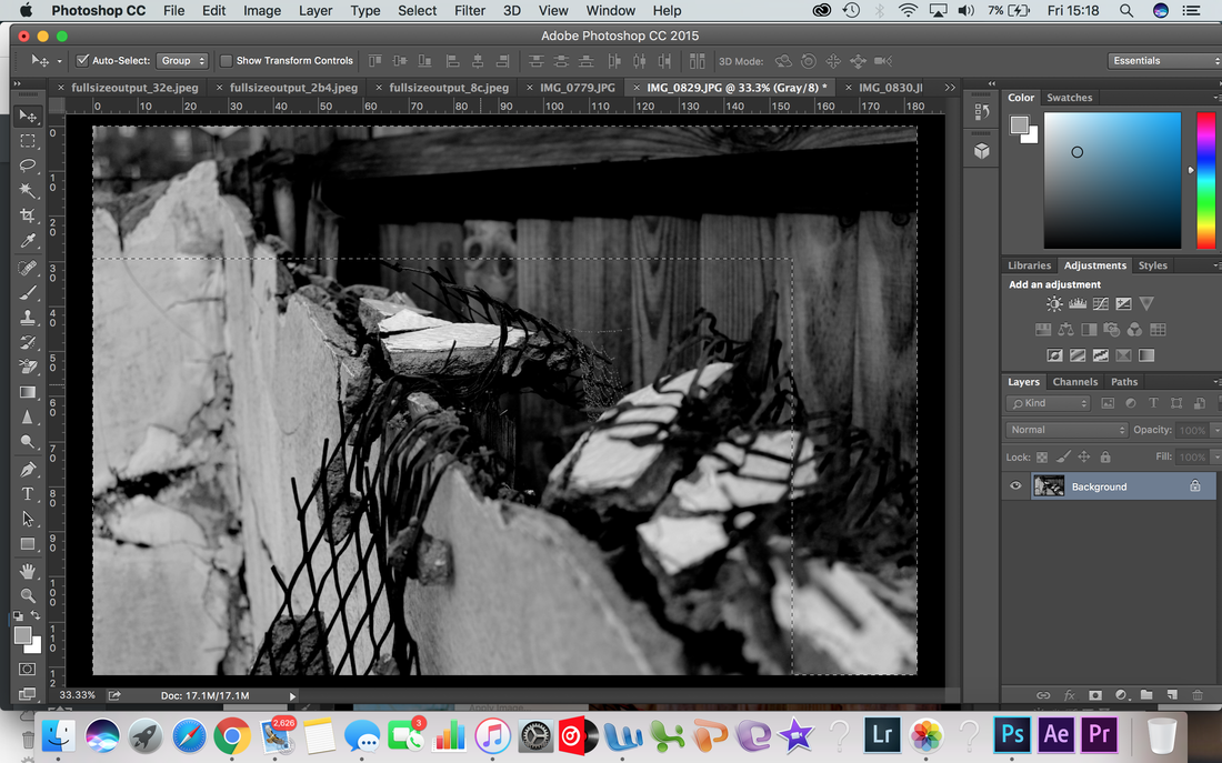
- I then cropped away an sections of the photo i felt didn't bring anything unique to the photograph in terms of details or textures.
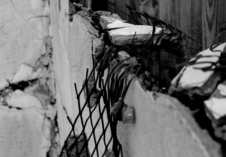
In this Image of decaying metal and concrete the formal elements of Texture and Perspective are evident.
This photograph gives an interesting perspective of the subject. The foreground is detailed with shapes contrast and details whilst the background which is out of focus, uses the blurred effect to increase the contrast between dark and light. This use of a shallow depth of field makes use of the formal element perspective.
The increased contrast on the image draws detail to the broken concrete as well as the water saturated spiders web on the centre-right hand side of the photo.
By cropping the photograph i have drawn attention to the areas of the photograph i feel relevant.
Rule of thirds applied to this composition:
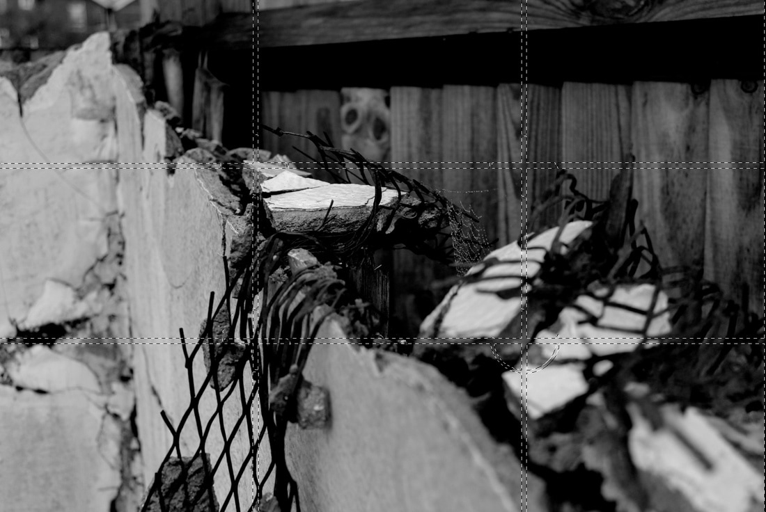
- Placing the rule of thirds grid over this image shows how the concept works.
- the intersections of the grid are the point of interest in the image.
- Each of the intersections show a unique element to the image, differing from one another. this is the idea of the rule of thirds.
Response to the formal elements:
In response to my research on the formal elements, i decided to produce a series of images from my shoots at the swimming pool and the woods which show each formal elements best.
Texture:
Shape:
Perspective:
Colour:
Personal Environment:
In this strand i decided to explore my personal environment and how i could document it. I decided on focusing on a specific area of my personal life and how i could photograph that.
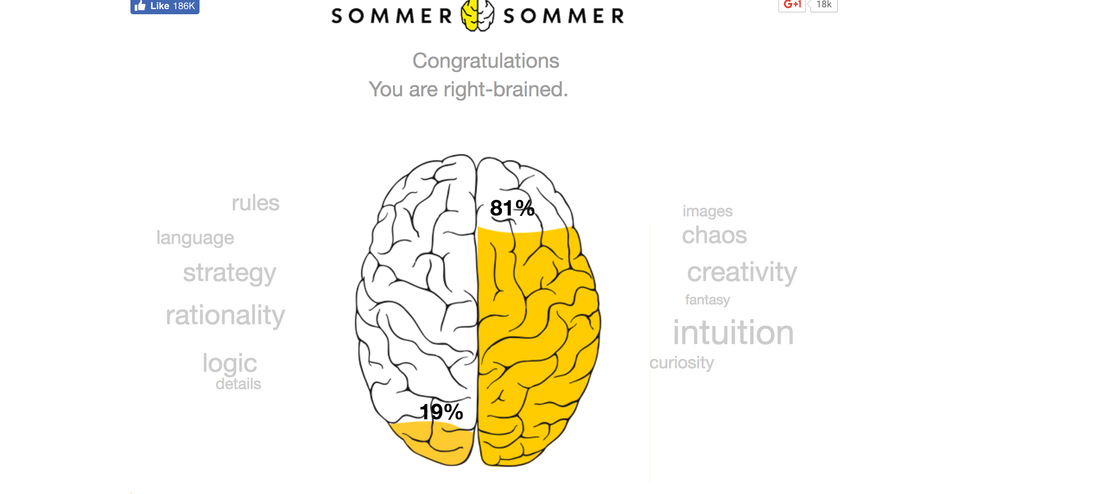
I decided upon exploring my environment as a left handed person.
I decided upon exploring my environment as a left handed person.
- Being left handed effects my everyday life, having an impact on my personal environment.
- The world is tailored for the majority of the population who are right handed and so everyday life is different for a left hander who makes up around 10% of the population.
- Here are some examples of every day left handed problems
- I started exploring my left handed environment psychologically.
- There is a psychological theory that if you are left handed you are "Right brained" meaning that the right hand side of your brain is more dominant than the left.
- If you are mainly right brained you are said to be more creative, intuitive and subjective, as well as paying more attention to things visually and emotionally.
- If you are left brained you are said to be more logical, rational, strategic and analytical. As well as being better with using numbers.


My next decision was to experiment with how being right-brain dominated affected my photography. Throughout my work i have always taken photographs with my left eye looking through the lens, the majority of people use their right eye. The design of the camera is made for right handed people with the 'grip' of a DSLR being on the right hand side for you to place your right hand on.
This struck me as intriguing as i had never really question the way i took photographs and how this differed from other.
This idea made me decide to experiment with taking images of the same subject but using each eye. The idea is to visually compare how my photo style changes, analysing which formal elements i pay more attention to as a left hander compared to a right hander.
I started by exploring my own personal environment of my house, linking back to my theme of personal environment in context of being left handed
I set about using each eye to take photographs. Throughout all my work i use my left eye, the dominant eye as i am left handed and its a natural instinct for me to do so.
This is the position i feel comfortable with when taking photographs using my camera. DSLR’s are made to be comfortable for right handed people with the main handle being on the right hand side of the camera body for use with the right eye looking through the lens , However i have grown to find this comfortable using my left eye instead.
This is the position i feel comfortable with when taking photographs using my camera. DSLR’s are made to be comfortable for right handed people with the main handle being on the right hand side of the camera body for use with the right eye looking through the lens , However i have grown to find this comfortable using my left eye instead.
- Using the right eye today like this was quite uncomfortable and i found that i had to adjust to it before taking any photographs, even looking through the lens like this was harder as i wasn’t used to squinting with my left eye and looking through the lens with my right eye.
- Holding the camera and looking through the lens in this way was un-natural to me and felt forced.
- I took photographs of the same subject matter using each eye to see if my photograph perspective would differ and if i thought certain angles were better with each eye.
- I found that looking through different eyes made me look at the subject matter differently and led me to frame my shots in a different way.
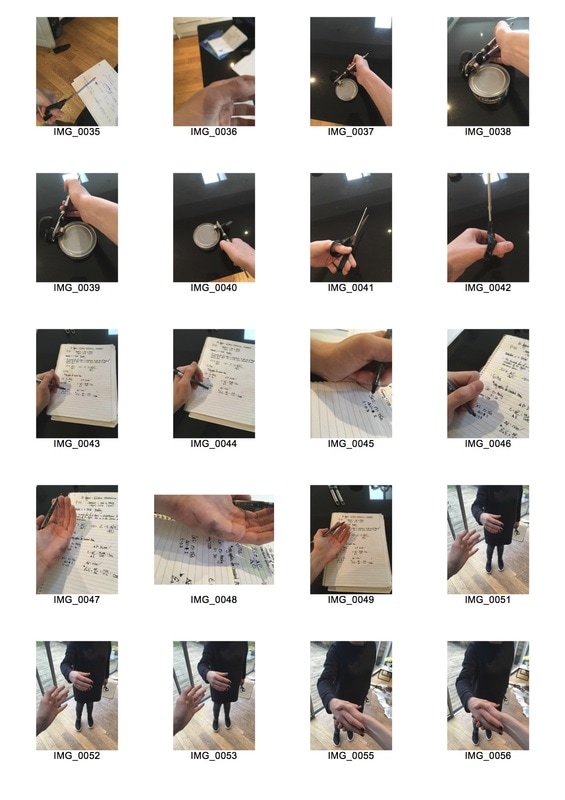
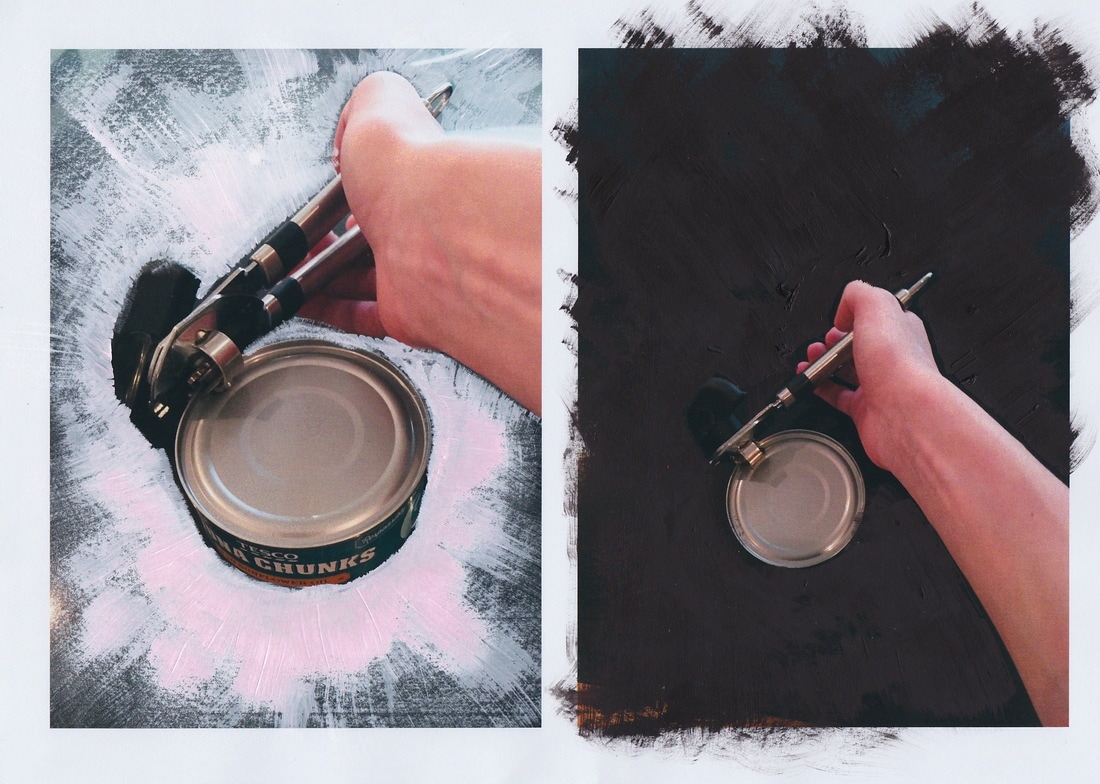
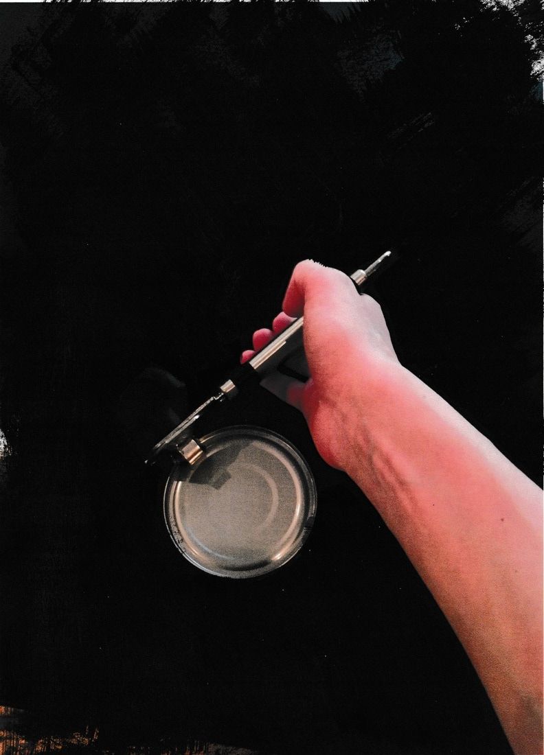
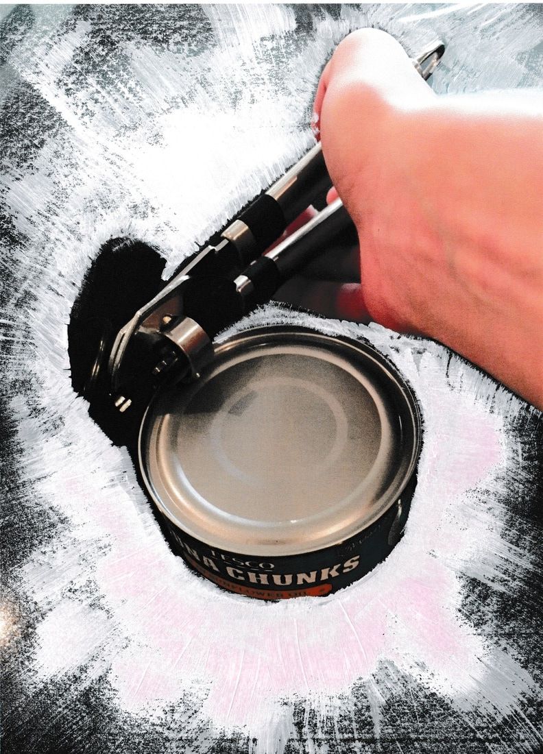
Left Handed every day problems
- In order to develop on the idea of comparing my left handed environment with that of a right hander, i decided to explore some of the everyday problems i face with being left handed in a predominantly right handed world.
- This includes using: Ring binder notepads, scissors and can openers. As well as this, simple gestures such as shaking peoples hands can be difficult as my immediate reaction is to put my dominant hand forward, my left hand. This can be confusing as a right hander will do the same thing, resulting in an awkward moment where we switch between hands until the handshake is correct.
- Ring binder notepads are hard to use as my hand rests on the rings, making writing very uncomfortable. As well as this, when writing with a pen i often get ink all over the side of my palm, as i write from left to right so my right hand smudges the paper as i move it along the page.
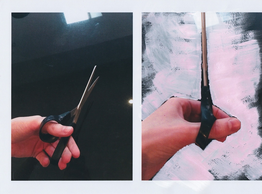
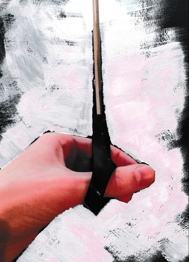
- Scissors are often designed to comfortably fit right handers, conforming to the shape of the right hand, as well as the blades being positioned in a different way so cutting paper doesn't work if a left hand is used. For me this causes discomfort when using them
- Can openers are also hard to use the way i would use the can opener is different as a left hander.
- Here are some photos to show this:


- To develop on these photographs, i began painting on the paper.
- By painting the photographs in this way, i am drawing focus to the subject of the images, my hand as i try and operate these items.
- This was done to show the underlying issue of each photograph in a clearer way, whilst adding a second medium to the compositions.
The Man-Made environment:
- This strand will explore the man-made environment.
- The man made environment involves urban landscapes. From city to infrastructure this area of landscape photography has existed for many years now.
Artist Research: Nicholas Nixon
- Nicholas Nixon(1947) is an American portrait and documentary photographer born in Detroit, Michigan.
- Most famous for his series "The brown sisters", a documentation series thats been in progress for over 40 years, Nicholas is one of the key members of the mid 1970s "New Topographics" movement, with his work featuring at an exhibition called "New Topographics: Photographs of a man altered landscape". This exhibition became on of the most influential landscape photography exhibitions of the time period and to this day still remains extremely important.
- Nicholas's work in the exhibition featured large format prints. Each photograph depicting the man-made city-scape's of Americas urban landscape from a vantage point above the majority of buildings. His images are breathtaking.
- Each photo is extremely analytical of the shapes and forms within the cities he photographs. Using black and white film and a large format camera, he retains strong details and textures of the landscapes without any loss of quality. Every photo seems rather mathematical and logical in the sense that the framing of the image is extremely regular and ordered. You can tell he was actively thinking about framing when taking the photographs.
- His images use shadows and natural lighting to create strong contrasts between light and dark as well as highlighting the ordered layout and shapes of the American cities.


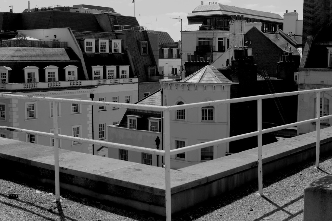
Response 1: Mayfair Rooftop
- In response to the work of Nicholas Nixon, I went to central London in search of a vantage point to take photos of the city.
- I eventually found a rooftop to begin taking photographs.
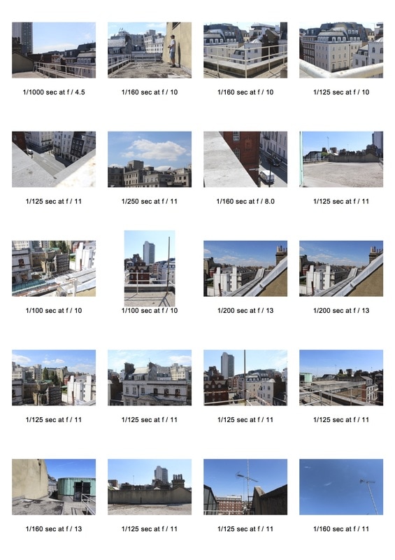
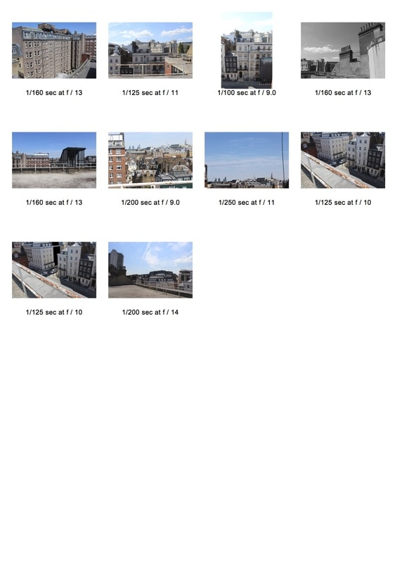


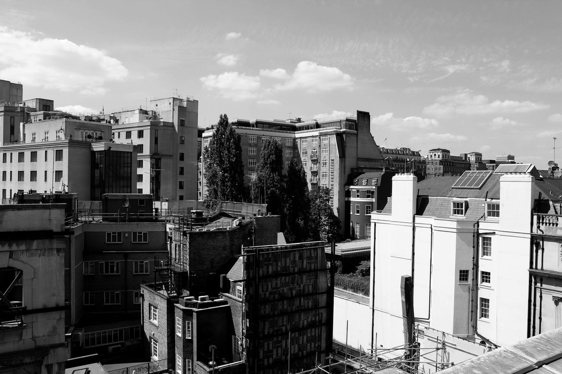
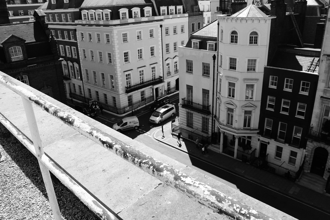
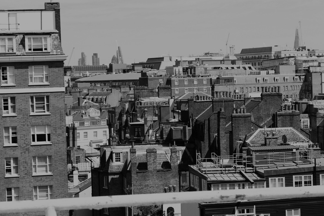
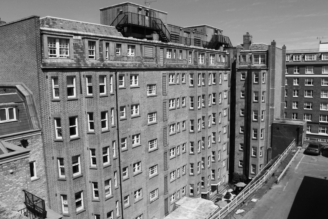
- I didn't have access to a large format camera like Nixon, instead i used my DSLR and edited the images in photoshop.
- using photoshop i changed the images to either grayscale or black and white, to try and achieve similar tones and Nicholas Nixon in his work. I also increased the contrast on the images to bring out the geometric shapes of the buildings as well as exaggerate any shadows that are seen in the compositions. I wanted to achieve a similar juxtaposition of light and dark on the big buildings surrounding me.


I am pleased with the outcome of these images. i have produced this work in the style of the new topographics movement effectively, achieving similar contrasts of light and dark whilst paying great attention to detail to the textures and shapes of the geometric buildings.
I felt slightly limited being only 5 storeys up, the majority of buildings surrounding me were level to me, this meant i couldn't achieve proper city scape photographs. As well as this i don't think my shutter speed was high enough i felt like some of the images were overexposed a small bit which meant i was limited in terms of increasing contrast in photoshop.
I felt slightly limited being only 5 storeys up, the majority of buildings surrounding me were level to me, this meant i couldn't achieve proper city scape photographs. As well as this i don't think my shutter speed was high enough i felt like some of the images were overexposed a small bit which meant i was limited in terms of increasing contrast in photoshop.
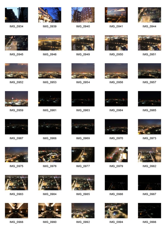
Development 2: Guys Hospital
- In my second shoot i set about capturing the London city scape in a similar way to my first shoot, however i wanted to capture it from a higher vantage point and at night.
- I wanted to be higher up than my previous shoot in order to successfully achieve a proper city scape. As well as this i wanted to experiment with taking the images at night. i wanted to see how contrasts of light and dark within landscape at night compared with that of the images i took in the daytime in the previous shoot. The contrast this time would be between street lights and the night sky.
- This led me to go to Guys Hospital in London Bridge. the 30 storey hight structure seemed perfect for me to gain a decent vantage point above the city centre.
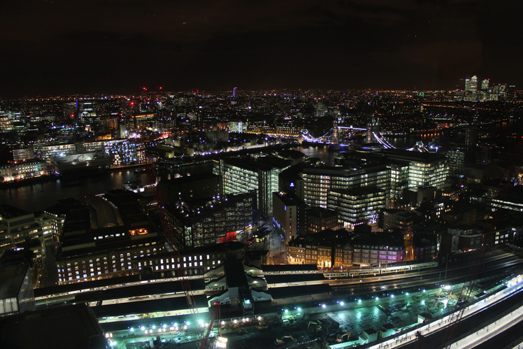
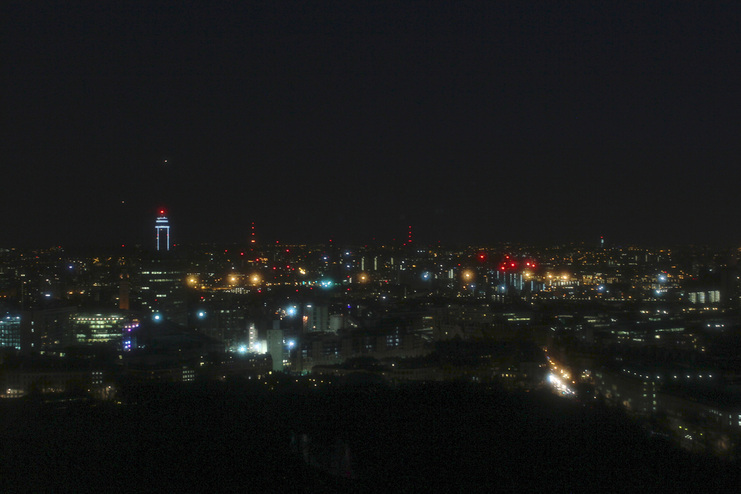
I was overwhelmed with the success of this shoot. This photo stands out to me the most amongst them all.
The contrast between the colourful street lights and the hard darkness of the sky, creates a rather surreal juxtaposition within this composition.
My thoughts behind this photograph were to show the complexity of London's interconnecting road and building networks. This image was taken during the evening but you can see how the city is still very active. the vantage point shot gives the viewer a new perspective to look at the city and show the built up landscape in an effective way. The train and station can be seen on the bottom of the image and at the top you can see the distant Canary Warf area. This shot has depth as a result of this. The focus can been seen to alter as you look further into the distance of the image.
Similar to Nicholas Nixon, i achieved a great details within the image although its is such a wide angle.
I decided against editing it so that it would be black and white purely because of the fact that the range of colours work so well with amongst the darkness of the sky.
- I was inspired by the placement of the train in this photograph, if i were to take this photograph again i would have tried to get a long exposure in which the train moves so i could capture the movement.
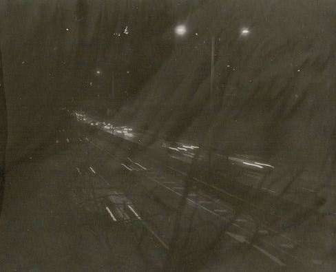
Development 3: Mayfair Hilton
- In this shoot i headed down to mayfair in search of another high place near a main road so i could capture cars as they move through the city streets.
- I came across the Mayfair Hilton, just off a series of main roads and so went up as high as i could to capture this.
- I began taking some long exposure type photographs through the window of the restaurant.
- I attempted to take long exposures, however the glare given off from the window made this an issue. As a result i tried to take multiple photographs of the same shot so try and capture the movement of the cars below.


- It struck me as i looked at this image below that it looked a lot like a cctv camera when blurry and distorted like this.
- This made me think about the man-made environment in London and how much CCTV cameras there are within the city.
- An idea came to my head, and so i decided to try and make this image look like CCTV to link this image of the man made landscape back to the location even more in a contextual sense.
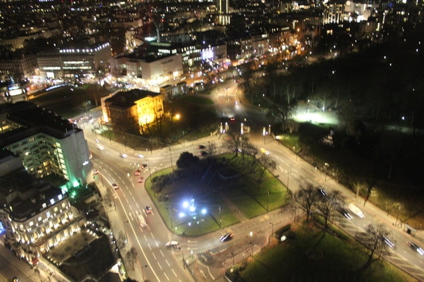
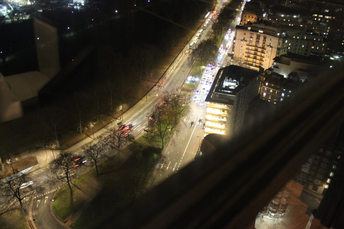
This photograph was taken with my Canon 600D DSLR using it on manual mode with the settings: 1/5th second , f3.5.
The photograph is of a set of roads and buildings taken from a high point in London, on the right hand side is an entrance to hyde park.
<----(The original, un-edited version is shown here)
The photo was taken without the use of a tripod as i didn't have one available during the time i took this photo. As well as this problem, the photo was taken through a large glass window which proved to be an obstacle as it was very difficult to get the reflection out of the frame, my only option was to hold the camera as close as i could to the glass whilst trying to keep a steady hand.
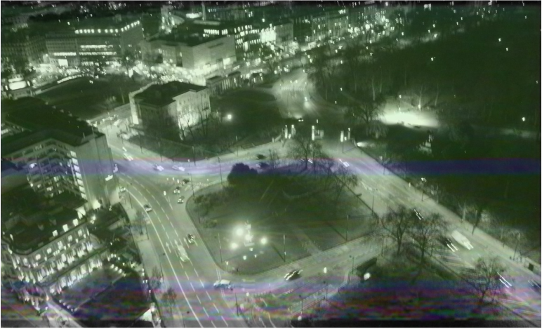
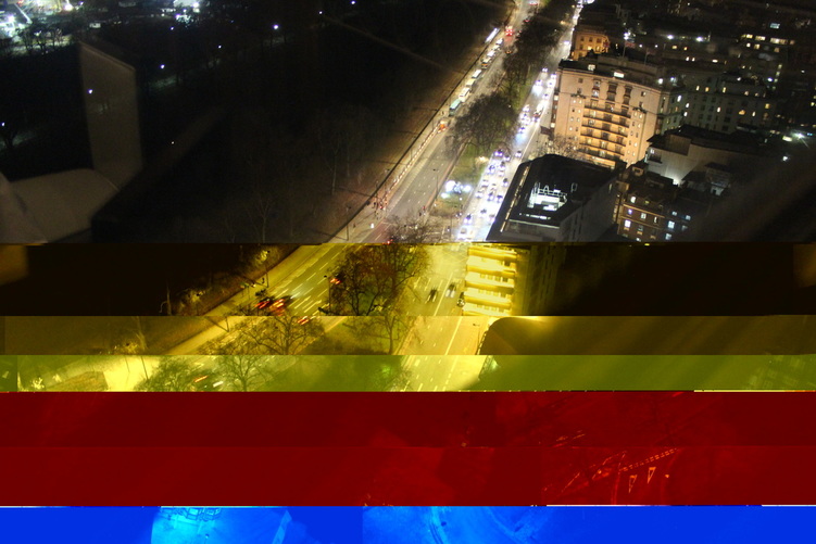
This is the result:
- Using photoshop i layered the image below over the photograph i took, altering the opacity of it so that the landscape image beneath could be seen.
- I found a photo online which depicted a VHS type glitch and added it as a layer to my photo. Then, i scaled the image onto my photo, turned the opacity of the new glitch layer i had added down to around 20% so it was barely visible on my photograph but the parts i had wanted to show up remained clear. This produced a very unique effect.
At first i saw the slight blur of the photograph to be a downside, but after editing the image in this way its almost complemented the idea i was aiming to convey.
However, if i went back to retake this shot i would have got the image fully in focus.
I have a thorough interest in old style filming and photographing (eg: 35mm, VHS, Polavision, Hi 8), and often i find that using a DSLR just doesn't compare to the effect given by these old types. VHS is particularly interesting in this sense as its very well known to glitch during playback and produce a fuzzy set of colourful electronic lines across the screen, CCTV cameras can also produce a similar effect.
This technological distortion is something id like to experiment with in my next development.
This technological distortion is something id like to experiment with in my next development.
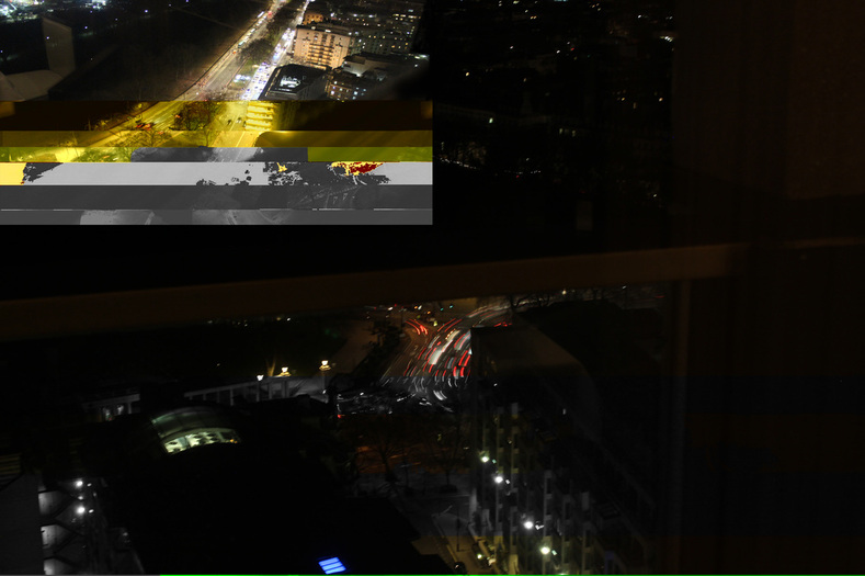
Development 4: Distortion
After creating this CCTV-like effect, i decided i wanted to further this idea of using a glitch like effect. I wanted to develop the visual distortion of these landscapes, bringing new meaning to the photographs.
By distorting the photographs i wanted to make reference to the fact that the man made environment is not always perfect and that there are 'errors' as such is the environment, signified by physical 'error' or distortion on the photographs.
By distorting the photographs i wanted to make reference to the fact that the man made environment is not always perfect and that there are 'errors' as such is the environment, signified by physical 'error' or distortion on the photographs.
Text Edit Glitch:
By copying and pasting a photograph into the application 'TextEdit' you can create a glitch effect very easily. This effect is the result of the file being corrupted due to technical errors in the photographs coding. To create this you need to:
- Make a copy of the photo you want to add this effect to so that you don't permanently damage the original file.
- Open up the copy of the file in TextEdit.
- Scroll past the first 1/4 of the coding that is now on screen and begin destroying the rest of the code. This can be done by adding new characters to the code or deleting sections of the coding completely. You can also copy sections and paste them in other parts.
- The image below is an example of what this glitch effect can do.
I was happy with this image. I added a new dimension of colour and shape to the photograph with this glitch effect.
My next decision was to experiment more with distorting images in different way.
My next decision was to experiment more with distorting images in different way.
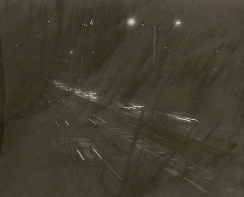
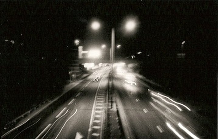
Development 5: Night-time experimental shoot


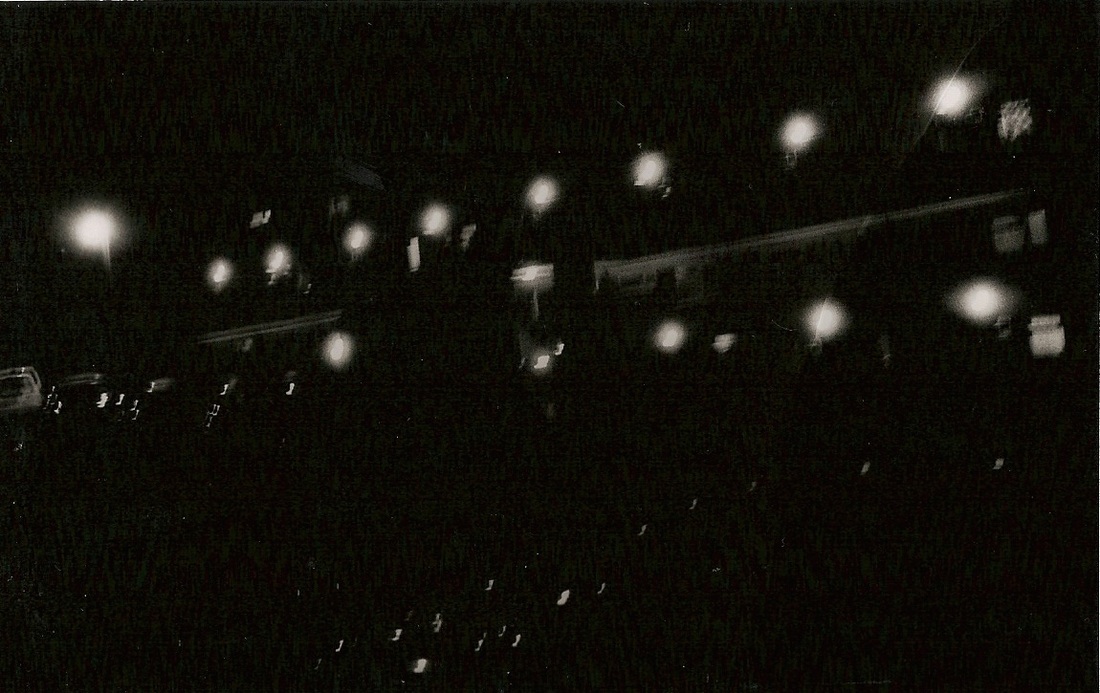
The photos were all taken using a Nikon F 35mm film camera and 200 ISO film.
This camera is extremely old, and i knew the lens had dust within it which is visible when looking through the viewfinder.
I took this camera out with me, without a tripod and took photographs as i walked near a local motorway during the night.
After developing the film in school and enlarging i got my first glimpse of them.
The outcome is rather eerie and mysterious.
- This is the outcome i was hoping for. i took a gamble using this photograph expecting odd results due to it being an old camera with some lens issues.
This image is particularly interesting. It looks as thought there are two different layers over this photograph of a motorway. The first being the tree figures on the lower right section of the photo and the second being this cloud like pattern, possibly due to the dust in the lens.
The result of this composition is due to the fact that i used an old camera with a lens that is past its prime. The distortion within this image is caused by a gradual deterioration over time. This idea of distortion/deterioration caused over time is something i'd like to investigate more in my work, in context of the man-made landscape and how it gradually deteriorates.
The result of this composition is due to the fact that i used an old camera with a lens that is past its prime. The distortion within this image is caused by a gradual deterioration over time. This idea of distortion/deterioration caused over time is something i'd like to investigate more in my work, in context of the man-made landscape and how it gradually deteriorates.
Development 6: Physical Distortion, Decay.
Artist Research: Nadav Kander, Chernobyl
- Nadav Kander is a renowned photographer and artist. Well known for his portraiture and landscape work the London based photographer has had his collections on display at The national portrait gallery as well as the Victoria and Albert museum.
- Nadav shows how photography can also be used as a tool for documentation of events as well as an art form. He shows this through his use of photography in representing the Chernobyl disaster during his visit to the city in Ukraine which was evacuated in 1986 due to a nuclear disaster.
- The disaster was a result of a design flaw in a soviet era nuclear reactor inside the nuclear power station in Chernobyl. Reactor 4 exploded producing steam and fire releasing lethal doses of radioactive fallout into the atmosphere surrounding it. Many of the rescue teams helping those who were living in the surrounding area to evacuate the locals also suffered high doses of radiation and often died later due to radiation linked illness (cancer). This is still to date the worlds worst nuclear disaster in the world.
Nadav Kander describes the work with this description:
"Home to more than 40,000 people, the apartments, schools and hospitals that were hastily left following the controversial evacuation are stark reminders of past lives, leaving a disturbing sense of quite. An uneasiness that I had never previously experienced"
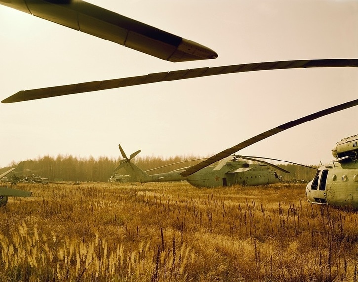
CONTAMINATED MILITARY EQUIPMENT COMPOUND, PRIPYAT — CHERNOBYL, HALF LIFE
This is a landscape photograph shot in a field somewhere in Chernobyl, Ukraine.
The image depicts an overgrown field with radioactive, contaminated military helicopters which were abandoned during the evacuation of Chernobyl because of the nuclear disaster. Black propellors of the helicopters are seen across the photo and the sun is seen covered by one on the top left hand side. The grass in the field shown looks lifeless with a gold colour to it. In comparison to normal grass which is a vibrant green colour this is a rather unusual sight and it suggests that this isn't a normal scene to be looking at. In the background, the horizon line is made by the tall trees blocking off whats in the distance.
The image seems to be lit by the flat, natural light of the sun.
Nadav Kander scaled this photo very well with the horizon line of the trees acting as a straight horizontal line. Perspective, scale and shape are clear themes of this composition.
The mood of this photo is rather nostalgic in the sense that these helicopters have been abandoned since 1986. However, there is a huge eeriness to this photo, its obvious that this is an abnormal scene because you wouldn't normally come across an abundance of abandoned military helicopters left to decay in a field. The fact that this site is abandoned gives the image a strong feeling of isolation. This isolation gives the helicopters insignificance although they are part of the photos focus, the insignificance is due to the helicopters being in such a large open space surrounded by overgrowth in an area which people do not often venture. The large amount of The warm yellow and green colours in the photograph make the image more neutral and take away this frightening element to photo possesses.
There is also a sombre mood to the photograph. This is emphasised by the rural setting and the lack of different colours the image has. The main colours are greens and dark yellow throughout the photo, even the sky has a warm look to it.
The photograph depicts abandoned soviet era helicopters in a field. the field is overgrown and its unlikely that it experiences many people passing through it as its in the radioactive zone surrounding the nuclear reactor that exploded in Chernobyl. nothing is happening in the image and the purpose of the shots is not to demonstrate something thats happening, but instead to draw a link to the modern day and the nuclear disaster that took place in the 1980s.
The image is representing the fact that a massive area surrounding Chernobyl is completely un-inhabitable and therefore left for nature to take its course resulting in overgrowth and decay.
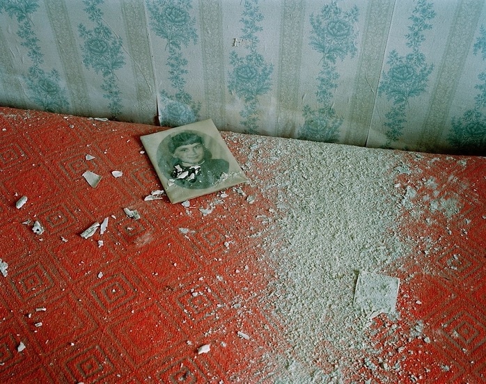
PHOTOGRAPH, PRIPYAT — CHERNOBYL, HALF LIFE
The picture shows a black and white portrait of what looks to be a child on the floor of an abandoned room within pripyat, chernobyl. The image shows looks like wall plaster on the ground in a dust like form, with small chips of the wall on the floor also. The ground itself is a red textured carpet. On the wall you can see a blue flower pattern surrounded by fading white and cream colours. The image was either taken from a standing postion or using a tripod judging from the distance from the ground to the lens, unless a macro lens was used
The pieces of the decaying wall and ceiling are on the floor indicating the room has been in a derelict state for a prolonged period. The image of the child was most likely to have been left in the room as the occupants evacuated the building this image was taken in.
Texture and lines are key themes within this composition. The texture being the carpet and the powder like substance on the floor next to the portrait photo. The photograph is a focused, close up of the interior of a room in the contamination zone.
Form: This is a landscape photograph which was shot inside an abandoned building within Chernobyl's radioactive zone.
Development 7, Nadav Kander Response:
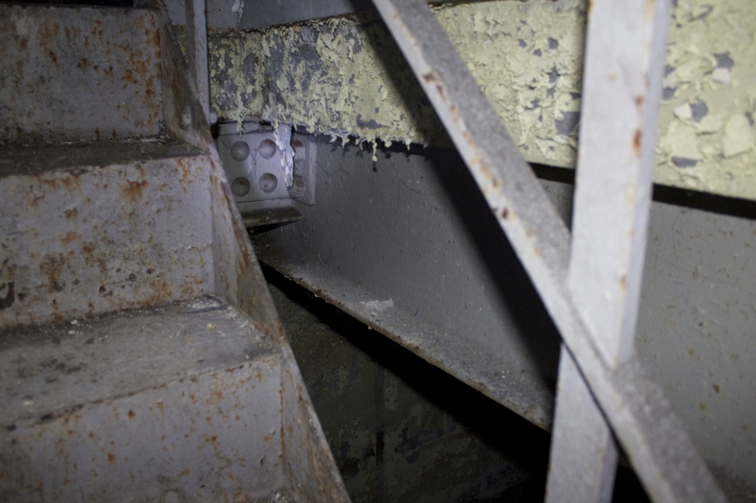
Abandoned Northern Line Sub-station
- In response to Nadav Kander's Chernobyl photographs i decided to respond.
- Kander's photographs depict a man-made environment left to decay after a man-made disaster. The result is a whole city in Ukraine left to rot. I wanted to find a similar man-made location that has simply been abandoned by humans and left to decay and physically distort over time.
- The following shoot was taken in an abandoned sub-station for the London Undergrounds Northern line service.
- The building was abandoned in the early 2000's.


Artist link: The Lurkers.
The lurkers are a group of photographers from the UK that spend their time travelling throughout the world, documenting this every step of the way on their website (http://www.the-lurkers.co.uk/).
They visually document their travels, occasionally leaving a small passage of writing to go with the series of photographs they produce.
The lurkers are photographers as thats essentially a part of their lifestyles they live, documenting their travels and leaving a piece of artwork in Most of the locations unique to them so others know they have been.
The Lurkers is an on going, conceptual art, lifestyle project that was formed in 2012 by like minded people who felt there was gap in the creative world around them that needed filling. A platform for content that would both entertain the people creating it and inspire those who follow it. To lurk is to observe and through observation often comes insight. Through the use of graffiti, photography, exploration, storytelling, fashion, film and animation we aim to deliver a unique blend of creative content that reflects our lifestyles and shows you the world from our perspective.
The majority of their photography is shot with 35mm film and its evident in some of the images due to the unique characteristics of shooting with non-digital cameras.
Its also a trademark of the lurkers to edit over the faces of everyone but the models in the images with their unique logo: A cartoon mans face with a bucket hat on top.
I am a true fan of using 35mm single lens reflex cameras and the nostalgic feel the photos have once they have been developed, i believe that in the case of the lurkers, using 35mm film is a great idea and its not like any other group of explorers as most use DSLR cameras for a number of reasons including ease of use whilst in these places.
The fact that they use film cameras and have a distinctive style of setting up scenes in the locations which they find, lead me to believe they are experienced photographers and have been doing it for a long time although they were formed as a collective in 2012.
As well as photographs, the group capture short films in a creative and minimal form. If i were to describe their short films in a general way it would be: minimal, artistic and visually pleasing documentation of their travels throughout the globe.
Im a fan of the whole ethos The lurkers bring to the photography scene and they tie in exploration, fashion, models, cultures and the graffiti into a well presented collective of media on their website.
Before i had even began this section of my photography AS-level, i was already a fan of the lurkers and i regularly read their blog.
I like the whole ethos behind the lurkers, they essentially bring photography, fashion, models, graffiti art and exploration into a unique and interesting collective of people all with the intention to lead a lifestyle of adventure and artistic production, all compressed onto a single website. Their idea to leave their 'mark' at these abstract locations is a way to portray a sense of ownership to a place although its clear they have no ownership. They get a sense of the culture within the places they visit and even refer to the history of some places in their travel posts which is a great idea and it really evokes the idea that they are going to explore and embrace the places they visit.
One of the reasons i chose the urban maze title as well as neglected and vandalised is to give my work direction as well as it allowing me to have a sense of freedom as i explore and document the locations i visit.
The lurkers are also very much like this, they too are very interested in exploration and documenting what they do as a collective and i think thats one of the reasons i have been inspired by them and many others similar to them.
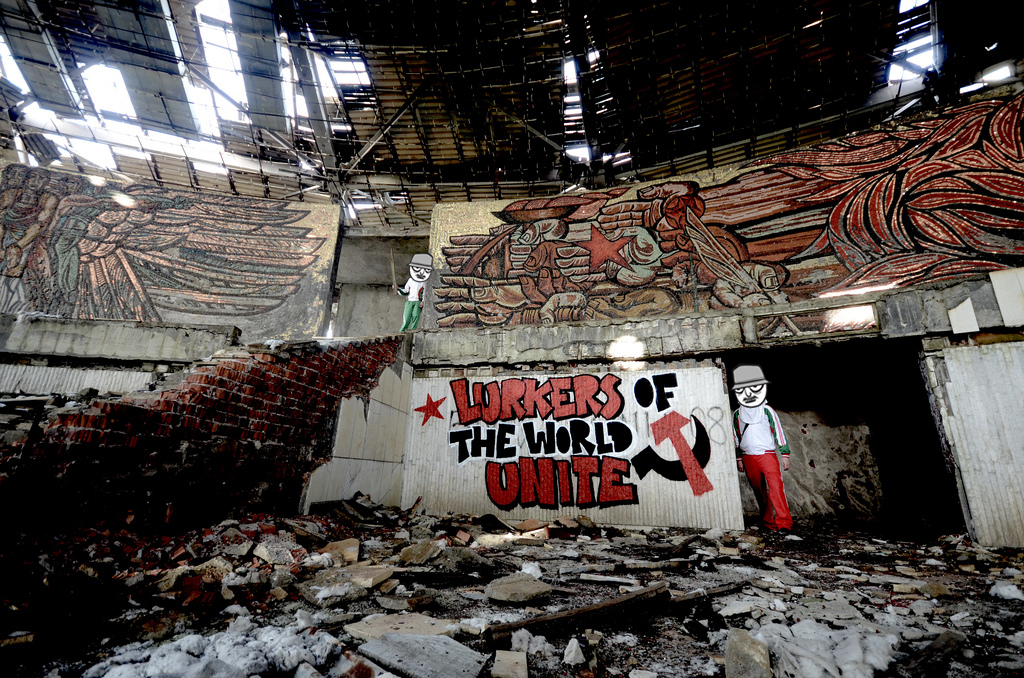
-Buzludzha Monument: The Lurkers travelled to this location in Bulgaria as part of one of their many travels, releasing a series of images afterwards (http://www.the-lurkers.co.uk/travel-shipka-buzludza/).
The photo is likely to have been taken with a 35mm camera as that is the most common format with the lurkers, it depicts two 'lurkers' in the image, one on the top left and the other the bottom right. The image was taken in the main room of the Buzludzha Monument, an abandoned monument built to commemorate socialist communism during the soviet era in Bulgaria. However, the building is now abandoned, neglected and vandalised as the picture shows.
-I found this website really interesting in telling the story of this old structured depicted in the image:
(http://www.buzludzha.com/history)
-Another photo of the lurkers piece inside the building can be seen here: http://www.buzludzha.com/node/6184
The lurkers have edited the image so that their faces are covered using their logo. Not only is this to cover up their identities, but also to show the viewer that this is a lurkers official photo. This gives the viewer the idea that they are not actually meant to be where there, this makes for an exciting mood produced by the image as a result.
Stronger colours in this photograph are the newer objects in the photo and the less vibrant, the older more degraded things, this could be seen as contrast. By covering the faces of the two men in the image, they are drawing focus to them although the photo subject is the graffiti and the building itself. this is a clever idea as this photo is drawing focus to almost every key element within it.
Rule of thirds is also followed in this image which helps make for a good composition.
Contextual Visit: Do Ho Suh, Victoria Miro


"I see life as a passage way, with no fixed beginning or destination. we tend to focus on the destination all the time and forget about the in between spaces"
- Do Ho Suh's exhibition is extremely well related to my topic of environment. I was thoroughly inspired by his work when i went to see his exhibition at the Victoria Miro in Hoxton, London.
- The exhibition consisted of multiple 1:1 scale replicas of places Do Ho Suh has lived and worked in during his life. From apartments and studios to his childhood home in South Korea.
- The translucent fabric structures are aimed to provoke reflection on memory and passage in his life, he wants people to focus on these areas of life which often become forgotten about, "the in between spaces".
- He replicates environments that are important to him and his life, resurrecting them from his memories. He wants his work to connect him with his surroundings, evoking memories and experiences he has shared with these key places.
- I'm inspired behind his idea of getting others to relive these places that he has lived or worked in. He makes the exhibition interactive between viewer and artist. He aims to try and get the viewers of his work to get a glimpse of his life and experiences through the use of these resurrected structures.
Response to Do Ho Suh:
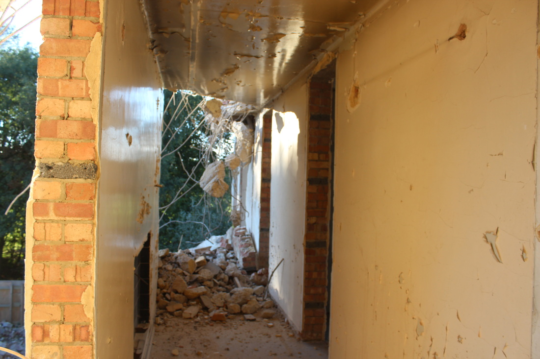
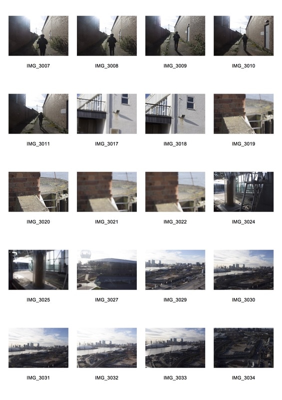
- In response to the work of Doh Ho Suh and as a futher development in my investigation of man-made environments, i visited a second abandoned building. This time a structure in the process of demolition, that was once a hospital in South London.
- I aimed to progress on from the last decaying building by capturing one in the process of demolition. the building had nature growing in and around it, whilst sections lay as rubble on the floor. In response to Do ho Suh i wanted to capture the passages of the building and preserve them as memories in the way Suh did when creating passages of places relevant to his life.


|
|
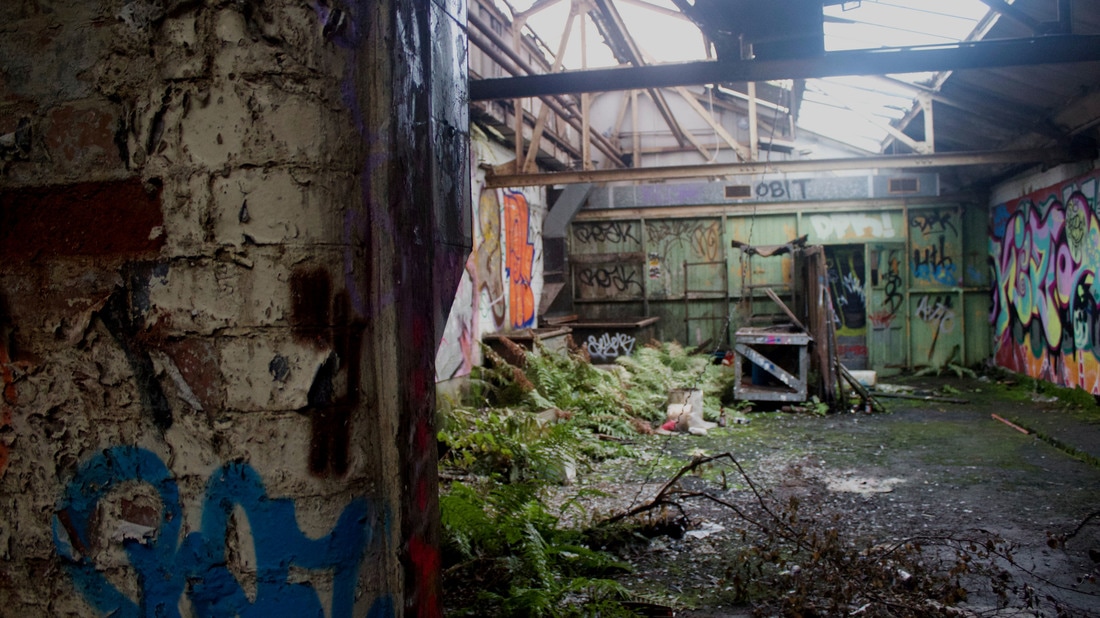
Further Development: Totteridge Warehouse.
After exploring the last abandoned building and responding to Do Ho Suh's work, my next idea was to experiment with the idea of Man-made vs Natural. These juxtaposing subject came to me as i explored the abandoned hospital and noticed the overgrowing weeds and ivy throughout the decaying structure.
As well as this Do Ho Suh's work influenced me to 're-live' experiences as he has in his work. For this reason i would like to work with this title of Man-Made vs nature, so i can 're-live' the experience of capturing the natural environment earlier on in the unit
As well as this Do Ho Suh's work influenced me to 're-live' experiences as he has in his work. For this reason i would like to work with this title of Man-Made vs nature, so i can 're-live' the experience of capturing the natural environment earlier on in the unit
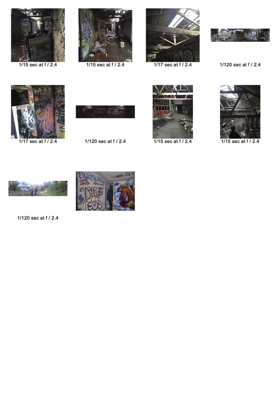
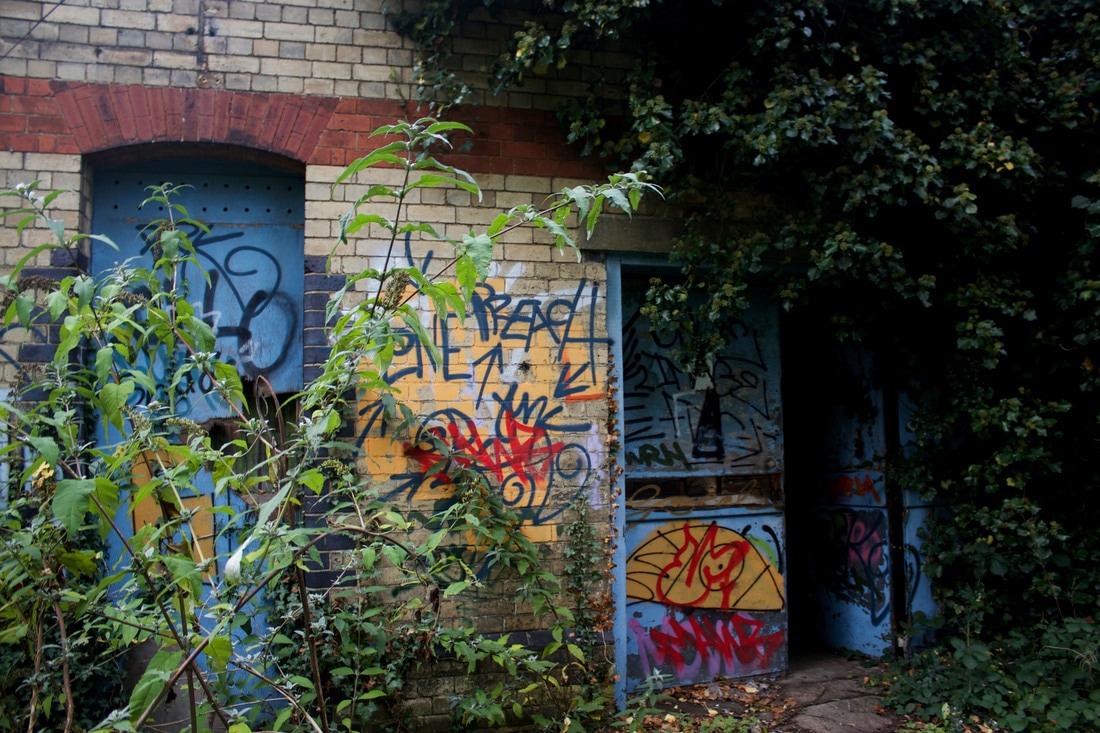
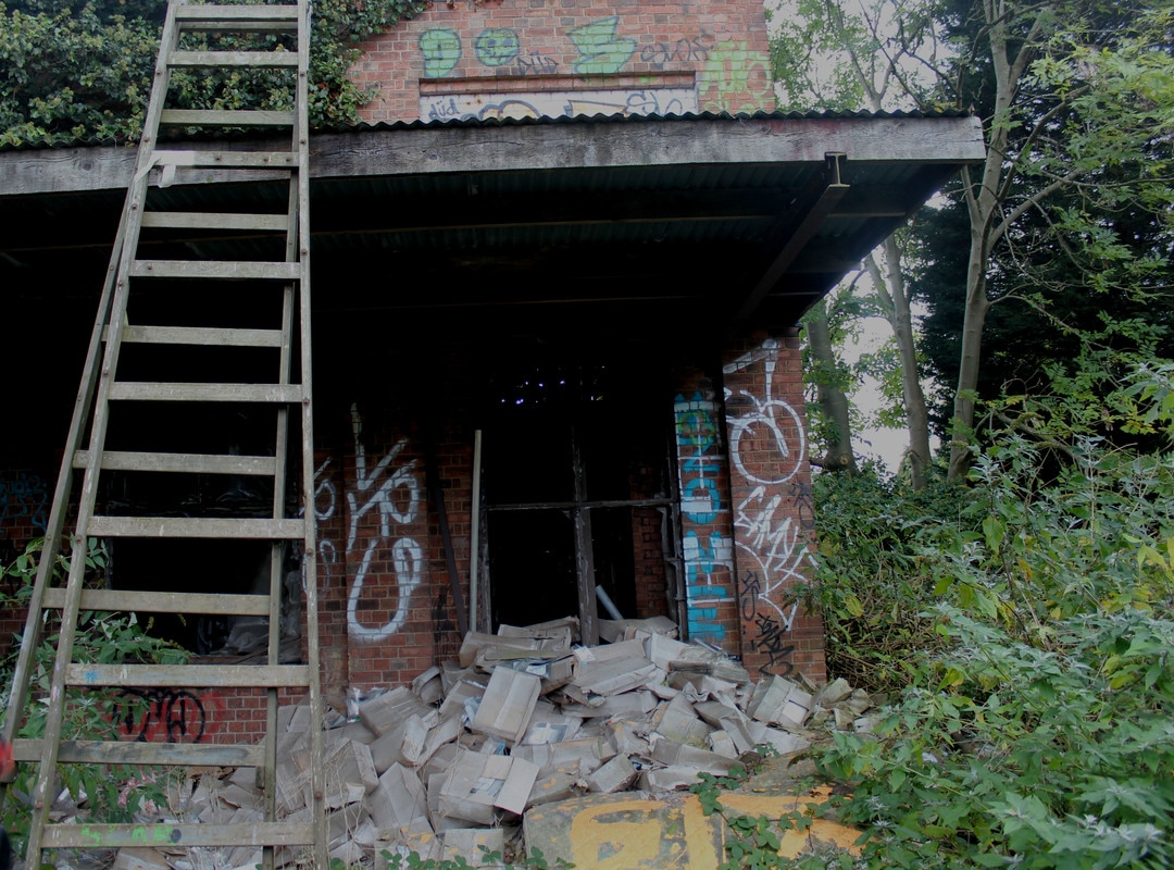
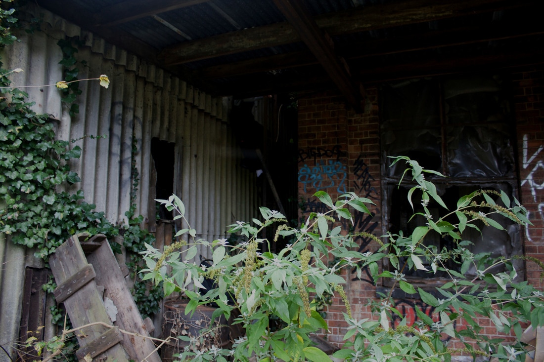
These images best represent the idea of Man-made vs nature.
The corroding building is being re-taken by nature, this is shown by the plants growing through the tarmac floor of the warehouse as the structure rots and breaks down.
The corroding building is being re-taken by nature, this is shown by the plants growing through the tarmac floor of the warehouse as the structure rots and breaks down.
Artist Research: John Stezaker
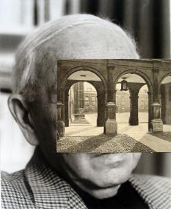
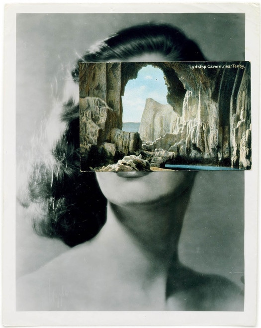
- John Stezaker (1949-present) is a British Conceptual artist widely known for his surrealist art work.
- Stezaker Studies Fine Art at the Slade School of Art, an art school which is part of University College London, in 1973.
- His influences include Giorgio De Chirico, an italian artist widely known for being the founder of the metaphysical art movement, Joseph Cornell, an American surrealist sculptor and artist and Pablo Picasso a Spanish Artist, printmaker, poet, play-write and ceramicist.
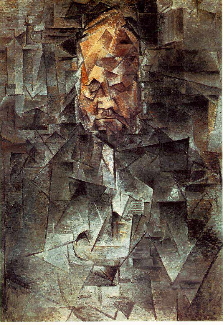
Pablo Picasso
|
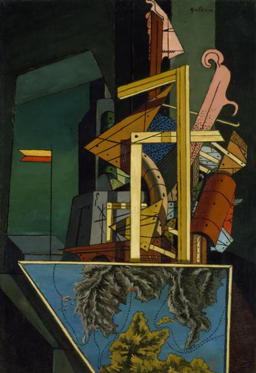
Giorgio De Chirico
|
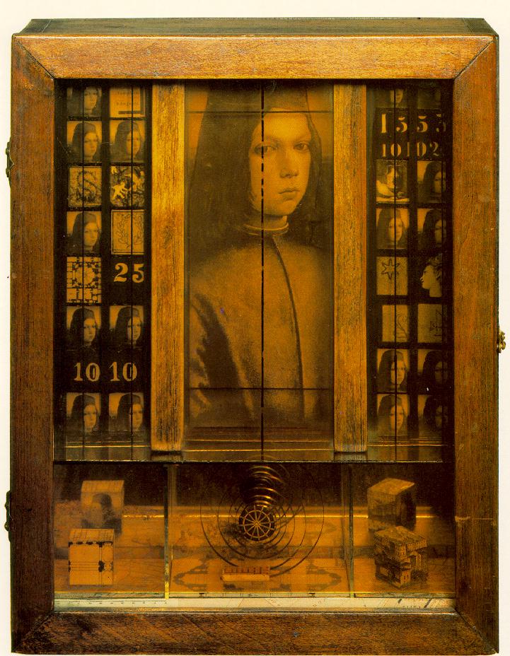
Joseph Cornell
|
Collage of Stezaker, Cornell, Picasso and De Chirico's work:
- In order to understand how Stezaker has been influenced by Cornell, Picasso and De Chirico's work i produced this collage of all their work, looking for similarities between their work.
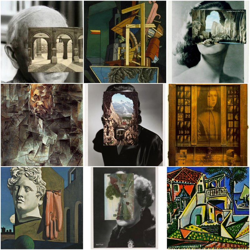
- Picasso, Cornell and Chirico have all had a major influence on the surrealist art movement, and it is clear Stezaker has taken inspiration from all of their work. The geometric shapes and patterns as well as the combining of disparate objects together to create these compositions with this unusual juxtaposition is something which features in all their work.
- Stezaker Takes ordinary portrait and landscape photographs and physically alters them.
- He cuts out square and circular sections of these images leaving a blank white area in its place.
- By doing this Stezaker is altering the way in which we perceive these images, questioning what was once in the place of these blank white spaces.
- Stezaker also takes images that he has found, film photos or postcard photos and places them delicately into position over the other. Through this precise act of layering he creates a whole new meaning to each photograph. By uniting these elements together he's almost showing the viewer a glimpse of the minds of these individuals in the background.
- The photos he layers on top of one another juxtapose in the largest way possible, yet they work so well together. As a result of his experimentation with placing photos over one another he produces mysterious and surreal imagery which cause a stream of thought from the viewer.
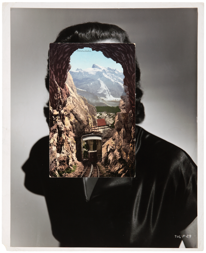
In this image Stezaker has taken a black and white portrait photograph, likely to be a film photograph or a postcard image, however the small annotation on the bottom right hand corner of the photo reading "734-P.29" may mean something to do with a film photo rather than a postcard.
Layered very delicately and specifically over the face and upper chest of the portrait is a colour image of a train driving into a tunnel in a mountain. In the distance a mountain range can be seen towering over the foreground. The top corner of this image says "Pilatusbahn" in very small letters. After researching what this meant i found that the Pilatusbahn is a mountain railway in Switzerland, indicating to me what and where the landscape is layered over the portrait.
The mood of this image is unclear to the viewer, however in my own perception i would say the mood is cheerful and optimistic.
The image makes me feel like i'm looking into the mind of the individual in the composition, and in her mind she is looking out at a bright and picturesque horizon. This imagery gives off connotations of optimism and happiness.
A reoccurring theme in this series of work by Stezaker seems to be a lot of negative space on the photos that are layered over the heads of subjects, this could signify the freedom of the human mind or it is used so that the surrounding details of the photographs get more attention payed to them by the viewer.
The Portrait photograph looks to have been taken in a hard-light, likely to be studio directional lighting as there is a white backdrop behind the individual. The landscape photograph has been taken in a much softer, natural light, creeping in through the open space of the mountain and onto the tracks which are descending into the mountain. Stezaker juxtaposes Black and white with colour effectively, its almost as if he is trying to show that the reality of the subjects surroundings are dull and lifeless, yet within her mind , signified by the photo layered over her head, there is vibrancy and energy. Or perhaps this layering is trying to suggest that she is thinking of this environment?
This technique of layering an image over another is extremely effective in bringing new meaning to photographs, The meaning to the composition is extremely open to perception. This marriage of juxtaposing photographs works very well and makes me think of the idea of opposites attracting. These two are opposites and they attract one another.
If i were to create an image like this one i would use two photograph that are quite similar and see how that compares with Stezakers technique of using juxtaposing images. I would also use the technique in the exact way he did, with opposing images, however i would use two landscapes rather than a portrait image and a landscape image as Stezaker used.
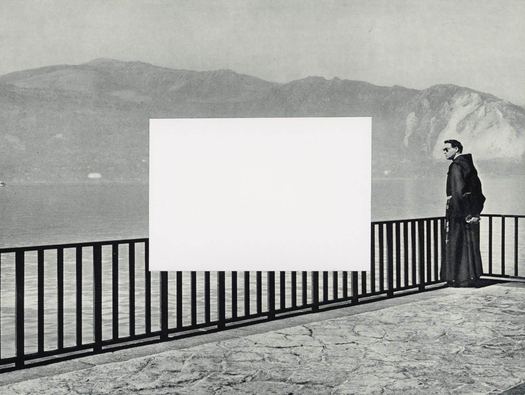
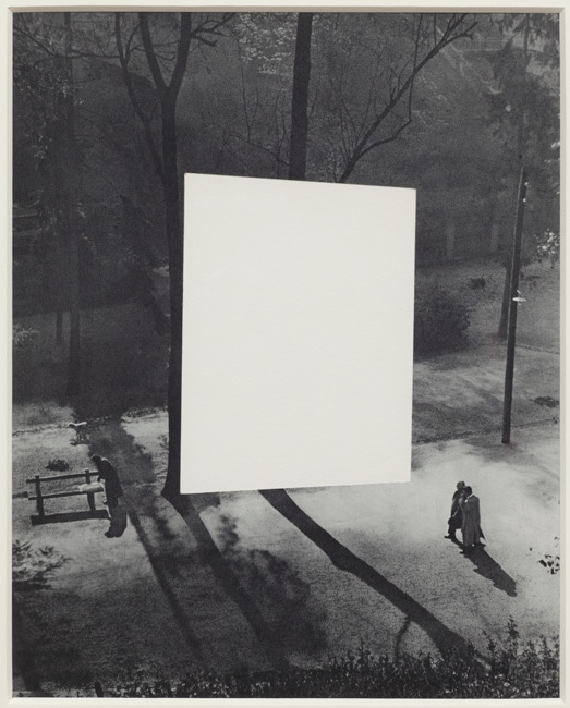
This work is by the artist John Stezaker and is titled “Tabula Rasa 1” and was created 1978-79. The picture is in black and white monochrome and features a large white square which appears to be suspended in the middle of a park and walkway that is quite dimly lit. There is a couple standing quite near to the square and it suggests they are looking at the object and another person standing by a park bench on the other side of the shape. The picture is “surreal” as the large white square is incongruous to its surroundings and the composition of the painting. This artist is well known for his juxtaposition in his composition of his works and his love of the surrealist movement, the painting has a retro 1950’s feel to its style with the oddity of the white square to throw a spanner in the works. The painting almost has a Sci-Fi B.movie quality to it. The artist is renown for using iconic images of retro photography and pop culture. Tabula rasa translated means blank slate and this piece incorporates collage. In my response to John Stezaker I will use his collage technique to juxtapose my exploration in the man made environment with my work in the natural environment. I like the work of this artist and this particular piece as he is a current artist yet produces pieces which look retro which you perceive as being from decades ago. It is more usual to see work from an artist from decades ago that looks contemporary today, that in itself is a juxtaposition.
Artist Research: Anselm Kiefer
- Anselm Kiefer (1945) is a German painter and sculptor.
- Stezaker Studied Fine Art at an art academy in Frieburg, and graduated from studying in 1969. He then studied informally with artist Joseph Beuys on occasions after this time.
- His influences come mainly from German culture including: History, Art history, Literature, Music, Philosophy and Architecture.
- A lot of Kiefers work evokes Fascist imagery, referencing Nazi Germany and life under Nazi rule. In 1969, Kiefer staged a series of self portraits, dressed in Nazi military uniform and posed in front of a series of monuments throughout, Switzerland, France and Italy.
- His work aims to evoke memories and experiences through making reference to history and events in his paintings.
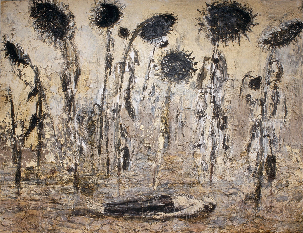
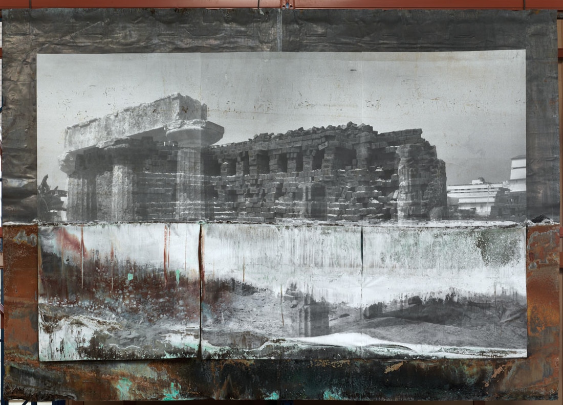
,This work is called Tempelhof it was created between 2010 and 2011 by Anselm Keifer. The painting depicts Tempelhof Airport in Berlin which was built by the Nazis as one of the largest buildings in the world and conceived to be the gateway to Europe and the symbol of Hitlers world capital Germany. The image reveals the airports derelict interior, it has was closed in 2008, although since houses a public park and ice rink.Cold light filters through the tall windows of the building and accentuates the emptiness and decay of the building, the focus of the piece being the perspective and shape of the long, hollow empty building tempered with dilapidation and abandonment. To anyone familiar with Kiefers work the subject matter is eerie and foreboding , but even if you are not aware it is an unwelcome image giving you the feeling of intrepidation.I think it is composed in way this to accentuate the failure of the cultural ideologies of Nazi history which is the recurrent theme in Kiefer work. The artist used oils, acrylics, terracotta and salt on this canvas to obtain the texture in his depiction of ruin.
If I were to create a painting inspired by Kiefer It would reference his concept of evoking experiences and memories. The painting would be in context of an area of environment i have explored in this unit, re-living the experience
If I were to create a painting inspired by Kiefer It would reference his concept of evoking experiences and memories. The painting would be in context of an area of environment i have explored in this unit, re-living the experience
Response to Anselm Kiefer:
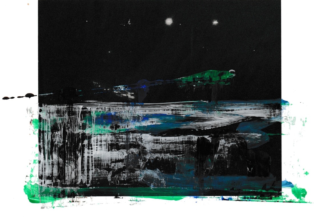
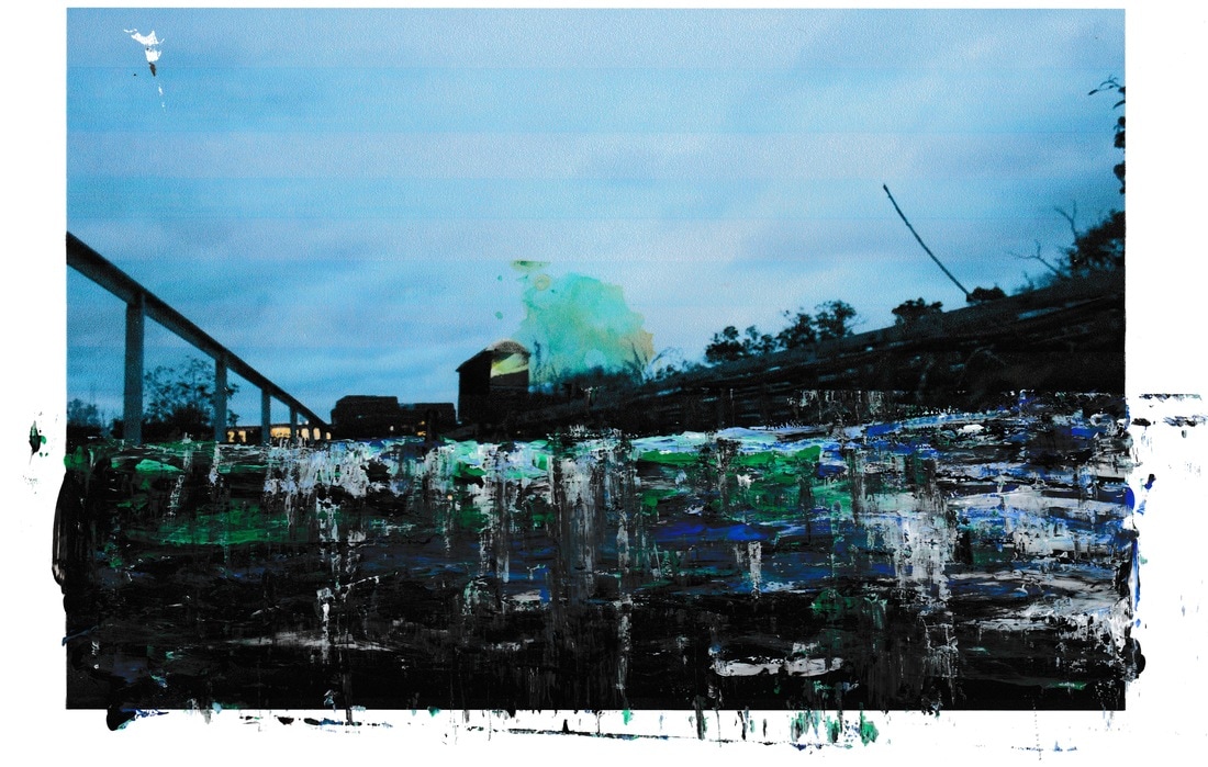
- Using a range of acrylic paints and glue, i created these paintings in response to Kiefer.
- The paintings are of the natural environments i explored earlier on in the unit.
- The idea behind this response to Kiefer is to evoke the memory and experience of this natural environment through painting these pictures.
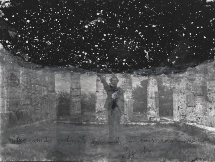
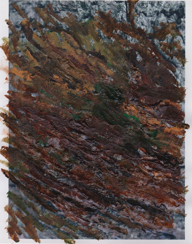
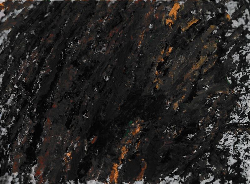
- In response to Anselm Kiefer's paintings of his memories of his childhood environment. I set about painting on transparent film overlaid onto my own photos. Which reminded me of his sunflower field. I used acrylic painted with thicken mediums to get a thick consistency to create the texture in Kiefer's paintings. I was surprised the results were quite successful, as if I could I would possibly use much more or thicker mediums. I applied this to the tree bark photo. Though it was more successful in thickness, I was not so happy with the outcome, it was almost too artificial.
- I then experimented with some of the dragging techniques Kiefer had used on some of his photographic work. It seemed that the photograph had been dragged when coming out of the printer, then paint applied on top. I tried this on my own shots but using ruler to drag the paint across the image. I was found the images to be interesting and emotive but not successful in recreating the Kiefer's technique.
|
|
|
|
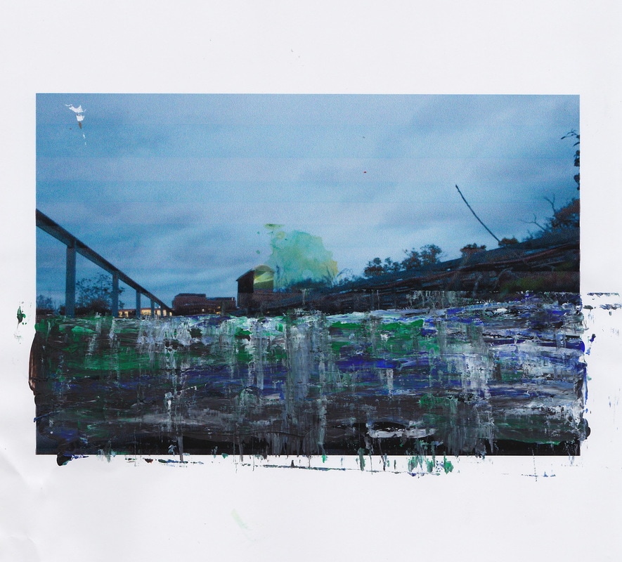
- In my final shoot i wanted to respond to the work of both Anselm Kiefer and John Stezaker. In my previous shoot, i captured the juxtaposition between the man-made environment and the Natural environment by physically observing it in the location of an abandoned warehouse which was slowly rotting away. Nature was taking its course and growing within areas which have decayed.
- Using Stezakers idea of juxtaposing environments through this collage/layered technique, i decided to go and photograph a heavily man-made area and contrast this with my responses to Anselm Kiefer's work in which i applied paint to images to provoke thought and reference experiences, as he did.
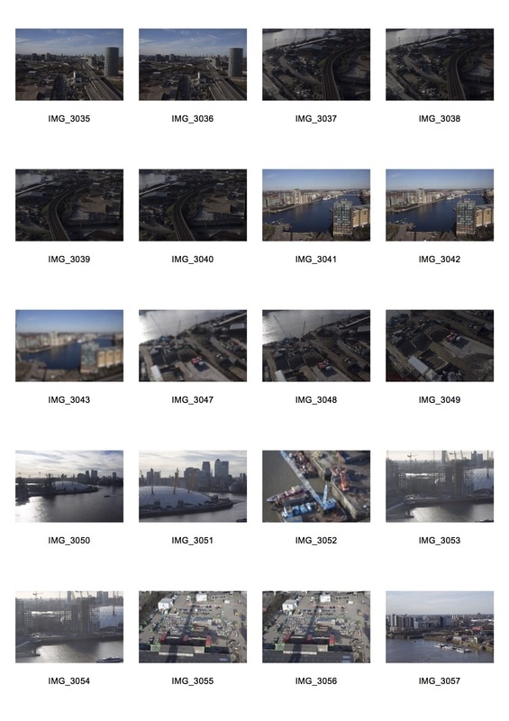
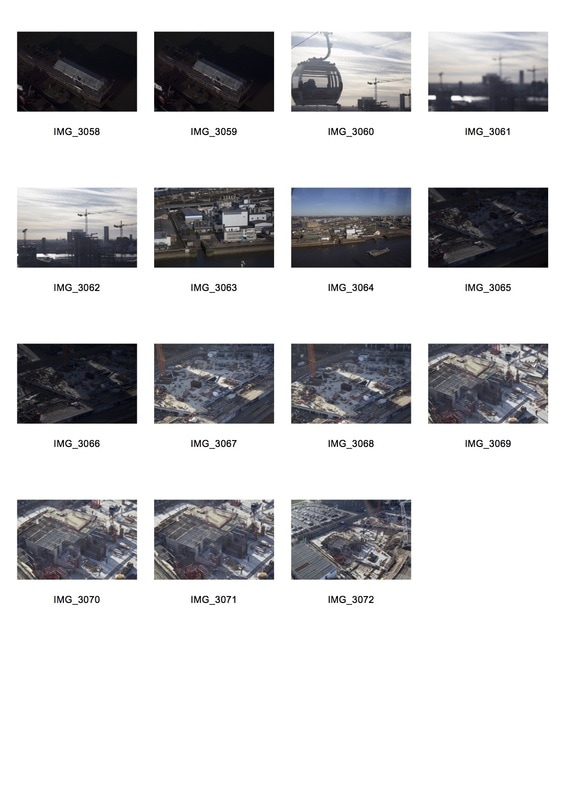
- My chosen location for this shoot was south-east London.
- During my trip i took a journey on the emirate cable cars, allowing me to take aerial photographs looking down upon the industrial jungle beneath me.
- I chose an extremely man made area with little to no signs of natural environment to create an even larger and more powerful juxtaposition when it comes to combining the pieces.
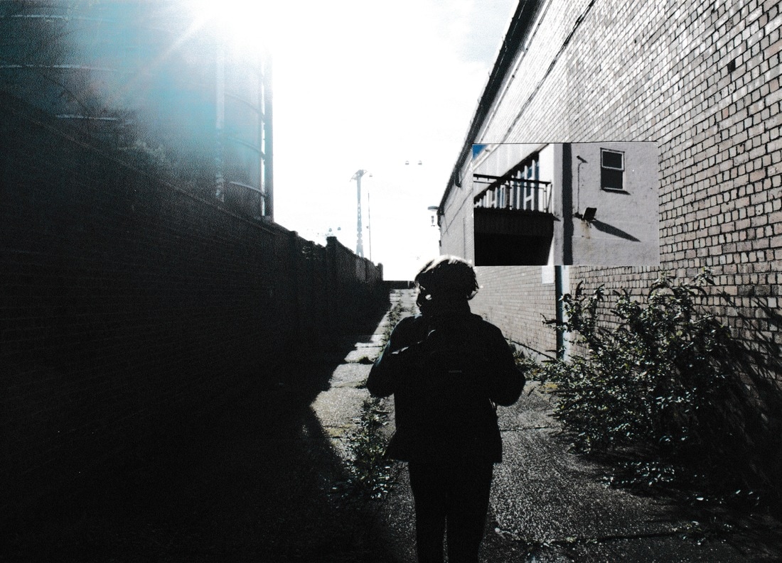
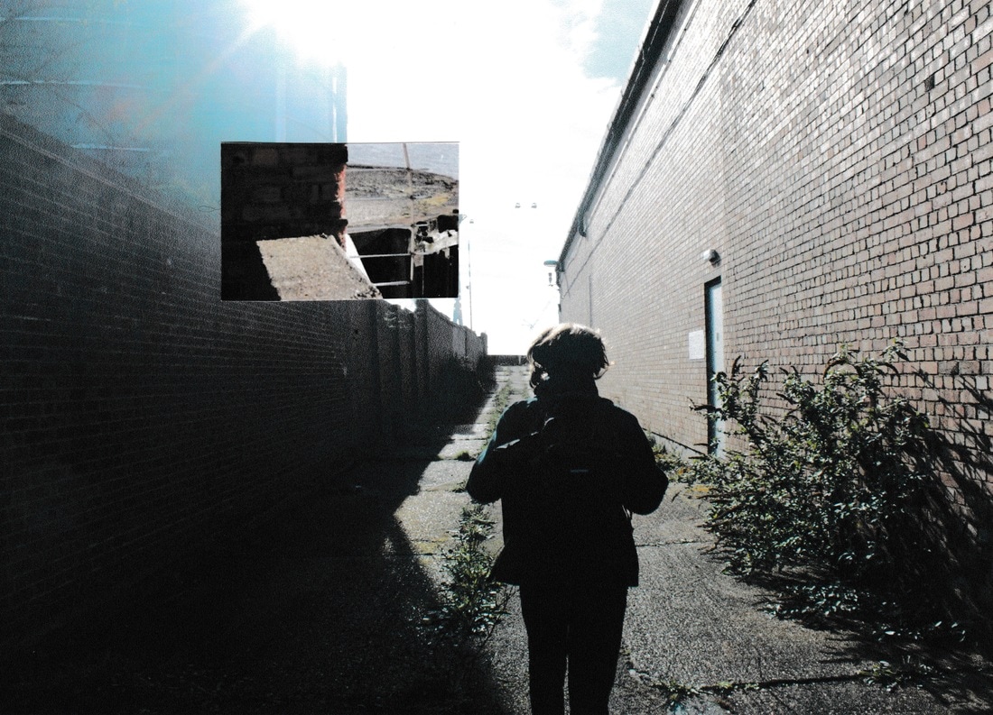
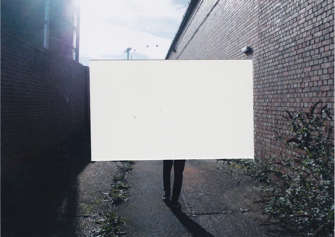
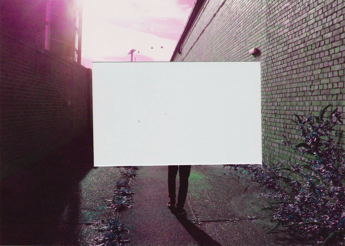
Response to Stezaker:
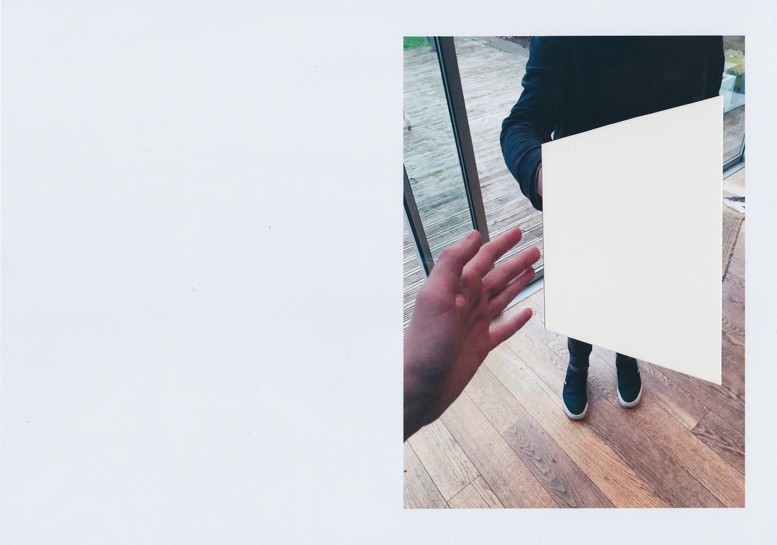
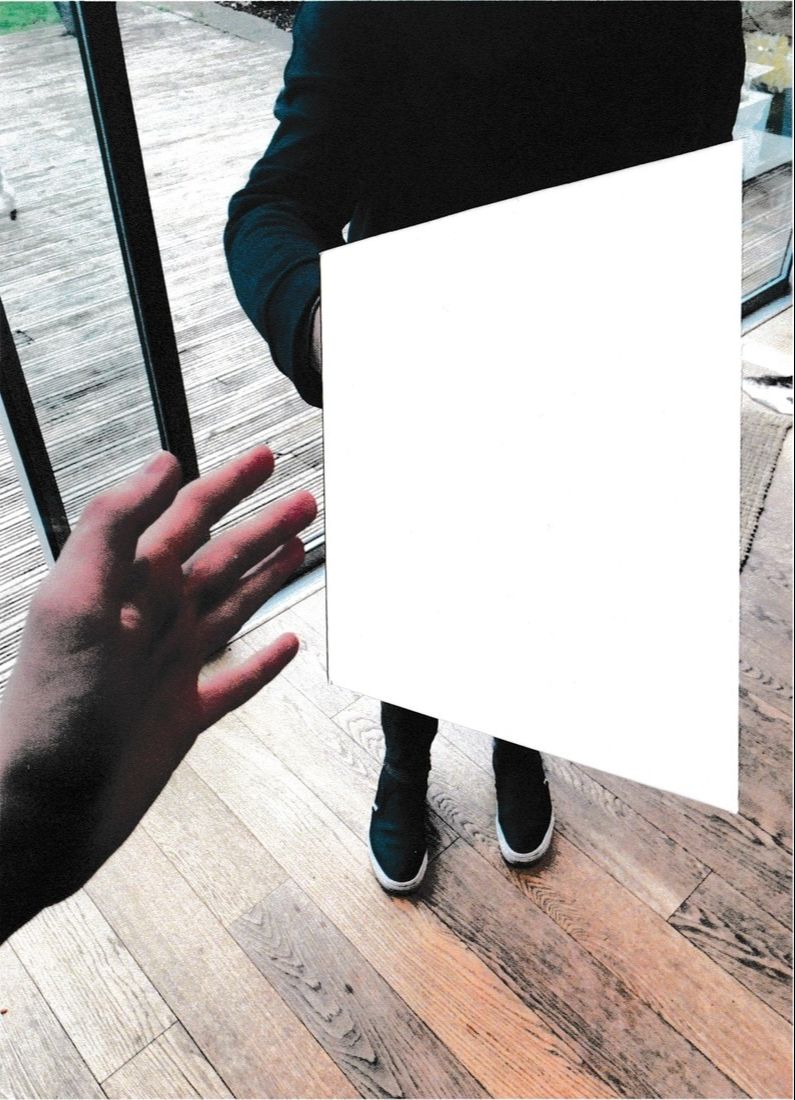
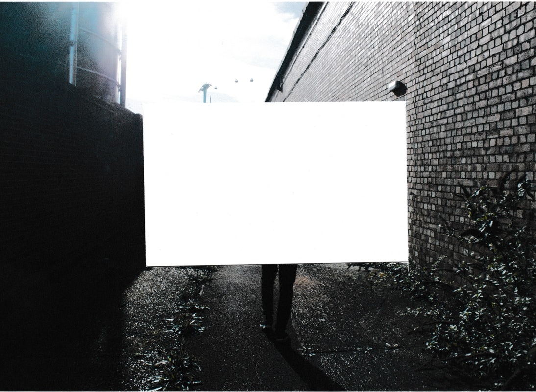
- Having looked at Stezaker, I set about recreating his collaged/cut out work using juxtaposition as a starting point. Using his techniques of cutting, editing and re-positioning differing images together. I wanted to see if taking out parts of my photos would create a different environment because certain parts of the images were not there.
- I did this also for my personal environment shots. I found this evoked the idea of what is missing? What was there? This created much more of a interaction with the viewer rather than the photographer. I hoped it created a much stronger bond of the viewer to the imagery, rather than walking past, they might stop and look further.
- I then wanted to see if I could create the juxtaposition of images collaged and tougher to create a new image. Again to provoke feeling of different relationships within two images placed together to create one. In my case looking at the relationship between differing environments, man made and natural.
- I developed this idea further by combining my shots of man made environments such as the swimming pool, urban buildings and street scenes with natural environments locally to me.
Response to John Stezaker in reference to my personal environment:
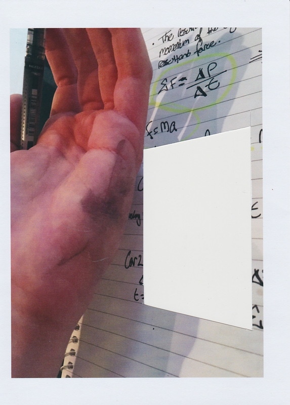
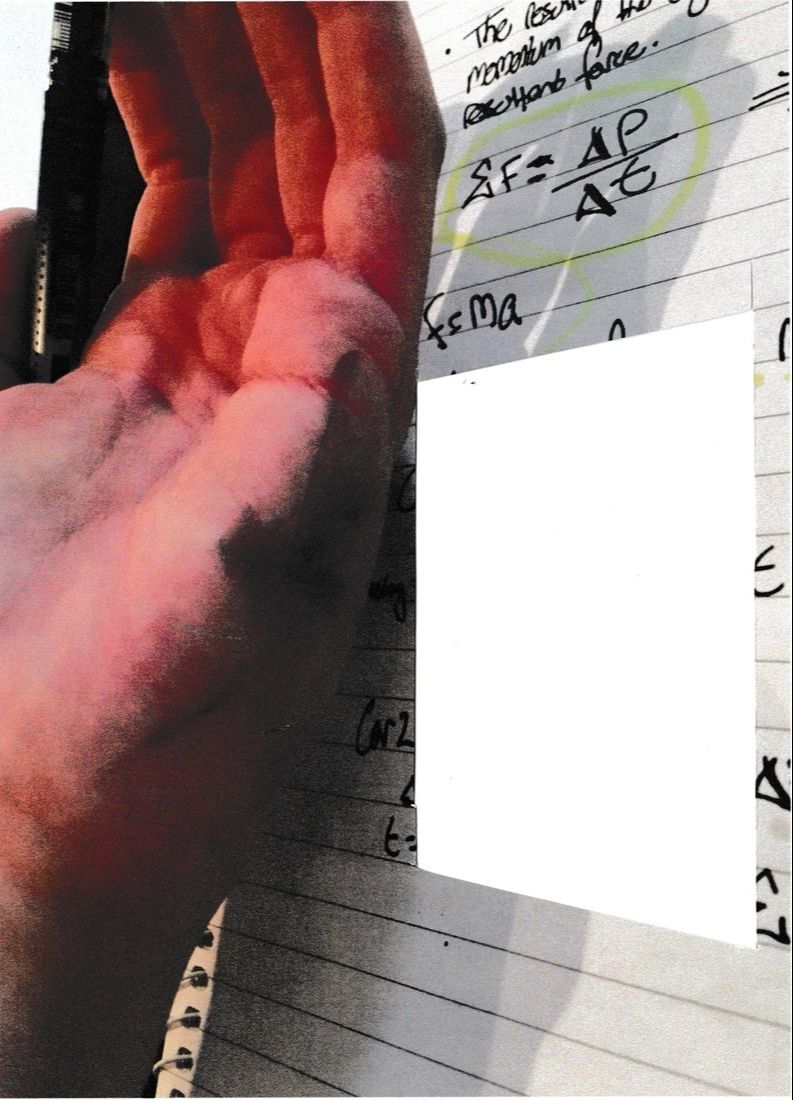
- I painted onto the left handed environment shots to accentuate the main focus of each image to try and draw the viewer into the environment, hoping they would be slightly uncomfortable as the images look slightly awkward.
Juxtaposing the Man-made and natural environment:
After my decision to explore the man made vs the natural environment and researching the likes of anselm kiefer and john stezaker, i have decided to combine both their techniques and processes and my photographs of the man made and natural environment, further developing this idea of man made vs natural environment.
|
|
|
|
Final Piece Development:
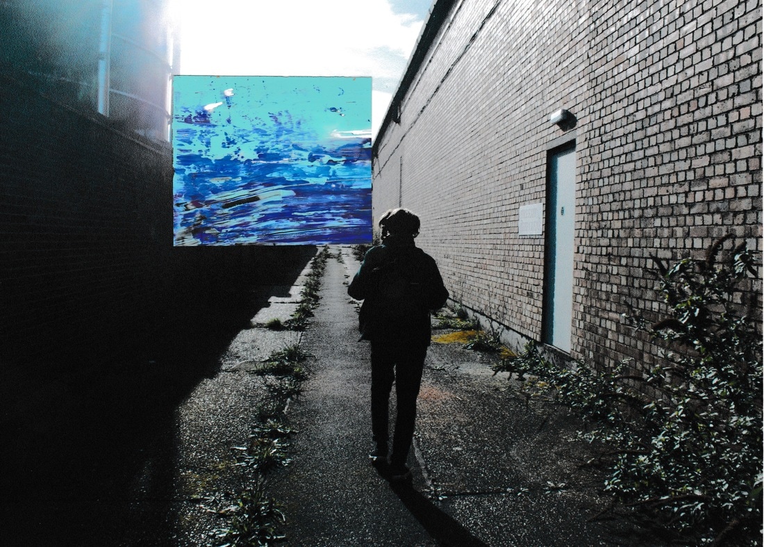
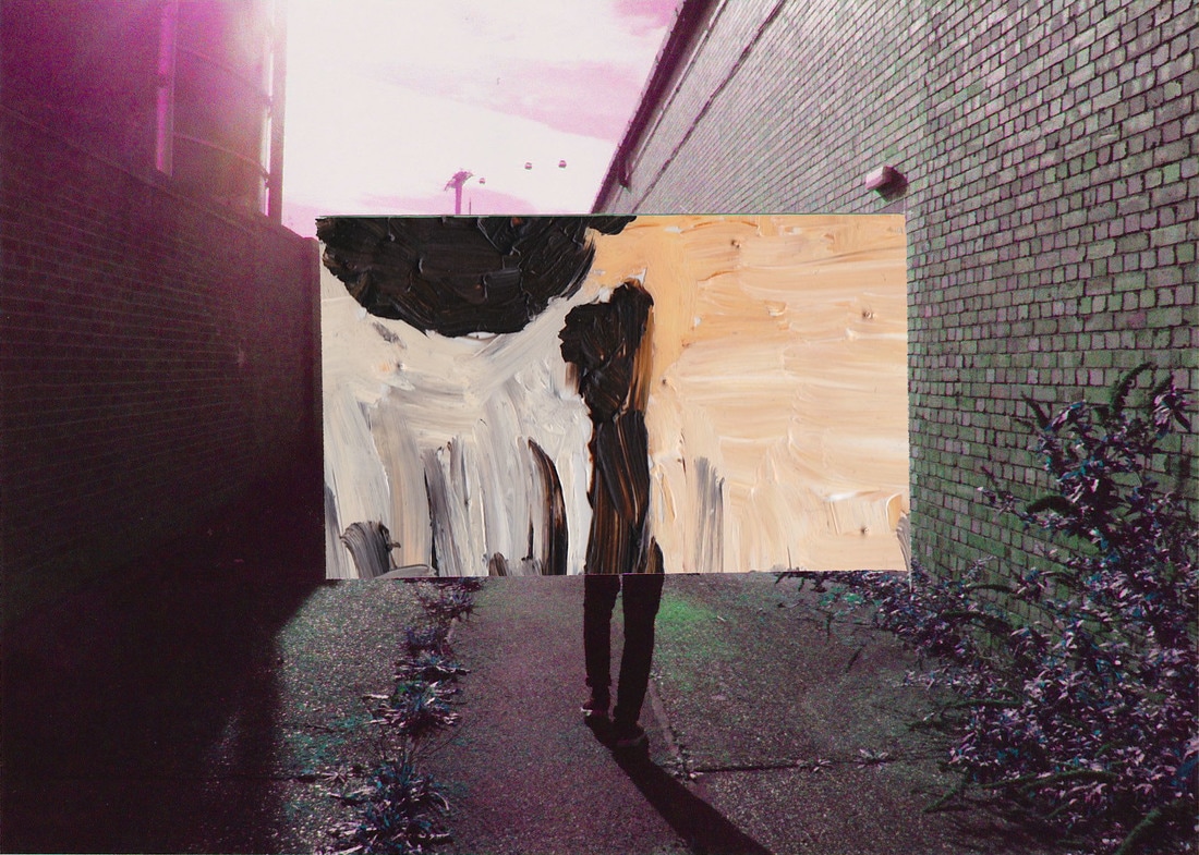
This piece of art work is a juxtaposition between the man-made environment and the natural environment.
Combining the techniques of Anselm Kiefer and John Stezaker to portray the idea
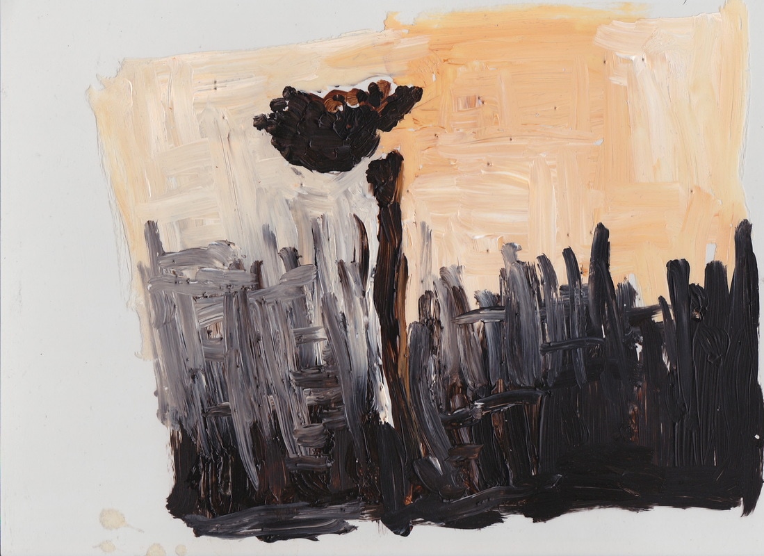
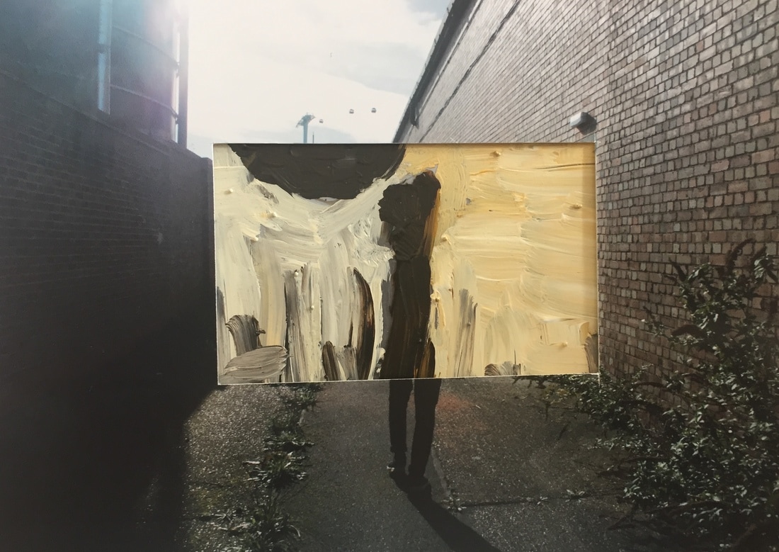
In response to Anselm Kiefer, I have produced two painting of depicting the natural landscape through the use of acrylic paint on acetate sheets. This technique ‘re-lives’ the experience of taking these photographs evoking them memories of being in that location. In response to Stezaker I have cut out square sections of the image, together creating juxtaposition to create compositions that re visit an environment differing memories, almost like they could fit together. The painting of the stick levitating in the air on the end of a spider web almost looks like an abstract impression of the subjects body in the photograph.
Combining the techniques of Anselm Kiefer and John Stezaker to portray the idea
In response to Anselm Kiefer, I have produced two painting of depicting the natural landscape through the use of acrylic paint on acetate sheets. This technique ‘re-lives’ the experience of taking these photographs evoking them memories of being in that location. In response to Stezaker I have cut out square sections of the image, together creating juxtaposition to create compositions that re visit an environment differing memories, almost like they could fit together. The painting of the stick levitating in the air on the end of a spider web almost looks like an abstract impression of the subjects body in the photograph.

|

|

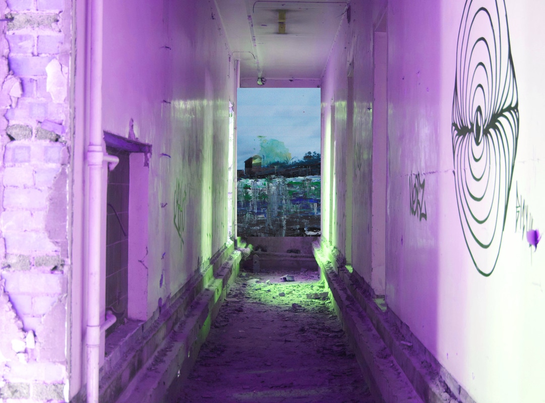


This final piece development was done in order to further link Do Ho Suh's work and ideas to my work as well as Anselm Kiefer's and John Stezaker's.

In my final piece i have used shots from my response to the work of Anselm Kiefer and John Stezaker.
For my streaker response i went out to a very industrial area of London to take photographs of the man-made environment that was there, I then responded in the style of his Tabula Rasa II work, cutting a square section out of a photograph from the shoot creating a collage type piece.
For my Kiefer response i went back to my exploration of the natural environment and recreated images i had taken in the style of Anselm kiefer, using acrylic paid with thicken mediums to achieve similar textures to his work.
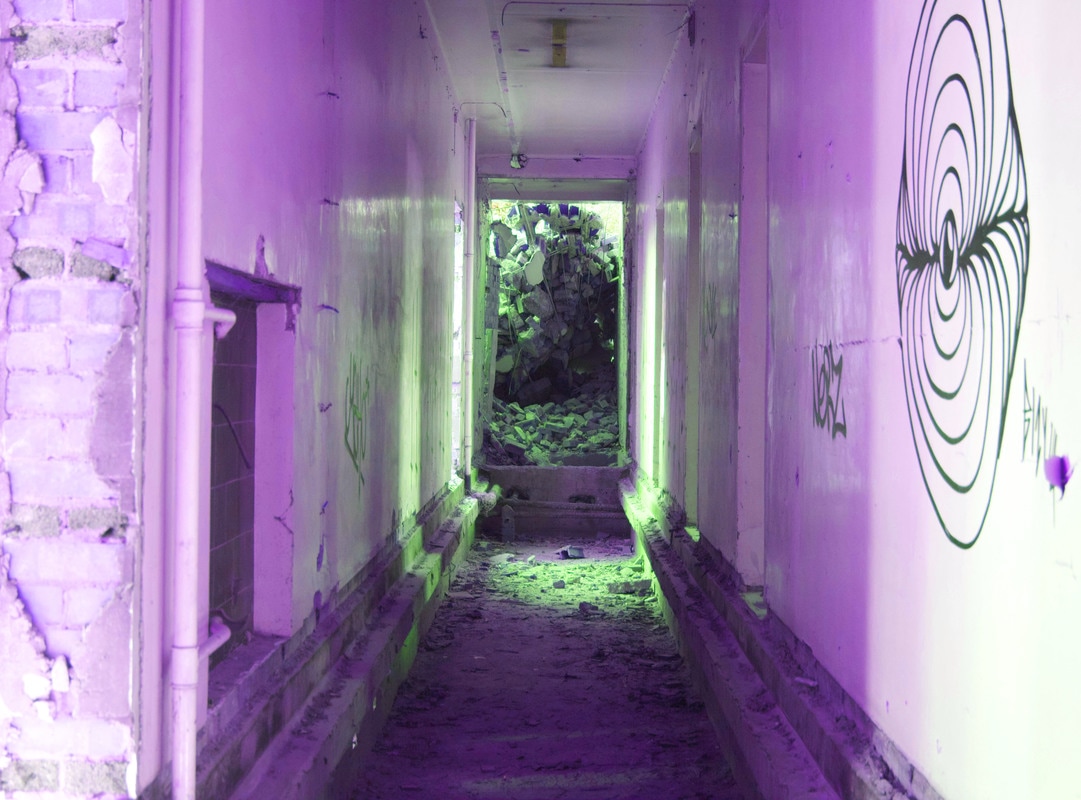
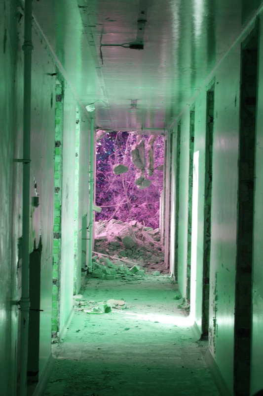
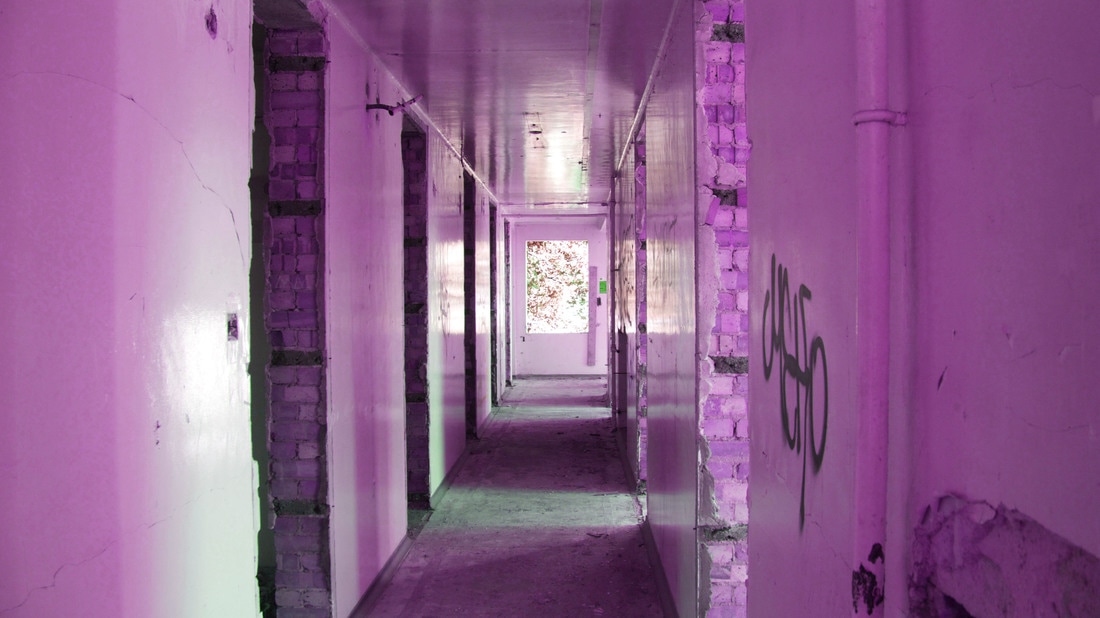
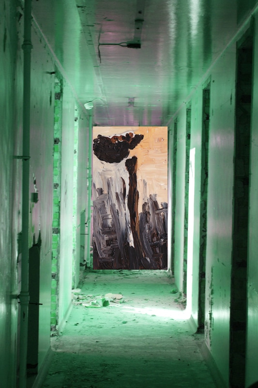
I then began experimenting with producing the image in the style of Do Ho Suh’s exhibition ‘passages’ i wanted to explore his idea of environment and how he has re-created places that are personal to him, places that are often forgotten about by the average person. He re-creates them in an extremely creative way, linking them all together in vibrant colours, this is done to make them stand out and show that they are not forgotten about. I took this idea on in my final piece, adjusting the Hue/Saturation in photoshop so that the image has a pink and orange tint. This final piece is a response to Do Ho Suh, Anselm Kiefer, John Stezaker and the idea of juxtaposing the man-made and natural environment.
My work is not completely like their work however you can visibly see where my influence for the piece has come from.
The piece reflects the idea of re-living experiences and memories, similar to the work of Kiefer and Do Ho Suh, whilst adding an abstract element to it with the collage effect of Stezaker. The Painting i did in response to Keifer almost looks like an extension of the person photographed in my Stezaker response, this adds to the abstract style as the figure can resemble both a twig and a person.
I aimed to evoke the idea of what is missing? What was there? This created much more of a interaction with the viewer rather than the photographer. I hoped it created a much stronger bond of the viewer to the imagery. Rather than simply walking past, they might stop and look further, intrigued by this increased interaction between them and the composition.
For my streaker response i went out to a very industrial area of London to take photographs of the man-made environment that was there, I then responded in the style of his Tabula Rasa II work, cutting a square section out of a photograph from the shoot creating a collage type piece.
For my Kiefer response i went back to my exploration of the natural environment and recreated images i had taken in the style of Anselm kiefer, using acrylic paid with thicken mediums to achieve similar textures to his work.
I then began experimenting with producing the image in the style of Do Ho Suh’s exhibition ‘passages’ i wanted to explore his idea of environment and how he has re-created places that are personal to him, places that are often forgotten about by the average person. He re-creates them in an extremely creative way, linking them all together in vibrant colours, this is done to make them stand out and show that they are not forgotten about. I took this idea on in my final piece, adjusting the Hue/Saturation in photoshop so that the image has a pink and orange tint. This final piece is a response to Do Ho Suh, Anselm Kiefer, John Stezaker and the idea of juxtaposing the man-made and natural environment.
My work is not completely like their work however you can visibly see where my influence for the piece has come from.
The piece reflects the idea of re-living experiences and memories, similar to the work of Kiefer and Do Ho Suh, whilst adding an abstract element to it with the collage effect of Stezaker. The Painting i did in response to Keifer almost looks like an extension of the person photographed in my Stezaker response, this adds to the abstract style as the figure can resemble both a twig and a person.
I aimed to evoke the idea of what is missing? What was there? This created much more of a interaction with the viewer rather than the photographer. I hoped it created a much stronger bond of the viewer to the imagery. Rather than simply walking past, they might stop and look further, intrigued by this increased interaction between them and the composition.
The final Pieces: