Unit 2:
The exam unit :
The idea of relationships:
Relationships as a concept can be perceived in a number of ways: A relationship can be seen as two objects or beings existing in sync with one another, to an extent one cant exist without the other. this can be applied to many different contexts which i will discuss below.
A relationship doesn't have to be two object, it can be anything that connects/links/associate with something else in some way. This can be shown through photography i countless ways using different techniques involving the formal elements and the photographers knowledge of the camera. Even the photographer and the camera is a relationship and without one neither can exist.
|
|
Daniel Mercadante : Daniel co-founded a team of film-makers that produced which can be seen on Vimeo.
The team no longer produce videos together however Daniel himself produces videos which can be seen on his personal Vimeo account which he operates with his wife Katina. The video 'Symmetry' won the grand prize at the 2012 Vimeo awards. and has been extremely useful to me in aiding me to brainstorm ideas for the Exam unit! The video shows a representation of the many different relationships that exist both in nature and the man made world. I particularly like how the film maker has demonstrated so many different relationships that would often go un-noticed by most such as: The relationship of the brush and the paint, the relationship between the ketchup and a chip, the police officer and the criminal. All of which are relationships but so many of these are subconscious links in the human mind. Without many of these relationships existing in sync with one another, they would simply not exist. This idea is truly mind blowing and you don't realise it till you really engage in thought about the relationships featured. For example a police officer and a criminal, without crime police wouldn't serve a function to the public. Without life there is no death, without animals theres no meat for humans to eat, without inspiration there would be little to no influence. these are just some of the ideas portrayed, there are many other relationships which are controversial and presented in this video such as medication and religion, many who are religious don't believe in artificial drug treatments and many who have faith in science don't believe in religion and instead believe in prescription drugs to aid health. I found the video inspirational and very powerful at times, the part when Daniel is representing life and death through two shots playing together. One is showing a new born baby crying in the hospital, whilst in a different hospital room, an elderly man lying in a hospital bed in the face of death. Relationships like this really have impact on the viewer of the video and although the shots shown featured are all still shots, the video is extremely creative and opens your mind to a number of different relationships existing in the world. |


Altering the context:
Inspirations:
|
|
-Guy Catling :
|


Guy Catling is an english based graphic designer. Catling has produces work individual to him, the iconic images are edited by himself by adding colourful patterns to the black and white prints, altering the context and 'mood' of the images by doing so. In my opinion Catling selects the most significant parts of the images to colourise, choosing brightly coloured floral patterns or just a simple colour. By colouring the images, he is creating a contrast of colour and black and white within the composition.
All the photos he chooses are sharp and clear, he then uses photoshop to edit them in this fashion. The edit he produces by photoshopping patterns into the images are very dominant due to the contrast of colour, he does this by using the magic wand tool in the programme to select a certain part of the photograph, he then uses the 'edit-past special-paste into' function to paste in the pattern/colour and makes final adjustments using the other tools available on photoshop (spot healing brush,paintbrush,perspective warp and others).
All the photos he chooses are sharp and clear, he then uses photoshop to edit them in this fashion. The edit he produces by photoshopping patterns into the images are very dominant due to the contrast of colour, he does this by using the magic wand tool in the programme to select a certain part of the photograph, he then uses the 'edit-past special-paste into' function to paste in the pattern/colour and makes final adjustments using the other tools available on photoshop (spot healing brush,paintbrush,perspective warp and others).
|
-Hayley Warnham : 'Everything is beautiful' series.
|
|


Hayley Warnham is a London-based illustrator. Newly graduating from the royal college of art, she has produced works for the likes of penguin books, the Tate and many more including numerous magazines.
I found her sequence of work titled "EVERYTHING IS BEAUTIFUL" the most useful for this section on developing the idea of altering the context of an image. In this series, Hayley uses old photographs taken using 35mm film cameras, and edits them in photoshop by colouring a select part of an image to add a new dimension/layer, essentially collaging. By doing so she alters the context of each image and brings contrast to the photograph due to the fact that the photos were not taken in colour but she has added colour to them by editing them in this way.
By carrying out this process, she is essentially turning old photos into new ones, challenging the relationship between the old photo and the newly produced one, creating a new perspective in which the image can be observed.
|
|
-Amir Ali Ghassemi 'party' series:
|


Amir Ali Ghassemi is an iranian born artist/designer. studying graphic design at Azad university in Tehran,Iran, he is the founder of a project space named 'Parkingallery'. The space is a collective of art and graphic design studio.
The series 'Party' which Ghassemi produced in 2005, distorts the context of ordinary snapshots by editing the exposed parts of the human body so that they are bright white in colour, It is for his original ideas and thinking that i am inspired by Amir's work.
By Amir 'censoring' his images, he is protecting the identity of individuals photographed at these dis-approved private parties.
The work refers to the censorship of media in Iran, and the strict traditional regulations and rules. He adds a sense of mystery and imagination to the photos as you don't know what the people being edited out look like or their facial expressions. The majority of photos clearly show whats going on to an extent, but there are some which are rather unusual in this aspect, distorting reality.
My own work using the idea of altering the context:
Thinking carefully about my choice of colour or pattern. i linked the images into historical context whilst being altered creating a juxtaposition between past and present as well as modernising the images. as well as this i used new images
Thinking carefully about my choice of colour or pattern. i linked the images into historical context whilst being altered creating a juxtaposition between past and present as well as modernising the images. as well as this i used new images
The original photos + the process:


To place an image into a select part of another (screenshots show the process for each):
-Copy the image you want to paste into another image
-Open photoshop and open the other image you want to use.
-Use the magic wand tool to select the area you want to paste your second image into.
-Press edit - paste special - paste into.
-Then press edit - free transform. This sizes the image you want to its desired size within your selected area.
- Use either the sport healing brush or the Eye dropper and paint brush tools to blend and smooth the paste you have made.
Relationships ideas:
All the things listed below are relationships that occur in the world around us.
Start and Finish
The Ball and Glove
Peanut butter and Jelly
Paint and a Brush
Basket and a Ball
Lock and Key
Clothes and Washing machine
Weights and Muscle
Cookies and Milk
Coke and Pesi
Ketchup and Chips
Salt and Pepper
Brother and Sister
Police and the Criminal
Meat and animal
Twins
Man and Women
Toilet and Gender
Glass and Liquid
Light and Sun
Day and Night
Old and Young
Man and his Dog
Rain and Cloud
Doctor and Drug
Time and the Clock
Heart and Brain
Love and Hate
Happiness and Sadness
Life and Death
Objects:
This section challenges the relationship between different objects when they are combined, showing a unique way to present these objects as well as demonstrating balance between them.
Inspirations and related video:


Peter Fischli and David Weiss (Fischli/Weiss): Fischli and Weiss are an artists, they were working together to produce art work since 1979 up until the death of David Weiss in april 2012. They are famous for their unique visuals combining individual objects and balancing them in a surreal fashion, they are essentially applying the laws of physics through doing this and creating art through this.
The best known work produced by the pair is a 30 minute art film they named 'The way things go'. Fischli and Weiss use random objects and rearrange the relationships between them. The artists don't show these everyday objects in a 'good light' or a 'bad light', but instead created a sequence in which the objects are re-structured from their original uses in our everyday lives.
The best known work produced by the pair is a 30 minute art film they named 'The way things go'. Fischli and Weiss use random objects and rearrange the relationships between them. The artists don't show these everyday objects in a 'good light' or a 'bad light', but instead created a sequence in which the objects are re-structured from their original uses in our everyday lives.


Laura Letinsky- Laura is a contemporary artist born in Canada. Currently a professor of visual arts at the university of Chicago.
she has been developing her work since the late 1990s through her excellent still life photographs influenced by Renaissance painting. Letinsky uses a large format camera in a controlled studio environment, her work mimics the aftermath of a meal, with stained tablecloths, spilled wine and misshapen fruit allude to frustrated desire and desolation. Letinsky has a minimalist, yet complex style of her work and the true mood/feeling of the photographs which Letinsky is aiming to portray is sometimes hard to properly understand, in my opinion her work is quite open to individual perception
In these images, Letinsky has started combining paper cut outs from lifestyle magazines and art reproductions with real objects. These are then combined with her confusing compositions. objects in the photos are shown to be on the edge of surfaces or balance on other objects. Through these photographs she is representing the relationship between these objects when used in a single composition


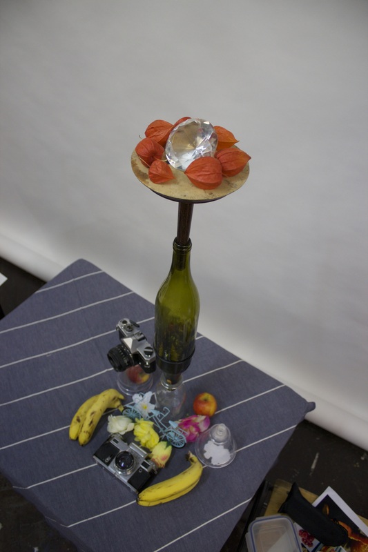


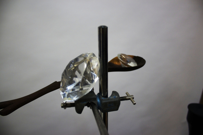
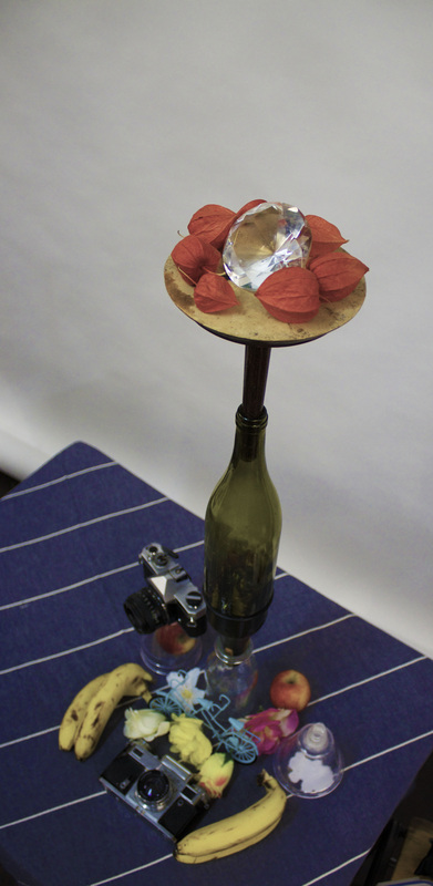
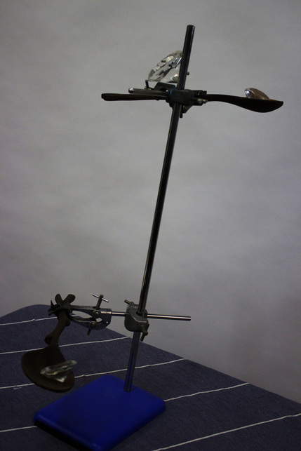
Using a combination of objects including: fruits,flowers diamonds, ornaments and a clamp stand, i produced these images. Inspired by Fischli & Weiss as well as Laura Letinsky's work, combining elements from both composers to produce my own take on the ideas involving methods they use in controlled environments like this one.
Memories and childhood:
Inspiration:
Jan Von Holleben:
Jan Von Holleben:
Through portraying childhood memories, the relationship between past and present can be explored and combined into one composition.
My most significant and happy childhood memories consist of:
skateboarding,Birthday parties, Christmas, easter, Lego, cycling, football, drawing, video games and going on holiday.
My aim was to try and portray one of these activities in form of a stop motion video
I decided the best way to show this would be through stop motion photography as it creates a sequence which can represent a childhood activity or a positive memory.
In order to create this stop motion sequence i had to think of an idea which could be made into this type of photography. A string of ideas came to mind immediately, and i made the decision to base this one on skateboarding. Heres how i did it:
-Use of the floor as the background.
-use of ladder as high point to achieve these perspective shots.
-A photo is taken every time the subject moves or something in the shot changes.
- the photos were then added to premiere pro and edited by putting one photo after the other and shortening the time each photograph is shown for, forming a video.


The outcome is shown in the above video.
My next idea was to take a photo of my younger brother and photoshop him into an object, objects that possess value to him as they relate to his childhood. I chose to use toys of his when he was younger, i wanted to make the object be of the same or similar size to him so its like they came to life, bringing contrast to the images i made.
I took photos of my younger brother standing and lying down and printed them out. From there i used a lego man and placed it over the printed image of my younger brother in such a way that it looks like they are interacting. I then took the photo and uploaded it.
Everyday objects
Inspirations: Richard Wentworth, Barry Lewis + David Zilber:
Everyday objects:
Richard Wentworth's work centres on the idea of transformation, of subtly altering and juxtaposing everyday objects which, in turn, fundamentally changes the way we perceive the world around us. He and Barry Lewis also observe how this occurs in the everyday life.
Dvid Zilber essentially compares everyday objects and scenes with other everyday objects or scenes, he does this by showing two image side by side or he simply takes a minimalist photo of a single object.
These three photographers challenge the current relationship existing between us and everyday objects, combining and presenting them in a way that is unexpected and creative, its for these reasons that i have chosen to analyse their work.
David Zilber:


A native of Toronto, Canada, David Zilber is a professional chef and butcher as well as a photographer. Born in 1985, he has produced photographic works for the past 5 years, as well as "cooking, painting, writing and industrial design". Shooting only in 35mm film, his work has been widely recognised by many different figures and has been featured by a well known arts,culture and media website(vice). He also has two other blogs alongside his actual website called 'EUONIA' and 'RECIDIVISM', Recidivism is his photography blog. Photography, however is not his primary job, as he currently works as a chef in Denmark. I Personally believe he is a very talented photographer, i really like the work he uploads on Recidivism and the way he intelligently puts together these visual works with a minimalistic, clean and artistic style to every photograph. He portrays relationships between certain parts of a photo in an implicit way, putting two photos side by side, enabling the viewer to draw their own relationship within the photos.
All of Zilber's photos are shot using colour film
All of Zilber's photos are shot using colour film
|
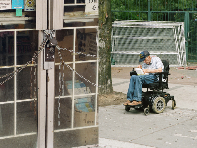
I found this image very powerful. Not only is it a photograph of an object, but he has used another photo to connect the meanings of both into one. By doing so he had made a relationship with the photos and their contents.
The idea i get behind these two photos is he is trying to demonstrate the concept of being trapped. By showing a locked door shackled in chains next to the photo of an elderly man in a wheelchair he is showing this as both the door and the person are 'held back'. Although, through this he could also be showing that although both are limited in some respects, it is not always a problem. The lock has a key which can unchain the door and the person can overcome the fact that he is in a wheelchair so its not a barrier to stop him doing things he wants to do. Both are obstacles to an extent, but can be solved and this is the relationship the photographer has demonstrated. |
Richard Wentworth:
Richard Wentworth is a british artist working and living in London.
He is most famously known for this image shown on the left.
Richard has changed what people normally perceive as art by turning random everyday objects into sculptures and works of art, altering art as we know it.
Using film instead of a digital camera Wentworth's composition style is minimal yet effective. All his photos have a focus point being a random object and using natural light to illuminate the composition, this is also used well and it clearly shows all he wants to be shown in the image. He doesn't seem to use shadows in his work form what i have seen aside from a small few images. All images are in focus and shot using colour film, this is also effective as there are contrasting colours in each photograph each setting a mood to them. His photos have two particular environments: Either in the streets or using a studio controlled environment with white walls. I am thoroughly inspired by his minimalist works, he never fails to make simple objects in a given landscape to look artistic and interesting and for this i have great respect for his work. All his compositions follow the elements of composition (perspective,focus, lines, shapes, textures, contrast and colour).


Barry Lewis:
Barry lewis and his 'Things' and 'visual noise' collection of photographs are also really interesting. He has contrast in this series by alternating between wide angle landscape photos and focused, close ups of objects such as the one shown on the right. all his photos are well composed and use natural lighting in the series, each and every one following the elements of composition (texture, shape, lighting, perspective, lines, contrast and colour). the majority of his photos can be seen on his website as i am unable to upload any directly to my weebly due to the fact that his images cant be saved off his website.
Barry lewis and his 'Things' and 'visual noise' collection of photographs are also really interesting. He has contrast in this series by alternating between wide angle landscape photos and focused, close ups of objects such as the one shown on the right. all his photos are well composed and use natural lighting in the series, each and every one following the elements of composition (texture, shape, lighting, perspective, lines, contrast and colour). the majority of his photos can be seen on his website as i am unable to upload any directly to my weebly due to the fact that his images cant be saved off his website.
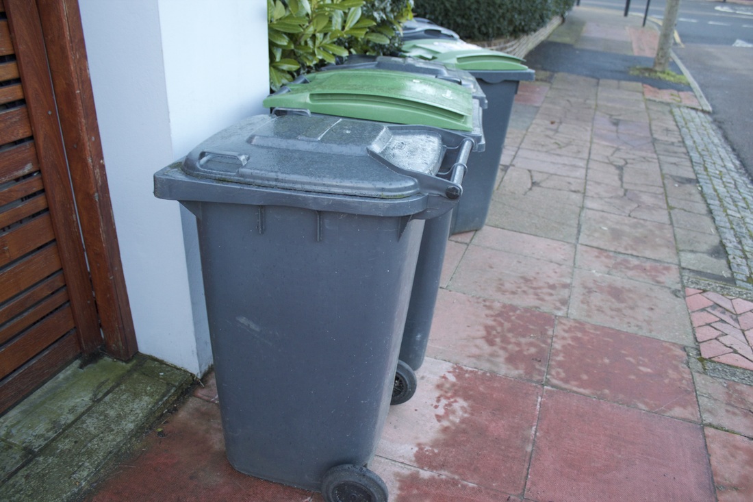
Everyday Objects/Scenery:
These are just a few things often seen by myself on a weekly basis: (Public Transport,Street bins, Woodland and broken objects)
These are just a few things often seen by myself on a weekly basis: (Public Transport,Street bins, Woodland and broken objects)


Film Noir:
Film Noir contact sheet.


|
|
The following series of images is shot in the style of film noir, using directional, concentrated and focused light to achieve the low lighted, contrasting photographs they produced during this era of cinematography.
Film Noir essentially means black film, it was used in cinematography in the USA during the 1940s to the 50s. It has a strong resemblance and is inspired by german expressionism which was at its height in 1920s Germany. Black often connotes death and death is often a key theme in film noir, black and white often highlights this idea. Chiaroscuro is the word used to describe the style of film noir lighting, and it is used to set the mood of the scenes often evoking negative and dramatic times. The most common themes of Noir style film include: Contrast, low directional lighting, geometry, directional camera angles, silhouettes and shadows. The style of photography reflects the post war world, by achieving a paranoid, tense, dark, gloomy, mysterious, dangerous and dramatic scene. The majority of the shots show empty and odd looking locations,often empty roads of the city. fog plays a big part in conveying this style to add to the directional lighting, achieving a mysterious effect when used in black and white film. I decided to explore this type of photography and create my own versions. The film noir style explores the contrast of light and dark as well as the mood of images when taken in this style. it is not always clear what the mood of these images are, making them mysterious and intriguing. |


My Film Noir style photos:
Using a single light source in a blacked out area of my school, i created studio conditions and achieved this noir style. I took the photos using a canon EOS series DSLR, edited them using photoshop cc by un-saturating them.


3 Strands:
So after researching into what direction i wanted to go into in terms of my final piece i have come to a conclusion, three strands in which i am going to progress my work into in order to respond to the theme. In doing so i am going to build on the skills and processes i've learnt through all the units.
Life and death Photo shoot:
This shoot is intended to explore the relationship between life and death in both a natural and man-made way, the too in this case are existing in sync with one another.
The images below show a neglected graveyard in north London. The unmaintained site has now been taken over by nature and the majority of gravestones are barely visible due to them being so overrun by nature, covered by ivy or other pants. The images show the worlds natural life cycle: When there is life there is also death and the two are arguably in sync with one another, at this spot in particular, and there is a relationship between life and death in many different contexts including this one.


The edits


Initials shoot: "The relationship between the artist and the instrument"
Whilst on one of my saturday urban exploring trips to an abandoned building, i was lucky enough to meet some street artists whilst they were having a painting session within the derelict structure. I approached them and mentioned how i am a photographer, i asked if they would mind if i just watched them get on with there pieces as i photographed the process, they were all really friendly and were happy to do so.
Using both my Canon 600d and newly obtained Nikon 601 35mm, i documented most of the day using my Nikon 601 so the film photographs are to follow on from the digital ones below.
The website of one of the artists i met is shown below:


|
After making this short video documenting my encounter with these street artists, i saw a video online similar to mine shot with a graffiti writer known as "lemon". From analysing it i found that the shots taken in the video were well planned and edited in a way to make the video both interesting a gripping without the duration/speed being increased like my video. If i had another chance to create video like the one i've made i would ensure the shots were better and i'd use a wider range of angles and perspectives to achieve better visuals. Unlike the video shown below, my video was simply an encounter with these graffiti artists not an arranged meeting. The other video had planned shots judging from the quality of the filming in comparison to mine where i had to quickly decide what shots i should take in order to make the video, so its not as effective as a result. However i have learnt from the experience, and i know that if the same opportunity arises in the future ill have a pre-planned story boarded video to ensure good visuals.
Shots i particularly liked in the other video: -Quick,snappy shots of the hand movements whilst painting -Tense mood set by the quick shots and fast moving video. -The video still showed the care taken by the artist although the piece was rushed as it was done on the street. -close ups and long shots from a range of angles and heights. -Focus was used well. |
UNIT 2 ARTIST SHOOT from George Bennett on Vimeo. |
I then developed my roll of film i had shot whilst at this location and enlarged the images:
I was happy with the outcome of these images considering i had only developed my own images a handful of times, they could have had a cleaner and sharper outcome if i had allowed the rolls of film to soak in water for longer to wash off any leftover chemicals from the process. It is visible from the images that there is residue causing there to be odd looking patches on the image. i have chosen to upload a select few of these images as i feel they are the best out of this series.
I was happy with the outcome of these images considering i had only developed my own images a handful of times, they could have had a cleaner and sharper outcome if i had allowed the rolls of film to soak in water for longer to wash off any leftover chemicals from the process. It is visible from the images that there is residue causing there to be odd looking patches on the image. i have chosen to upload a select few of these images as i feel they are the best out of this series.
Man-made and Natural relationships in different environments:
This section will explore the man-mad and natural relationships that exist in the world today..
Many relationships that exist in the world we live in today are a product of human creation.
For example, lets take the relationship between man and dog. The human in this situation has taken in this animal, fed them, walked them and taken care of them, carrying out the essential processes for the dogs existence to continue. In exchange the dog provides its unconditional love. Dogs are known to show this through small gestures indicating their liking of you, they often follow you around or go crazy with happiness when you come home from a day of being out, behaving as if they hadn't seen you for over a year. there have even been cases publicised on the internet in which dogs don't leave their owners gravestone after they have died, like they are waiting for their owner to one day return to them. Its quite odd to think that if humans hadn't domesticated these animals, these relationships between them and their pets would never have existed. Archeologists have suggested that there is evidence arguing that canines have been used as pets for roughly 15-30 thousand years, however this doesn't mean that this relationship is natural..
Now this is just an example but there are many other examples which i could possibly discuss it would be more effective to portray such relationships through Photography.
Natural relationships covers any relationships that exist in nature, unaffected by human civilisations on the planet for example: ivy on trees, plants in soil, animals and their young, birds and trees, day and night, rain and clouds, light and sun, life and death.
Ways in which i can present this:
-Two photos side by side portraying a relationship between the two photos (eg: one photo of a cloud, one photo of rain falling).
-Two photos side by side, one showing a natural relationship, one showing a man-made relationship similar to that of the natural one).
-Two photos side by side, one showing a natural relationship formed through the presence of a man made one also being there.(eg: Grass growing out of the cracks between the pavement). The other photo is a complete contrast eg nature destroyed by man made presence: (eg: city centre with no natural life present or a city skyline purely showing man made structures).
I believe two photos being shown side by side in this situation is the best way to help the viewer make a link and draw a relationship between elements in each photograph, it opens the mind to contrast more and the viewer is more likely to make mental comparisons between images.
i have also considered altering them to give them a more surreal appearance i have been inspired by visual art
If i were to install this work:
i would have a sequence of images,
Inspirations:
I have quite a few inspirations for this section:
The first being my own thought process whilst with my dogs at home and realising this would be a great idea to use for my work. thought i could generalise this relationship to include a wider range of possibilities, which included a load of smaller ideas i had but couldn't quite title yet so i eventually decided on man-made and natural relationships.
From there i began my research.
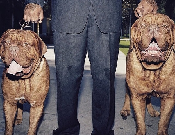
The second inspiration being a post i saw on a social media site posted by a friend, showing a link to a website that was selling at 125 page book exploring the relationship between dogs and their owners made by a friend of his. This really inspired me as i thought it was an amazing idea as dogs often seem similar to their owners in some way. The photo below is an extract from the book. i considered buying it but i didn't have enough to pay for it as its £38 posted. i can honestly say i see the relationships between the dogs and the owners when i'm walking my dogs in the park and can see other owners. This photograph shown below is no exception. The image shows two dogs of the same breeds. they look strong and perhaps aggressive, the leads being held with lots of tension(held very tightly to the owners hand) suggests this. the dogs look expensive and well fed, the fact that there is two of them suggests lots of money has been spent on them. The owner is wearing a suit suggesting he must have a well paid job. However, the tattoos on his hands suggest he may not have a formal office job..The situation i immediately think is depicted here is that the photograph is potentially portraying a gangster and the guard dogs for his property.
The photographs in the book were taken by a photographer + film-maker who i personally have a lot of respect for and really admire his work called Will Robson-Scott. photos were also taken by fashion photographer Ollie Grove. Ollie has done work for the likes of big brand names such as Nike and Bulmers cider as well as the famous DJ, Goldie. So both photographs are recognised in the scene for great work.
Their description of the book "in dogs we trust" is:
"In Dogs We Trust, a 124 page hardback book, reveals the special relationship between dogs and their owners on both sides of the Atlantic. Photographers and friends from childhood Ollie Grove and Will Robson-Scott spent years searching across the social spectrum to shoot intriguing characters and their beloved hounds in locations as diverse as Hackney, Hampstead, Venice Beach, Brooklyn and Queens. Published and designed by Victory Edition , NYC.
Photographer and filmmaker Will Robson-Scott achieved notoriety with 'Crack and Shine’, a series of books and films documenting the global underworld of illegal graffiti writers. In 2014 he won 2nd place in the Best European Short Film and Young Director Award categories at Cannes Lion. He splits his time between London and New York.
Portrait and fashion photographer Ollie Grove shoots international campaigns for the likes of Bulmers; album covers for platinum selling artists such as Rudimental, and regularly produces work for high profile brands and music artists. He has a slight obsession with dogs."
I have quite a few inspirations for this section:
The first being my own thought process whilst with my dogs at home and realising this would be a great idea to use for my work. thought i could generalise this relationship to include a wider range of possibilities, which included a load of smaller ideas i had but couldn't quite title yet so i eventually decided on man-made and natural relationships.
From there i began my research.
The second inspiration being a post i saw on a social media site posted by a friend, showing a link to a website that was selling at 125 page book exploring the relationship between dogs and their owners made by a friend of his. This really inspired me as i thought it was an amazing idea as dogs often seem similar to their owners in some way. The photo below is an extract from the book. i considered buying it but i didn't have enough to pay for it as its £38 posted. i can honestly say i see the relationships between the dogs and the owners when i'm walking my dogs in the park and can see other owners. This photograph shown below is no exception. The image shows two dogs of the same breeds. they look strong and perhaps aggressive, the leads being held with lots of tension(held very tightly to the owners hand) suggests this. the dogs look expensive and well fed, the fact that there is two of them suggests lots of money has been spent on them. The owner is wearing a suit suggesting he must have a well paid job. However, the tattoos on his hands suggest he may not have a formal office job..The situation i immediately think is depicted here is that the photograph is potentially portraying a gangster and the guard dogs for his property.
The photographs in the book were taken by a photographer + film-maker who i personally have a lot of respect for and really admire his work called Will Robson-Scott. photos were also taken by fashion photographer Ollie Grove. Ollie has done work for the likes of big brand names such as Nike and Bulmers cider as well as the famous DJ, Goldie. So both photographs are recognised in the scene for great work.
Their description of the book "in dogs we trust" is:
"In Dogs We Trust, a 124 page hardback book, reveals the special relationship between dogs and their owners on both sides of the Atlantic. Photographers and friends from childhood Ollie Grove and Will Robson-Scott spent years searching across the social spectrum to shoot intriguing characters and their beloved hounds in locations as diverse as Hackney, Hampstead, Venice Beach, Brooklyn and Queens. Published and designed by Victory Edition , NYC.
Photographer and filmmaker Will Robson-Scott achieved notoriety with 'Crack and Shine’, a series of books and films documenting the global underworld of illegal graffiti writers. In 2014 he won 2nd place in the Best European Short Film and Young Director Award categories at Cannes Lion. He splits his time between London and New York.
Portrait and fashion photographer Ollie Grove shoots international campaigns for the likes of Bulmers; album covers for platinum selling artists such as Rudimental, and regularly produces work for high profile brands and music artists. He has a slight obsession with dogs."
One of the most fascinating relationships shown through photography in an urban environment is the relationship between the landscape during the day and the night. Recently i have seen a number of images which show the city during the day and the night blended into one image .


These images are really effective in showing the natural relationship between day and night in a man mad landscape. The merging of numerous photographs showing day turning to night demonstrates the subtle contrast from light to dark in the city. The photographers took a range of photos over a period of a day, each at different exposures (higher f stop during the day and lower f stop in the evening/night), In each case natural light has been used to illuminate the images, however judging from the images, they have been edited later on using photoshop or lightroom.
The relationship between visuals and words:
This idea is going to dissect the relationship between images and text. This is a very powerful relationship and the two being presented together can have a strong impact or meaning or they can have no impact or meaning at all. Words can either, directly work in sync with a photograph or they can contrast each other. Both these methods are very effective in portraying the relationship between words and visuals and it can be shown i an unlimited number of ways.
One of my main inspirations for this is Dvid Zilber and his 'euonia' blog. This blog is purely quotes which he has either made or found elsewhere, some are truly inspiration if you can seek the meaning behind them. Something i particularly like about using quotes with photos is that they can both have infinite meaning i have decided i may use some of the quotes off his blog to aid me in achieving this relationship between visuals and words.
A quote can be directly interpreted to a literal meaning or it can be perceived in a completely opposite way. A photo with a quote can either show exactly what the quote is explaining or it can contrast the quote and show the complete opposite. i can even install the quote in an artistic way rather than just showing the text on the side of the image, so not only are the words and photograph artistic, but the way in which both are installed with one another is an art form.
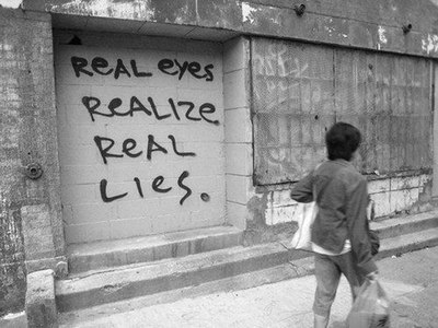
I also considered having the quote within the photo in which a relationship can be drawn between the quote and the scenery surrounding it. although that would obstruct part of the photographs as it would be covered by the quote, unless the quote was within the scenery.
This isn't a great example but it shows how a photo is part of the scenery has been used to show a quote. This is potentially more effective than having a photograph next to a quote if used properly.
Although this isn't the greatest example it is a good concept which gives the photograph more depth.
|
Robert Montgomery:
Robert Montgomery was born in Scotland (1972). He studied at Edinburgh College of Art and currently lives in London. Montgomery is a poetic artist. He installs his words into a scene in lots of different forms. Using billboards, cardboard, photoshop, light pieces, water colours and wood cut piece, he is extremely creative in his presentation of his work. Robert was born in Scotland (1972). I particularly like his concept of putting text into a landscape, although it isn't meant to blend into a landscape, but instead its the subject of the image. This alongside meaningful text and the visually pleasing scenery creates these wonderful compositions. I am inspired by Montgomery and i may produce some work with elements of his composition style in my productions. |
|
Strand development:
After developing my work into three possible directions i could go in (strands) i decided it would be best to develop my ideas in the direction i feel is strongest.
whilst looking through the work i've done for my three strands and analysing what path i can take my work, i realised i could incorporate all 3 of my strands into 'The relationship between the artist and the instrument' by producing a video.
The video would be a 'day in the life of' style video documenting a single days worth of exploration, photography and other related activities showing both the other relationships i have explored (Man made and natural relationships, as well as the relationship between words and visuals). The video could include all the previous skills i have learnt through this section combined into a singular composition.
or....
I will produce work just for the title "the relationship between words and visuals" and "the relationship between the artist and the instrument". This will involve a set of images documenting a journey for a photographer, in which his camera has essentially taken him on the journey, where he places a quote or word at a specific location and the journey and the words are correlated through visuals,without the camera the photographer would never do the things he does or go to certain places. And this relationship can be explored through his journey and the photographs he takes.
I find as a photographer myself, that i am constantly pushing my abilities to further myself in terms of photo and video quality which i produce, the camera influences me to better my skills and ideas and i work with this instrument for the best possible outcome i can.
I intend to use a range of camera types and film as well as photography. After looking through my loft i discovered and old vhs camera and a mini dv camcorder which i will use to my advantage to produce some abstract work. I even thought of using duct tape to secure my canon 600d lens to the vhs camera to get some better video quality.
Strand development:
In order to develop my above ideas, i decided to follow a photographer and a friend of mine of a day of exploration and photography. we ventured to east London's Silvertown and explored the industrialised landscape in search of some interesting spots to photograph. This was a development of my idea 'the relationship between the artist and the instrument', in this case the artist is the photographer and the instrument, the camera.
I had my camera in a setting that took photographs in both raw and jpeg, i use this setting all the time to be able to choose from either photograph depending on which i prefer when i comes to editing. However, i tend to mainly use raw for its better quality.
Heres a contact sheet style layout of my work from that day:


This shoot shows how the camera (the instrument) has taken the photographer (me) on a journey, travelling to places which are normally unseen by the public.
The majority of photos are landscape photos, with the occasional photograph including the subject. Lighting in every photo is natural provided by the sun. The artist in this case is seeking inspiration through london's derelict industrial sites.
The majority of photos are landscape photos, with the occasional photograph including the subject. Lighting in every photo is natural provided by the sun. The artist in this case is seeking inspiration through london's derelict industrial sites.
|
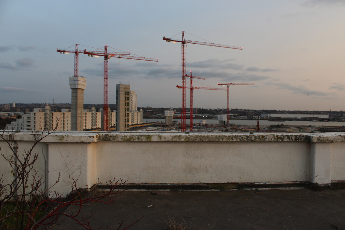
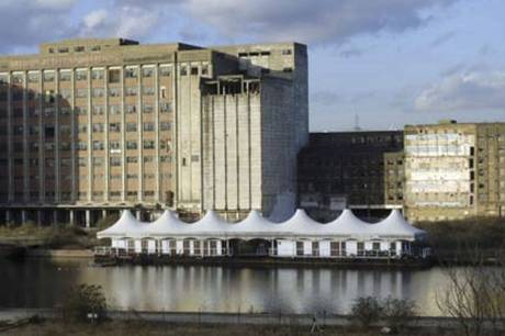
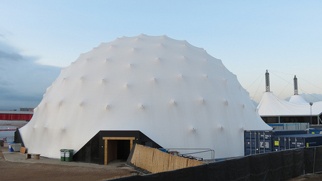
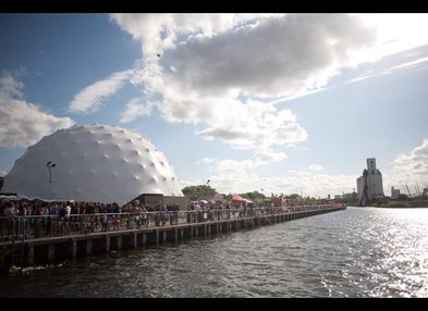
This site was abandoned for a long time, it then reopened in 2012 around the time of the olympics starting, only to be abandoned months later due to the lack of attraction after it going into administration due to a low turnout. This means this land has had layers of abandonment making it interesting and inspirational for photographers interested in exploring. The site was once a vibrant festival during the 2012 London olympics it is now a wasteland open to decay like many other sites in London. But in my opinion it doesn't detract from its beauty. I have an avid interest in places like this and this interest is due to the cameras i own. I love documenting the decaying landscape and finding beauty in these areas neglected and left to rot. the photos right and below are showing how it looked whilst it was open so a comparison can be made to the photos i took.
|
|
|
|
The website link i have included above shows this site listed as one of the "perfect 10" London pop up bars of 2012. Its amazing at how quickly it can deteriorate into the place it is today and it becomes forgotten about my the general public.
This photo-shoot was a development of one of my strands, inspired by my previous ideas and thought processes, combined with the photographers i have been researching recently (David Zilber,Marc Atkins,Iain Sinclair,Ollie Grove, Will Robson-Scott). This collective of new found inspirations has given my work more direction. From here i will continue to expand on my work through this path.
This photo-shoot was a development of one of my strands, inspired by my previous ideas and thought processes, combined with the photographers i have been researching recently (David Zilber,Marc Atkins,Iain Sinclair,Ollie Grove, Will Robson-Scott). This collective of new found inspirations has given my work more direction. From here i will continue to expand on my work through this path.
The 'final' shots from this shoot:
These shots are the select few i have chosen to be my 'final' shots for this particular shoot which i went on. All of these were RAW photos, some were edited on photoshop and saved as RAW files, whilst some were left untouched so remain as RAW files.
My aim through these images wer to gain an accurate portrayal of a day in the life of an urban explorer/photographer, so i followed a friend of mine on a journey throughout the city documenting te places we went to and the things we did whilst out for the day. The whole journey was wildly influenced by the cameras we own and our passion to reach these places that often go unseen to document and explore the areas, for the sake of taking artistic photographs.. This is the relationship between the artist and the photographer.
My aim through these images wer to gain an accurate portrayal of a day in the life of an urban explorer/photographer, so i followed a friend of mine on a journey throughout the city documenting te places we went to and the things we did whilst out for the day. The whole journey was wildly influenced by the cameras we own and our passion to reach these places that often go unseen to document and explore the areas, for the sake of taking artistic photographs.. This is the relationship between the artist and the photographer.
These images are intended to show the hidden side of London city. London city is by man accounts a conventional,impenetrable fortress. Security is constantly stepped up in certain places increasing the likely-hood of these parts of the city to go unseen by the public, many would pass places like these an wonder what its like to explore it before they proceed to carry on doing whatever they were in the first place, they would never consider actually to find out, unlike urban explorers. Derelict buildings are generally thought to hinder the landscape, whilst many believe they give areas more history and depth. Urban exploration has been described by a famous urban explorer commonly known as 'Ninjalicious' (real name: Jeff Chapman) as being , "Interior tourism that allows the curious minded to discover a world of behind the scenes sights". An inspiring statement and it is no doubt a truthful statement.
All the photos shown here are landscape, taken with a Canon 600D, the settings were manually adjusted for every shot.
All the photos shown here are landscape, taken with a Canon 600D, the settings were manually adjusted for every shot.


|
Visiter ビデオ from Natalia Stuyk on Vimeo. |
If i were to 'alter the context' of a photograph as i had done in the earlier section of this unit, i would do so in an abstract fashion similar to this visuals art by Natalia Stuyk.
i would aim to make a photograph look similar to a 3d generated version of the same photograph. This would completely alter the context compared to simply layering a pattern or colour over a select part of an image. My first idea of this was to give a 3d effect to an image but change the opacity of certain layers to generate a 'digital' effect i will demonstrate this below: |


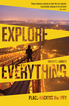
I have recently purchased two books related to my topic i am developing, the first being called 'place hacking the city' by Bradley Garrett and the second book called 'liquid city' by Marc Atkins and Iain Sinclair. I intend to use photographs and extracts of text or quotes which i will analyse and use to develop my own work as both books are closely related to what i'm doing at the moment and i have a strong interest in them.
Place hacking is about Bradley Garrett, an urban explorer travelling throughout the globe and testing each city's limits in terms of there security by exploring their hidden, closed, secret and forgotten urban spaces. He restructures the readers view of a city-scape and portrays it as a place for endless adventure. By the end of the book you can see the world through the eyes of an urban explorer. I was recommended this book as it relates to my style of photography and it is related to me in the sense that it is about urban exploring. I intend to use it as an inspiration for my final piece. From reading the first quarter of the book i'm already glued to it, everything being said in the book inspires to me to carry on what i'm doing and to go out and explore even more than i do. I can relate to certain quotes, many of which are from recognised explorers. The books give a non-fiction insight into the world of urban exploration through the eyes of Garrett, he also gives information on the historical background of urban exploration, about how the 'unseen' is seen by a select few of creative minds who leave it untouched as they document the beauty in the decay.
Garrett describes urban exploration as "interior tourism that allows the curious minded to discover a world of behind the scenes sights", i couldn't agree more with this statement
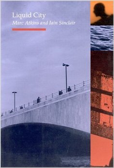
Liquid city is a book about photography in London including some literature. The style of photography show in this book is topographic, depicting London city in a revelatory manor. The book has been described as a guide through London's "hidden streets and canals" which Sinclair and Atkins have been mapping out.
With both of these books i'm going to scan certain pages in with photographs and analyse them in order to help me develop my work. I like the idea that both these books are essentially exploring the 'underworld' of London city, the parts of the city that go unseen normally and few actually venture into the places described in this book. As well as this, the books are both illustrated by photography of these places and this adds to the scenes set by the text.
With both of these books i'm going to scan certain pages in with photographs and analyse them in order to help me develop my work. I like the idea that both these books are essentially exploring the 'underworld' of London city, the parts of the city that go unseen normally and few actually venture into the places described in this book. As well as this, the books are both illustrated by photography of these places and this adds to the scenes set by the text.
Through reading and analysing the images and text it has led me to want to alter my title, although the new title is closely related to the other titles i have chosen. I have found that one relationship title has led to another and within those relationships i tend to find other relationships to explore. This can often lead me to be confused as to what direction i am wanting to head in but after a long thought process i have reached a decision.
|
|
The photos in liquid city are all taken in black and white, the subject matter is often just the landscape and in this particular situation, the London cityscape. Each photograph was taken with a film camera and created specifically for the production of this book. The formal elements are evident in Marc Atkins work throughout this book. the perspectives of each shot give the photos depth, as well as making the architectural side of the landscape stand out among the rest of the scenery pictured.
Each location photographed was carefully picked by Marc as it had particular relevance to the book. mostly because these locations were near/next to rivers and canals that both him and Iain were following whilst documenting these landscapes along the way. |


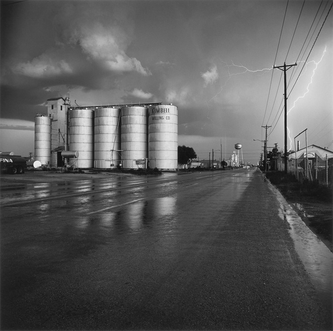
Topographics : An Inspiration
Topographics is a form of landscape photography, mainly shot in black and white, the photos commonly show contrast of black and white colours. The ‘movement’ so to speak, started in the 1970s. Topographic photography has a common theme of depicting architecture and landscapes such as cities or rural areas, as well as the modern industrial landscape through the use of film cameras (eg: Large format and 35mm).
Related artists: Each photographer is a leading figure in the 'New Topographics Movement',
Click to set custom HTML
|
Frank Gohlke is an american landscape photographer born in Texas(1942). He is famously known for his topographic work which emerged with a number of other photographers during the 1970s through the exhibition 'New Topographics: Photographs of a man-altered landscape', held in 1975. The exhibition kickstarted this new form of landscape visuals through a collective of new photographers who strayed away form the normal confinements of landscape photography that was standard before this era.
All His work is produced with black and white film except for some of his newer work shown on his website (42.30 North and The Sudbury River), It is likely he has used a medium or large format camera over a 35mm as this is the standard for most topographic landscape photographers. After watching an interview of Frank Gohlke is appreciate his work even more so, he is a photographer purely based on the fact that he finds it all such a "congenial" activity, from going out to take the photographs to the development process, i can relate to him in this way and i believe that a photographers work is the best when they are photographers for similar reasons as this one because the work is the most natural to them in this way. As an ex-english literature student he has a great rang of vocabulary when describing his work and he phrases things in a very intellectual manor which aids him to accurately portray his work through words. Over his career spanning over 30 years as a photographer, Frank has taught at a number of art institutions and universities in the united states, he is now a professor of photography at the university of Arizona where he is currently living. Frank always ensures a good composition within his images, there is always a main subject matter, however you are intended to appreciate the whole landscape for what it is, even if he is defying the general idea of a 'beautiful landscape'. He is capable of making a landscape look breathtakingly picturesque and detailed through a single photograph. The formal elements of composition are evident throughout his work, the main elements that stand out the most for me in his work are: Perspective, texture, contrast, lines, balance and depth. His work documents landscape that has been altered by human presence and he demonstrates how civilisation has worked to alter a landscape in a way that contrasts the natural world. All his work has a relation to his life in some way, the majority of his photographs are in the american landscape whether it be the natural or man made side of it, he mentions in the interview embed on the right hand side that the houses he documents through his work are common in the area he grew up, similar to that of Lewis Baltz who also documents landscapes he is familiar with through his past. |
|


Installation ideas + The Final Piece:
Installation is key when presenting your work. It can add a third dimension to a two dimensional image, as well as giving a photograph a better context in which it is placed in. Installation can add to an abstract photograph or set the scene for an images environment in which the artist wants the photograph to be seen in. Installations are often created in gallery/studio spaces, however, its possible to install work in a non-gallery/studio spaces but it is not as common.
This summer my friend and i are holding an exhibition of our work in a gallery space due to a friend of mine receiving funding and help for our photography collective 'The Unusuals' from an arts organisation helping artists and photographers. This event as well as this unit of the photography course has filled me with installation ideas and concepts which i could possibly use.
Heres a few of my ideas:
•Installations that match the scenery of my images- eg: Decaying building image framed in a 'broken looking' frame hanging on a chain in an all white gallery space. This idea would signify and industrial photograph through the chains and the deteriorated look of the frame with the subject matter. Or the photograph could literally be installed in the environment it was taken in, this would truly allow the viewer to get a sense of the emotions and feelings at the scene. i could then photograph the piece in the environment i choose and upload.
•My work could literally be installed as if it were to be presented at a gallery. So the work would be in a white-walled studio/gallery area so that nothing is detracting from the images . i would create a 'zine'(Magazine) to hand out as i would at a gallery to allow the viewers to see the type of work that i produce.
• For me, a 'Zine' or magazine is a collective of images in a small book-like format, zines are made by hand although you could get one published into a hard copy as a photo book. The images will be part of the final piece and related to the images i will be fully installing.
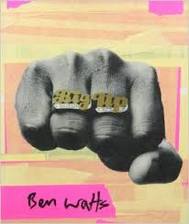
one of my biggest inspirations to make one is Ben Watts and his scrapbook style photography books, they generally portray lifestyles on a day-to-day basis and the photos represent all the things surrounding a certain lifestyle from music to clothes to sports. I love this type of work, you can really get a sense of what someones life is like or what the photographers common subject matter is. i want to incorporate this into my work as a result and so i am going to draft a design for a zine. After this mind mapping stage i'll create the final one.
•The type of subject matter i have dealt with in this section of the photography course, with inspiration from the people, objects and structures i have photographed as well as the places my camera has taken me whilst carrying out tasks for the relationships titles i have experimented with.
•The zine will go with the title “the seen and the unseen” this is because it is the unseen side to me and my photography. You are able to see my photographs throughout this course but unable to actually understand who i am through my photos, this zine is making the unseen, seen through a combinations of photos linking up the people i often find myself associated with through my camera and position as a photographer. I may not be one of these people but i am the person to be documenting their lifestyle and creating art through my photographs. All the photos are journeys i have endeavoured on as a result of being passionate for what i do and the magazine will show this.
• I will create the zine by scanning writing and photos into a computer and printing it off as a collective photo book, i will take inspiration from the booklet given to me by Ed Thompson when i went to his exhibition in bethnal green (19/04/15) for its clarityThe zine will go with the title “the seen and the unseen” this is because it is the unseen side to me and my photography. You are able to see my photographs throughout this course but unable to actually understand who i am through my photos, this zine is making the unseen, seen through a combinations of photos linking up the people i often find myself associated with through my camera and position as a photographer. I may not be one of these people but i am the person to be documenting their lifestyle and creating art through my photographs. All the photos are journeys i have endeavoured on as a result of being passionate for what i do and the magazine will show this.
• My final idea for the final piece is to have 4 photos arranged in a rectangular formation, each photo linking in with the first of the series of 4 in an arrangement as shown below. My final title is "the relationship between the seen and the unseen", the style of images will be in the new topographic format similar to my inspirations mentioned above. Each photograph is portraying either the seen of the unseen side of the landscapes surrounding people living in London city. The first image in the series of four will be the 'seen' side of a location and the other three will portray what is not seen on a street level/ without the location being explored. I decided that the images will be mounted on foam board for my installation, the 'seen' image which will be at the top left of each set of four, will stick out slightly more than the other four images by layering the foam board behind it more than the other 3 images in each set. This will be done to represent what you can see on the surface of a location. If i were to install this in a gallery, directional lighting would be used to make the images 'seen' over the rest of the gallery space. the rest of the room will be dark with exception for areas with my images installed, this will be done to set an atmosphere for my relationship title 'the seen and the unseen'. everything else will be unseen and so the gallery space would be metaphorical of my title for the final piece.
• A video which i have created will be projected on one side of the gallery space taking up a whole wall, the video will have the audio embedded below playing, this is essentially a blank noise, thought to improve focus. I chose it personally as it is 'neutral' in my mind, it provides an undecided emotion to the video allowing the viewer to perceive the video as they want, i often find the audio of a video influences the ideas and thoughts the viewer has over it, this video will simply allow the viewer to take it as they want to. The audio will also add the the surreal atmosphere i would aim to create if i were to actually install my work in a gallery space.
•The video would be played on repeat using a projector connected to a laptop.
Each photograph will be exploring the great contrast observed when you see this 'other side' to the city when you explore its hidden or unknown areas. On the surface, the locations look a lot more contemporary and picturesque in terms of the normally perceived standard of beauty, but behind the scenes, many of these places are stripped down to the bare structure holding the dead loads and live loads of a building. Or they are simply left to decay, untouched by humans although human presence is clear in these areas.
It is arguable that a landscape photo taken in the city without a person in the subject matter can still show human presence within it. A city is full of human presence, a simple structure shows human presence in the area wether its derelict or in use, anything man made is arguably portraying a human presence.
This summer my friend and i are holding an exhibition of our work in a gallery space due to a friend of mine receiving funding and help for our photography collective 'The Unusuals' from an arts organisation helping artists and photographers. This event as well as this unit of the photography course has filled me with installation ideas and concepts which i could possibly use.
Heres a few of my ideas:
•Installations that match the scenery of my images- eg: Decaying building image framed in a 'broken looking' frame hanging on a chain in an all white gallery space. This idea would signify and industrial photograph through the chains and the deteriorated look of the frame with the subject matter. Or the photograph could literally be installed in the environment it was taken in, this would truly allow the viewer to get a sense of the emotions and feelings at the scene. i could then photograph the piece in the environment i choose and upload.
•My work could literally be installed as if it were to be presented at a gallery. So the work would be in a white-walled studio/gallery area so that nothing is detracting from the images . i would create a 'zine'(Magazine) to hand out as i would at a gallery to allow the viewers to see the type of work that i produce.
• For me, a 'Zine' or magazine is a collective of images in a small book-like format, zines are made by hand although you could get one published into a hard copy as a photo book. The images will be part of the final piece and related to the images i will be fully installing.
one of my biggest inspirations to make one is Ben Watts and his scrapbook style photography books, they generally portray lifestyles on a day-to-day basis and the photos represent all the things surrounding a certain lifestyle from music to clothes to sports. I love this type of work, you can really get a sense of what someones life is like or what the photographers common subject matter is. i want to incorporate this into my work as a result and so i am going to draft a design for a zine. After this mind mapping stage i'll create the final one.
•The type of subject matter i have dealt with in this section of the photography course, with inspiration from the people, objects and structures i have photographed as well as the places my camera has taken me whilst carrying out tasks for the relationships titles i have experimented with.
•The zine will go with the title “the seen and the unseen” this is because it is the unseen side to me and my photography. You are able to see my photographs throughout this course but unable to actually understand who i am through my photos, this zine is making the unseen, seen through a combinations of photos linking up the people i often find myself associated with through my camera and position as a photographer. I may not be one of these people but i am the person to be documenting their lifestyle and creating art through my photographs. All the photos are journeys i have endeavoured on as a result of being passionate for what i do and the magazine will show this.
• I will create the zine by scanning writing and photos into a computer and printing it off as a collective photo book, i will take inspiration from the booklet given to me by Ed Thompson when i went to his exhibition in bethnal green (19/04/15) for its clarityThe zine will go with the title “the seen and the unseen” this is because it is the unseen side to me and my photography. You are able to see my photographs throughout this course but unable to actually understand who i am through my photos, this zine is making the unseen, seen through a combinations of photos linking up the people i often find myself associated with through my camera and position as a photographer. I may not be one of these people but i am the person to be documenting their lifestyle and creating art through my photographs. All the photos are journeys i have endeavoured on as a result of being passionate for what i do and the magazine will show this.
• My final idea for the final piece is to have 4 photos arranged in a rectangular formation, each photo linking in with the first of the series of 4 in an arrangement as shown below. My final title is "the relationship between the seen and the unseen", the style of images will be in the new topographic format similar to my inspirations mentioned above. Each photograph is portraying either the seen of the unseen side of the landscapes surrounding people living in London city. The first image in the series of four will be the 'seen' side of a location and the other three will portray what is not seen on a street level/ without the location being explored. I decided that the images will be mounted on foam board for my installation, the 'seen' image which will be at the top left of each set of four, will stick out slightly more than the other four images by layering the foam board behind it more than the other 3 images in each set. This will be done to represent what you can see on the surface of a location. If i were to install this in a gallery, directional lighting would be used to make the images 'seen' over the rest of the gallery space. the rest of the room will be dark with exception for areas with my images installed, this will be done to set an atmosphere for my relationship title 'the seen and the unseen'. everything else will be unseen and so the gallery space would be metaphorical of my title for the final piece.
• A video which i have created will be projected on one side of the gallery space taking up a whole wall, the video will have the audio embedded below playing, this is essentially a blank noise, thought to improve focus. I chose it personally as it is 'neutral' in my mind, it provides an undecided emotion to the video allowing the viewer to perceive the video as they want, i often find the audio of a video influences the ideas and thoughts the viewer has over it, this video will simply allow the viewer to take it as they want to. The audio will also add the the surreal atmosphere i would aim to create if i were to actually install my work in a gallery space.
•The video would be played on repeat using a projector connected to a laptop.
Each photograph will be exploring the great contrast observed when you see this 'other side' to the city when you explore its hidden or unknown areas. On the surface, the locations look a lot more contemporary and picturesque in terms of the normally perceived standard of beauty, but behind the scenes, many of these places are stripped down to the bare structure holding the dead loads and live loads of a building. Or they are simply left to decay, untouched by humans although human presence is clear in these areas.
It is arguable that a landscape photo taken in the city without a person in the subject matter can still show human presence within it. A city is full of human presence, a simple structure shows human presence in the area wether its derelict or in use, anything man made is arguably portraying a human presence.
Four sets of four images will be made. similar to the configuration shown here.
|
|
Inspirations For the photograph magazine:
I have a number of inspirations as in the mentioned above paragraph/s. I will give details of the inspirations and what has influenced my work in these particular pieces:
|
|
Ed Thompson, The unseen:
On 19/04/15 i visited Ed Thompsons exhibition at the four corners gallery in bethnal green. The exhibition was called the unseen, perfect research for my relationship title "the seen and the unseen". There were 15 minutes left until it closed as i had been late to leave my house. i arrived panting as i had ran the last 10 minutes of the journey to the gallery to ensure it didnt close before i arrived. What i saw was amazing. He had produced a range of images using Kodak Aerochrome, a discontinued form of infrared film that turns living plants that absorb and re emit infrared radiation red. He researched its uses and the reasons for its development and put the film to the test delivering photographs testing each of the films many capabilities. I was then approached by Mr Thompson himself, he had seen me running in and was very pleased to see the lengths i went to to appreciate the visuals he produced. He talked me through each piece and why he chose certain locations, and the ideas behind what he called "one big experiment" (the work) he explained why he chose the red forest in chernobyl and how the infrared film itself work in terms of electromagnetic frequencies, which was extremely interesting to me since i am an A-level physics student. he then gave me a booklet of the exhibition which was on sale for £10, for free! The books design and layout was a big aid to me in structuring my work in this magazine form. |


|
Stickers by DB Burkeman:
Stickers is what the title says it is. The book consists of stickers and descriptions of the culture behind the stickers shown, stickers ranging from politics to contemporary art are shown in this book and the range of them shown is enormous. i was particularly impressed by the pages i photographed, i like the idea of including a graffiti related part to the zine as i photographed some graffiti artists during this relationships section and since then i have appreciated it as a form of expression and an art form although some may disagree. i was given a blank sticker a while ago which is similar to the stickers used in this book and by graffiti writers around the world and so i will write my name on it and use it for a section the magazine. |
|


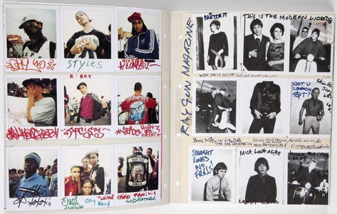
Ben Watts: Big Up
Ben watts, Big up is a photographic publication made by the british photographer Ben Watts, it was purposely made in the style of a scrapbook of images, with rough looking filing of images on pages made to look taped down. images have writing over them and each person photographed had written quotes or words. The book depicts what seems to be 1990s lifestyles of punk artists, boxers, models, graffiti writers and hip hop artists living in new york. the book was one of my biggest inspirations for my magazine as it kickstarted my idea to create my own version of this but slightly different. i will take on this idea of writing over images and allowing a 'rough' aesthetic to the publication to be part of its style.
All photographs in this book are portrait, in my publication there will be a mixture of landscape images and portrait, i will use a range of film and digital photographs taken over my time as a photographer during this course.