UNIT 1: PORTRAITURE
"Representation of a person"
This section of unit one is based around portraiture and the representation of people through portrait photography.
A portrait in my opinion is an artistic representation of a person in the form of visual art. A portrait consists of a person as the subject and they are placed in a setting that connects with them in some way, allowing the viewer of the portrait to perceive and interpret the implicit meaning of the photography or artwork in their own unique way.
A portrait in my opinion is an artistic representation of a person in the form of visual art. A portrait consists of a person as the subject and they are placed in a setting that connects with them in some way, allowing the viewer of the portrait to perceive and interpret the implicit meaning of the photography or artwork in their own unique way.
A brief history of portraiture:
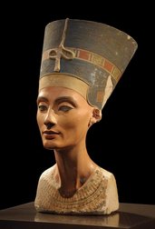
- Portraiture is one of the oldest art forms in existence, portraits have been found from 5000 years ago during the times of the ancient Egyptians.
- Photography has only been known to exist in more recent times, before this portraits were created either by sculpture or through painting. These two methods were the only available ways of recording the appearance of someone. This often meant it was only the wealthy or powerful that were able to have portraits of themselves.
- In the early stages of portraiture the portraits were aimed to portray beauty, power, wealth and status. This meant that the portraits were flattering to their subjects.
- As time progressed, so did portraiture and artists began painting the common man rather than purely pieces of the wealthy and powerful, although these pieces were often commissioned by wealthy individuals.
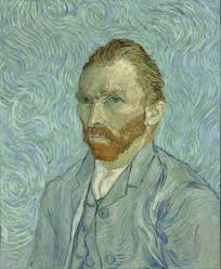
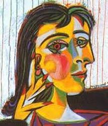
- As portraiture developed more, impressionists formed, they manipulated the idea of a portrait and began to deconstruct the traditions that were in place. Vincent Van Gogh is among one of the key figures in this. When the 20th century came around, artists like Pablo Picasso began to manipulate what was known as a portrait. He began focusing more on shapes, colours, lines and forms within a portrait that defied all the previous traditions.
- Around this time Cameras started to take dominance in the field of portrait, providing a way in which more people had access to a portrait rather than the wealthy and powerful in previous years.
- Portraiture has continued to modernise and change as time progresses, and will continue to do so as new artists push the boundaries of what we consider to be a portrait, This unit will explore aspects of portraiture.
|
|
|
What is a Portrait?
In order to begin with the unit 1 portraiture title i was given i need to understand what a portrait actually means to be able to successfully investigate.
After some research online i decided to form a list of definitions:
After some research online i decided to form a list of definitions:
- "A portrait is an evocation of a person, that gives the sense of that person. it doesn't need to look like the person but it has to give some impression of them."
I was inspired by this idea of a portrait being an "Evocation" of a person. Commonly when people think of a portrait you would immediately think of a photo of a person. This definition questions this idea, and raises the point that a portrait doesn't need to be a clear replica of what that person looks like in their appearance, but instead it should represent a part of them.
- "A portrait is a creative collaboration between an artist and a subject."
This quote is quite powerful in a sense that this person has raised the idea that a portrait requires a mutual effort between artist and subject. Both are working for the the desired outcome. Often it is seen by many that a portrait requires no effort from the subject other than to pose.
- "A portrait is a depiction of a person that can be idealised to give an impression of them as a person or an abstract piece that gives off an element about them."
This quote is interesting. It suggests that a portrait can be manipulated towards a desired outcome, producing a composition that is subjective and aimed towards representing something in particular.
- "A portrait is a visual representation of a human being"
This is a very broad way of seeing the word 'portrait'. The emphasis on "human being" is also quite interesting and suggests that the concept is strictly only applied to a human being. a portrait has to be a representation of a human.
- "A portrait is an image of a human being that places emphasis on their unique qualities."
This definition questions the traditional idea of a portrait being a photograph or painting of someone, it suggests the photograph or drawing can simply be a depiction of an aspect that separates the subject from any other individual. An idea i quite like as it adds another element of detail to a portrait. A portrait, using this definition, must show something special to the viewer about the subject.
Portraiture in Poetry:
The poem "checking out me history" by John Agard is a verbal representation of a person who is expressing his desire to discover his own history rather than the British history he has been taught in school. John was born in Guyana in South America in 1949, he moved to England in 1977. In 'Check Out Me History' by John Agard, the poet's message is that a persons personality is significantly affected by their personal history, the poet uses the history of his race that schools in England were not teaching him to represent him as a person as he believes he has to know his history before he fully knows himself.
"Dem tell me
Dem tell me
Wha dem want to tell me
Bandage up me eye with me own history Blind me to me own identity
Dem tell me bout 1066 and all dat
dem tell me bout Dick Whittington and he cat But Toussaint L’Ouverture
no dem never tell me bout dat
Toussaint
a slave
with vision
lick back
Napoleon
battalion
and first Black
Republic born Toussaint de thorn
to de French
Toussaint de beacon
of de Haitian Revolution
Dem tell me bout de man who discover de balloon and de cow who jump over de moon
Dem tell me bout de dish ran away with de spoon but dem never tell me bout Nanny de maroon
Nanny
seefar woman
of mountain dream firewoman struggle hopeful stream
to freedom river
Dem tell me bout Lord Nelson and Waterloo
but dem never tell me bout Shaka de great Zulu Dem tell me bout Columbus and 1492
but what happen to de Caribs and de Arawaks too
Dem tell me bout Florence Nightingale and she lamp and how Robin Hood used to camp
Dem tell me bout ole King Cole was a merry ole soul but dem never tell me bout Mary Seacole
From Jamaica
she travel far
to the Crimean War
she volunteer to go
and even when de British said no she still brave the Russian snow a healing star
among the wounded
a yellow sunrise
to the dying
Dem tell me
Dem tell me wha dem want to tell me But now I checking out me own history I carving out me identity "
John Agard Response:
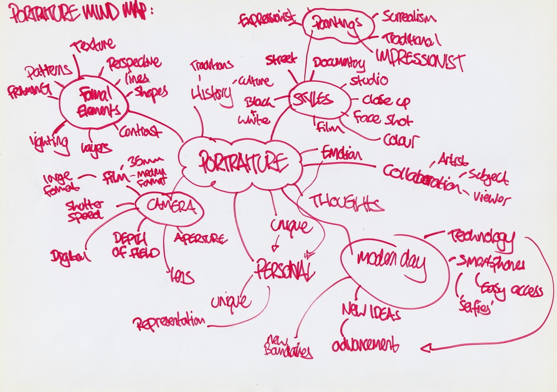
To introduce the title of unit 1 portraiture and to respond to John Agar's idea of understanding himself and his past to know his identity, i have constructed a mind map representation of myself. These are some of the things that form me as a person.
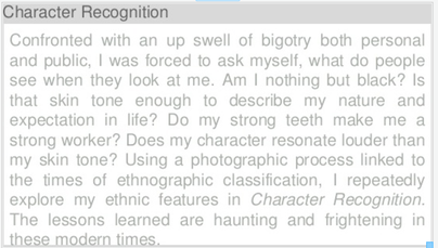
Artist Research: Myra Greene, Character Recognition
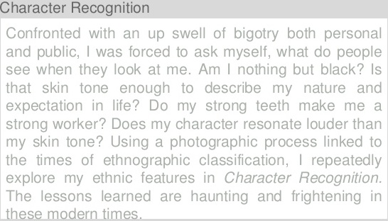
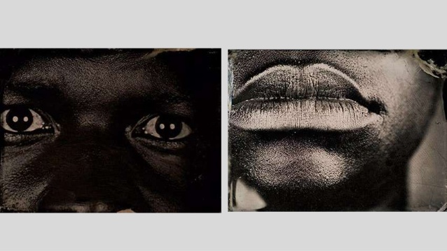
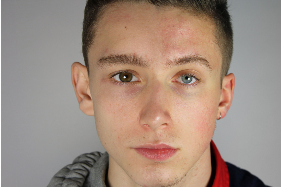
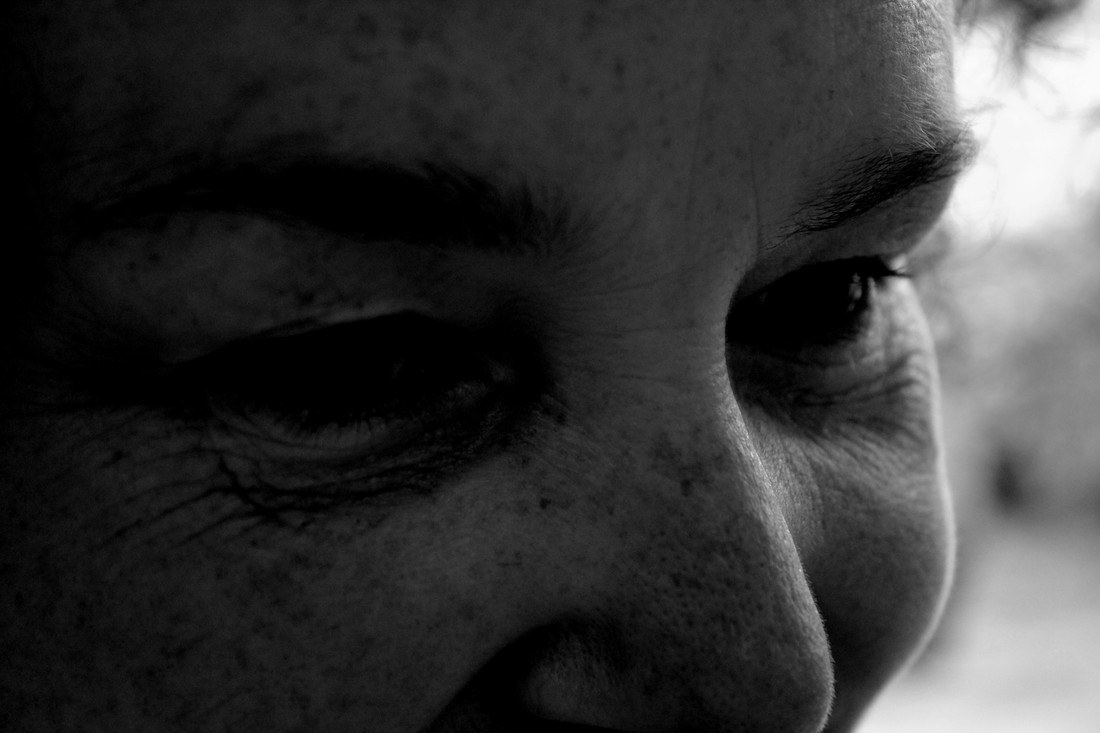
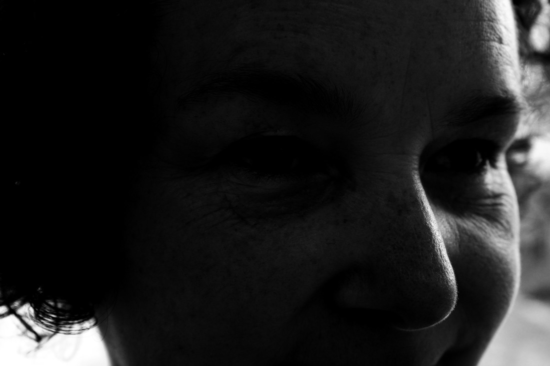
This project titled "Character Recognition" is an exploration of artist Myra Greene's ethnicity and facial features.
Myra uses the ambrotype process to create these compositions, a process using glass that has photosensitive chemicals on it which are exposed to light to form a photograph. The process makes a contextual reference to the era of colonisation and slavery, when this photographic process was commonly used for portrait photographs. She wields this process into her exploration of her body and culture as an African-American women. She explores the history of her ethnicity through these portrait photographs of her features as a black women.
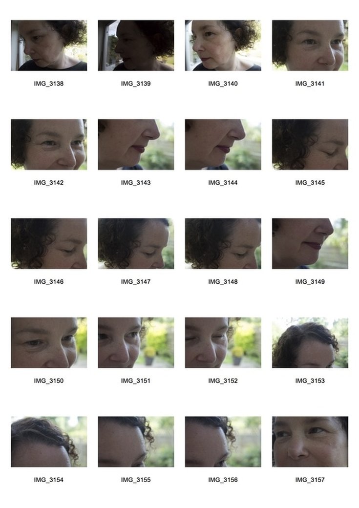
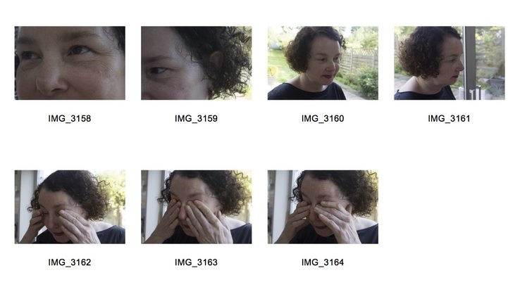
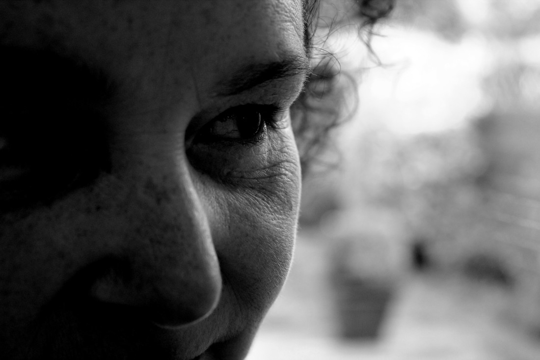
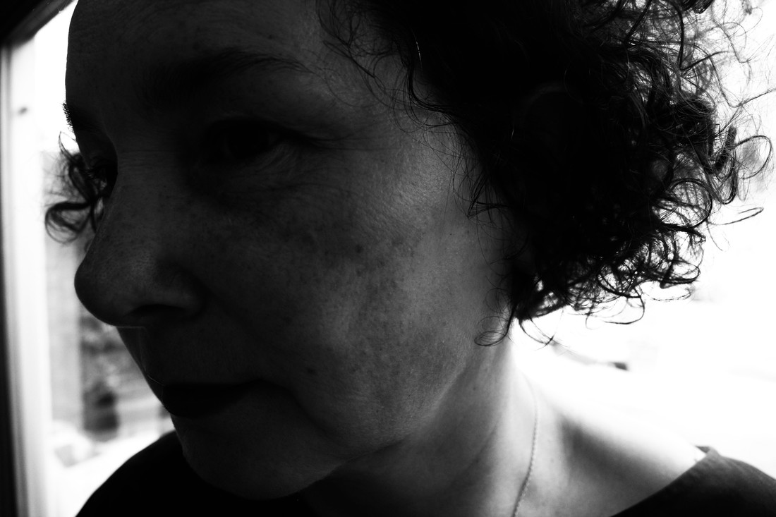
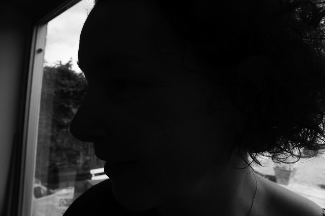
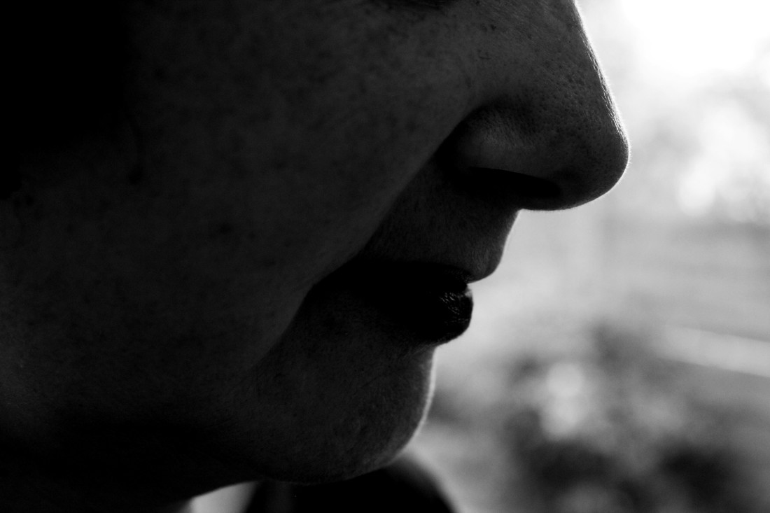
Response to Myra Greene:In response to Myra Greene i aim to represent a person through the style of Myra Greene. to me this style is visual representation of a person through close-up snapshots of select parts of the person so that the viewer is able to analyse these photos. The images should give a sense of a person and highlight their features giving the viewer a visual impression of them.
Unlike Myra Greene i also took photos of clothing and accessories of the subjects, i thought this would be a great idea as fashion and style is also a way in which people choose to express themselves as a person. This idea links back to the unit title "Representation of a person" clothing is a way people choose to be seen by others.
Similar to Myra's idea of specific features being related to someones identity i chose to photograph clothing as well as facial features. I chose to capture close up sections of clothing capturing the brand of the garment but at the same time making it clear what the garment being worn is. People choose and adapt clothes to reflect the lifestyles they lead or the lifestyles they aspire to lead. I believe clothing has a major role to play in representing a person as it says something about a persons character and their general lifestyle and life choices which is why i did this. similar to Myra Greene, this first contact sheet of photos i have produced shows contrast between light colours and dark colours. I took photographs of select parts of my subjects body, this was done to allow the viewers mind to stimulate their own mental image of the person based on the close up snapshots i took. In comparison to Myra Greene's idea of using a camera could also argue that i took this using a DSLR because its linked to the era of time my subject is living in, the modern day. Myra used a photographic process linked to the times of "ethnographic classification" an idea she aimed to raise through her use of the process to create the photographs. The Editing Process:
Artist and I:
Similar to Myra's work, i aimed to produce an abstract set of images detailing select parts of the subjects body.
Artist Research: Georgetown, Lewis KhanGeorgetown from lewis khan on Vimeo. To gain a better understanding of portraiture i began studying a film by a young film-maker and photographer from South London called Lewis Khan. The Film Titled Georgetown is an exploration of the life of a local resident to Lewis named George. George lives on the same estate as Lewis and suffers from a long history of mental illness. The project, filmed over a span of around 6 years is a small insight into the life of this man named George who grew to become a friends of Lewis’s.
The film has given me a better understanding of what portraiture means. Portraiture can simply mean a representation of a person which is what this film is. Khan's wide range of still footage along with POV and scenic shots help to give the viewer a very detailed insight into the life of this man although the video is only 11 minutes long. "A friend, a neighbour, a familiar face in the street. Georgetown is a view into the life of south London resident, George. During a period of my adolescence that saw playing football in the street as a daily ritual, George and myself often shared the same space. Frequently we would meet with a simple nod, more frequently a hello, and on occasion George would join in for a kick about. Georgetown is informed by six years of these impromptu and informal meetings in the street, usually the same one" Portraits can be taken anywhere and often the most powerful images taken are of everyday life. From the extraordinary to the mundane all subject matters can create exciting and inspiring photographs, Georgetown is no exception. This inspiring piece created by Lewis Khan has been screened at: -The London short film festival 2014, -Open City Docs Fest 2014, UCL, London -Kinodot Film Festival, Moscow -Motorcade/FlashParade National Open, Bristol -Reely and Truly, Bold Tendancies, Peckham The film is an insight into the day to day life, thoughts and feelings of a very unusual man named George. George is the subject of the film throughout and all shots taken have some relevance/relation to his life even if he is not in the shot himself. Khan leaves the viewer to draw implicit meaning through detailed macro shots and wide angle still shots of Georges' daily routine and elements of his life which would have gone un-noticed if he had not used certain video shots in the film.
Some of the things George said in the video and certain scenes Lewis films such as the scenes inside Georges flat lead me to believe that George suffers or has suffered from mental illness. This idea was inferred through lewis's photography when random quotes and thoughts are shown in script form on Georges' walls all through his flat. we soon begin to learn that these random and broken sets of phrases, names and thoughts have meaning to Georges' life and the viewer soon starts to compute that this writing adds up and aids you to build a mental image of his life. the names are of people who had/have significance in Georges' life and the phrases, things that people have said to him or things he wants to remember which he has said. To a normal person this would perhaps be seen as 'off the wall' but in actual fact it makes perfect sense and is rational to an extent. A second element of the video that led me to believe that lewis khan aims to demonstrate this idea about George having mental illness is the hidden meaning behind the clips of Georges table, in which Lewis is trying to show that George smokes cannabis. the first thing that led me to believe it was the shots of the table showing roach card, tobacco and an almost full ash tray, as well as the fact that George said "all i do is smoke". It is known throughout society that excessive smoking of cannabis over a prolonged period of time dramatically increases the chances of mental illness and i think Lewis khan took these shots to show this element of Georges life without going in depth through audio or video. George also has a collection of teddy bears which he considers to be his friends, each with there own individual names. this is another indication of his mental state. How:
Lewis Khan uses a wide variety of different types of Video shooting techniques to achieve visual documentation and discourse. these include:
Lewis also ranges the shots in a sense that George is not always the subject of the shot but he is in it. this is a clever idea and in my opinion it is done to draw links to George and the subject focus.
The video allows the viewer to 'read' it as if it were a text, rather then passively recognising sections of the video, Lewis draws the viewer in with this unusual story to achieve meaning.
To be perfectly honest, i was inspired by this video and it has encouraged me to do my own video representing a person, as Lewis has, but in my own way. i have learnt a lot from his video and i will take on board lots of his filming techniques such as extreme close ups as well as ways in which he presents implicit meaning. This video has benefited my photography and has inspired me as a photographer i believe that watching this has created 'sparks' of creativity in my mind. something just clicked in my head when i watched "Georgetown" and i think it will help me to do great things in this field of photography (video). 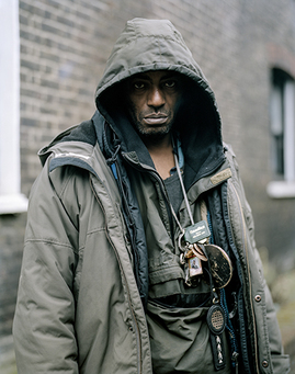
The video shows two sides to George. One side shows a rather odd, strong looking man that can look rather intimidating if you were to see him in the street. Photos of George taken by Lewis show him with a cold, straight facial expression. His hood being up further adds to this intimidating look.
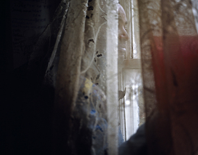
However, he also gives the impression that theres a very unstable and fragile man underneath that straight face and menacing look. Throughout the video he talks about having to take medication and in certain shots its quite clear that he is under a cloud of prescription drugs which he has to take by law. The image shows George looking rather uneasily out of his flat window. He almost looks frightened by the outside world in this image and this evokes the idea that he is a very fragile person inside suffering mental illness. Its photos like this which lewis took that are really powerful and can tell a story just by analysing the image.
I discovered a new side to George when i met Lewis Khan and he talked me through Georgetown and some of the photographs he took. i really benefited from this meeting with him as i really gained a true understanding of the general process in making the video and how Lewis was aiming to represent George. Response to Georgetown:
|


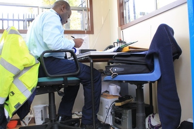
Although the admin/reception department of the school is among the most active of department It was so quiet i could probably have heard a pin drop with exception for the odd sound of a telephone ringing or someone coming to the reception desk to enquire about something. the mood of the reception was almost lifeless, i thought that capturing an image of that withering plant in the dark, office was a great way to visualise the overall mood i interpreted whilst in that room. darkness is a clear theme in the images i took whilst in the office, i did this purposely to show that the light levels are low in the room as well as implying that the reception was cut off from the rest of the schools departments as they are the admins of the building and have little to no interaction with students on a day-to-day basis unless students approach them.


|
|
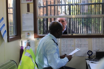
- These two contrasting photos in combination are extremely effective in regards to the unit title "Representation of a person"
- The first photograph on the left shows the security guard how everyone sees him. Dressed formally addressing visitors to the school through a small window.
- The second image shows a more personal side to him. A stereo system is placed underneath the table, this indicates he listens to music from time to time. A small microwave and kettle are also pictured underneath the table. Two items i would not have known were in there.
- The two photographs show two different representations of the same person.
Second response to Georgetown:
In response to Lewis Khan's 'Georgetown' and in reference to my project title "Representation of a person" i set about producing a visual representation of a friend of mine.
My subject, a friend of mine called Sonni is a young film-maker and photographer. Having started filming when he was around 14 he has produced many music videos as well as personal projects.
I asked him to talk about himself during the video as i filmed him carrying activities he would do on a normal weekend which include exploring abandoned places and rooftops around London city, capturing this all through his camera.
This style of audio recording relates to Lewis Khan's video as he also had his subject talk about himself and his life. Khan clearly manipulated audio by doing so although he allowed his subject to go off on a tangent and maybe expand on certain subject areas. something i also did in my video.
My video aimed to build up a picture of Sonni and what makes him unique, this video is my representation of him.
- My initial thought in starting this task was to produce a contact sheet to summarise the video through a number of photographs before the video is presented.
The following slideshow is of the images shown on the contact sheet above.
The subject of the film, Sonni, is a passionate photographer/videographer, avid urban explorer and blogger as well as having strong interests in many other things although these aren't covered in the video. my video is a representation of some of his life over around 6 months worth of footage, involving a range of different locations- ranging from galleries and exhibitions to rooftops and abandoned buildings. All the locations in the video are a result of simply following a passion (photography) and using it in many ways to achieve visual meaning through photographs and using his website to share experiences and to represent his life. My aim was to capture key elements of his life in the video, leaving out some details of his life so the viewer still doesn't know exactly who he really is, similar to the portrayal of George in Lewis Khans video. i believe that having an element of mystery in the video adds to it being more interesting and ensure the video isn't passively watched, but instead interpreted and read as if it were a book.
|
|
|
Using a trial version of final cut pro i set about creating the video, encountering multiple problems along the way, mainly due to the trial version being riddled with bugs and constantly crashing on my computer forcing me to restart work and over again. the program then stopped working after completing 50% of the video so i used iMovie instead which came as a great disappointment as i felt extremely limited with what i could do to the video and how i could manipulate the shots in comparison to final cut pro, however i worked with what i have and i am proud of the outcome..
My Representation of a person response video: The video is a collective of shots i have taken going around with my friend on our journeys around London, documenting our adventures every step of the way. Like Lewis khans video, i wanted to film the video whilst my friend was simply going about his weekly activities so the footage was true to him and an accurate representation of his life. thats why a lot of shots were done whilst the camera was handheld and the subject was on the move. This video is simply following the subject on a day to day basis as he went about his weekly activities, ranging from editing to filming and photography. If i were to improve the video i would invest in Final Cut Pro X so i could put my editing skills to use and a microphone for better audio quality. |
Artist Research: Ulric Collette, Genetic Portraits
Ulric Collette is a photographer well known for producing a series of photographs known as "genetic portraits". The images are of family members faces merged together through photo editing software such as photoshop in order to make it look like they are one person, the results are astonishing..
Collette's work shows the similarities between family members which often can only be seen if they are stood side by side.
I believe this is an amazing idea, it allows you to see how similar people look to their family members due to sharing the same genetics. Some people look almost identical to family members when the images are merged in this way.
Ulric's idea of representing two people as one in this creative way is inspiring.
Response to Ulric Collette:
In response to the work of Ulric, I set about creating my own merged portraits.
Using the schools photography studio i began creating my own genetic portraits but using classmates and teachers instead of family members to merge the faces together.
- I took the photographs then put them onto the computers where i opened up photoshop and began editing the images together.
After a bit of trial and error using photoshop i managed to create a few images that were up to my standards and worked well together i found the best way to get the images to merge well together is to aim to match facial features and skin tone between people for the best effect.
you can see that the first one involved a bit of trial and error as there are still some mistakes such as the lip looking quite odd and one eyebrow being slightly higher up than the other. but i took these mistakes into consideration and made a few more attempts before i reached my finished product and had mastered this function in photoshop. Another tip i found which aided me was to ensure that the subjects faces are in focus before using the photos to edit, if they are well focused the image formed may not be perfect.
you can see that the first one involved a bit of trial and error as there are still some mistakes such as the lip looking quite odd and one eyebrow being slightly higher up than the other. but i took these mistakes into consideration and made a few more attempts before i reached my finished product and had mastered this function in photoshop. Another tip i found which aided me was to ensure that the subjects faces are in focus before using the photos to edit, if they are well focused the image formed may not be perfect.
Heres my first attempt at making one of these portraits and below that in the slideshow is the finished and well edited version i made later on using a different set of images.


I also merged my younger brother and my mothers faces together. this is a true genetic portrait as you can really see the resemblance between them

Using two teachers as my subject i created this merged portrait in response to Collette's work. I was intrigued by this result. This unusual image of two people that completely juxtapose one another when stood together actually works extremely well. possibly because of the similarity of their facial shape causing the merging to be a lot smoother.
The Editing Process:
How to merge faces in photoshop:
- Select all ,copy then paste one image into the other to have one on top of other.
- Go to bottom of left hand bar icon Change it to 50% opacity
- Then move so that images are merged well (make one side perfected)
- Then press : Edit - transform - scale -move dot to on eye then begin scaling
- Then take layer from background, put one image up to 100% .Then cut half of face then do same to other image (use marquee tool)
- Then cut the image at point where you want it merged
- Select layer from background and cut just at end of nostril
- Then select all , edit- auto blend layers to blend the layers together
- Use brush tool (spot healing brush tool) to remove any imperfections and to blend parts together.
- change opacity on top layer to 50%
- I also found that there loads of tutorials on the internet showing you how to do this which is another way you can learn how to do this.
- For the photo with my mother and younger brother, i had to copy half of my mums lip and 'copy' it onto my brothers side of the photo as it look too abnormal having differing lip sizes in the image.
Artist Research: Sayako Sugawara, Cyanotypes


Sayako’s work is extremely unique. The processes she endeavours on to create her compositions are mostly involving the dark room where she exposes photosensitive paper to light, experimenting with ways in which she can manipulate the process. Often she uses materials to cover sections of the paper produces different textures, shapes and forms on the paper. This technique, alongside experimenting with how the film is developed, such as splashing developer chemicals on sections of the paper to create a dripping effect where sections of the paper remain white, are some of the techniques Sayako uses to produce abstract imagery.I was taught first hand by Sayako about this process of manipulating compositions in this manner and spent a day in the dark room with her to experiment and develop my technique in the dark room.
I was introduced to different techniques on printing and manipulating of the photographic image. I began by manipulating photographs by putting things on top of the photographic paper when they were being enlarged, placing materials over the image or changing exposure times on select parts of the paper to contrast the brightness.
I was introduced to different techniques on printing and manipulating of the photographic image. I began by manipulating photographs by putting things on top of the photographic paper when they were being enlarged, placing materials over the image or changing exposure times on select parts of the paper to contrast the brightness.
Response to Sayako Sugawara:
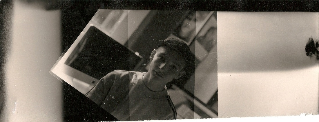
- In response to Saya's work i started experimenting in the dark room using the acetate sheet with the photograph i took using the large format camera.
- The process was similar to enlarging negatives of 35mm film, however I had to separate the acetate and the photosensitive paper with a thin plate of glass rather than inserting negatives into the enlarger as i normally would with 35mm negatives.
- all of these images were made using the same original image but the photos were enlarged,exposed and developed in different ways to show how an photograph can be manipulated in these ways
|
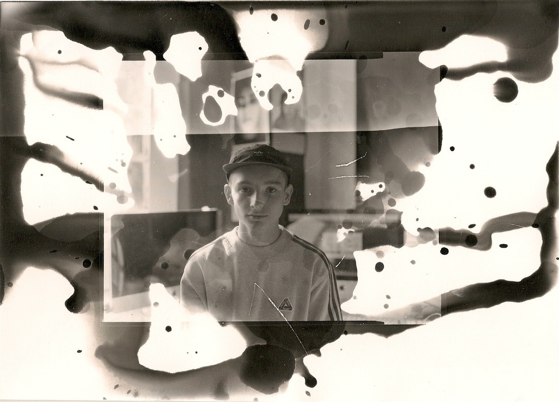
The third photo was a test strip that had an amazing outcome, i realised that by putting a layer of glass sheet above the photographic paper whilst exposing it i could blur the image. i also experimented with exposure time: the darker part was exposed for 6 seconds and the lighter half for 3 seconds.
|
|
|
I created this image by ranging the exposure times whilst enlarging the image. ranging in sections of 2 second exposures adding up to about 6 seconds total, it draws focus to the features of the subject in the image and blurs out any details i deemed unnecessary for this photo.
|
|
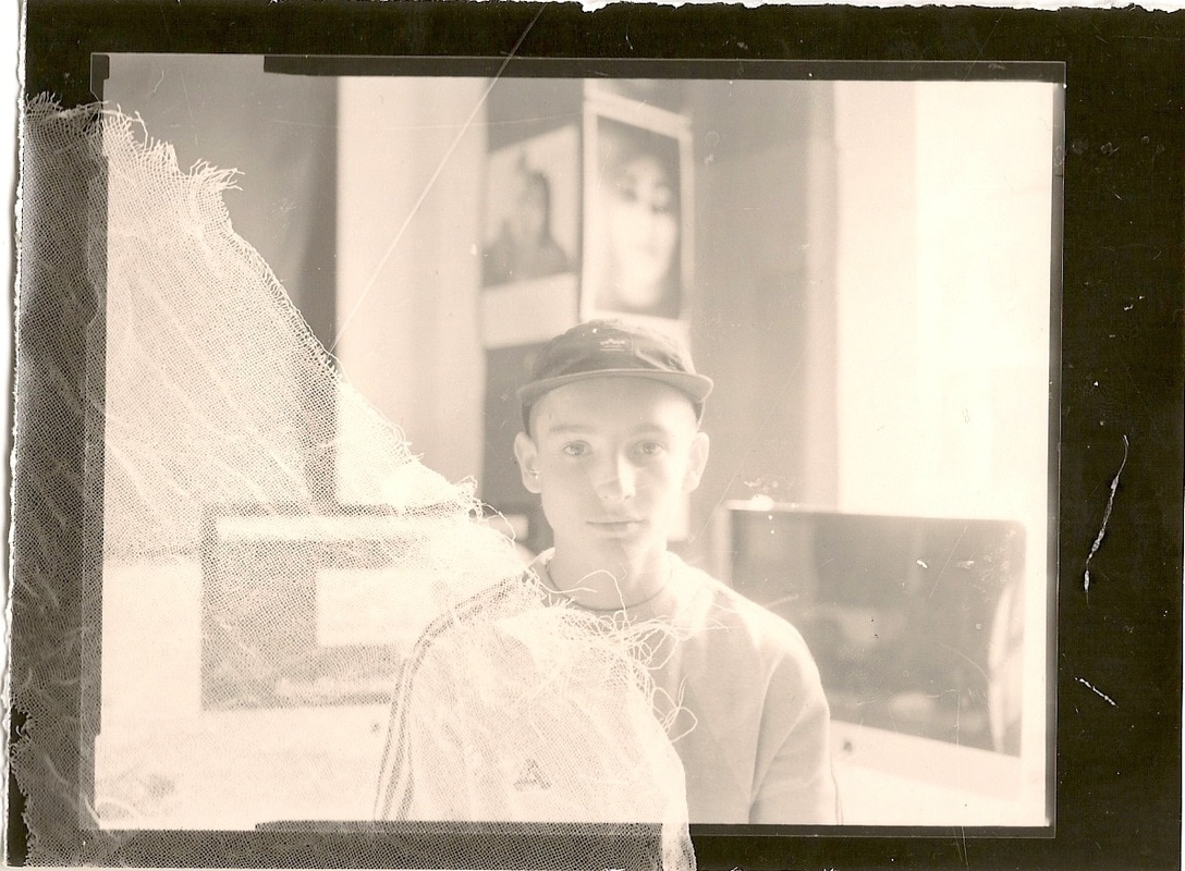
After exposing this image for 3.5 seconds, i splashed developer over the paper with a paintbrush, rather then placing it in the developer and gently agitating it until the whole image became developed.
I did this in order to create this dripping effect on the page. i then waited for two minutes to finish the developing process. The enigmatic facial expression of the subject alongside this water like distortion effect creates a rather surreal composition. It almost looks as if the image has been damaged, this photographic composition is extremely ambiguous and mysterious as a result of this developing technique. |
|
|
This image has a 2 second exposure time whilst enlarging it to create a very high brightness. i layered the image with a piece of cloth material on one side to blur details underneath where it was placed. this image reminded me of the photograms i did in the foundation section. The under exposure of this image reminds me of the sepia effect which i explored when i was taking images with a pinhole camera.
|
Evaluation and Progression:
This experimentation was rather inspiring. The manual manipulation of the photograph was something i wasn't very familiar with beforehand. Normally, i would alter a photograph digitally on photoshop. This manual manipulation of images has led me to want to experiment more in this field of photography.
The Photographic Object:
In this section of portraiture, the ongoing question of 'are art and photography the same thing?'. This question has been asked by many, for over 180-years. Some have complained that photography is "too literal to compete with works of art" claiming photography cannot elevate and influence imagination, something which i would strongly disagree with. Through school and my own personal researching and finding i have found that photographers have been incorporating techniques frequently associated with art that reclassify their work as pieces, sculptures, paintings and installations. Making them become pieces of art in the eyes of many.
Within portrait photography, artists and photographers can use many techniques outside of the darkroom and beyond the realms of photoshop and other photo editing software to enhance the message being stated in the photograph/piece, whilst manipulating an image into a different form. By doing this and changing the ways in which the photographer or artist presents/installs their work they can blur or intensify the message/meaning the creator is aiming to bring across to the viewer.
Artist link to Photographic object/ Inspiration:
Marlo Pascual:
|
|
Dryden Goodwin:

|
|
Gerhard Richter:
|
|
Lucas Simoes:
|
|
May Xiong:
May Xiong:
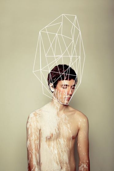
|
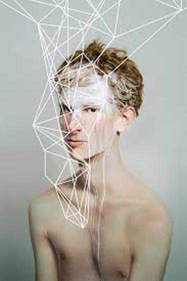
|
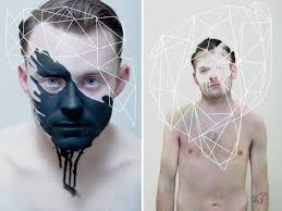
May Xiong is a Seattle-based conceptual artist/ photographer who also ties art and photography into one. May is a contemporary artist, there is a minimalist and abstract feeling i am given by her work. The work looks so clean and perfected whilst what is going on in the photo doesn't look clean itself, instead its the the way that her work is presented that makes it so fine. The image above represents this.
I am most fascinated by her work where she has edited the photo once it has been taken by drawing geometric shapes/patterns over it, linking the shapes to the minds of the subjects. i think this gives her an original and strong style whilst achieving visual discourse.
My personal belief of what these artistic pieces represent is the connection between the body and the mind, as well as showing the complexity of the mind through complex irregular geometric patterns. Xiong has a plain background in her work to draw focus to the subject, i didn't like this idea although it does work for her art. i found her work thoroughly enjoyable to appreciate and interpret and so i chose her as an inspiration for my next piece.
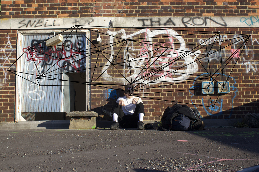
The photo was taken on the Roof of an abandoned hospital whilst on an urban exploration journey. The shot itself is a low-down, ground shot. The subject is positioned in the centre of the photo and sitting against a wall covered in graffiti with a small hatch to the left hand side of him leading to a staircase going down through the derelict hospital.
The location was chosen as the subject is an urban explorer. An urban explorer is a person that regularly embarks on journeys to urban, man made structures often derelict buildings, rooftops or underground sites which a normal person would not usually notice or think to venture into.
Unlike May Xiongs work i didn't make the subject the sole focus of the photograph. instead i had a rather chaotic backdrop to show what the subjects mind would have been taking in at that moment in time. This draws attention away from the subject but still shows him as a key element of the photograph.
The identity of the subject is unknown by looking at image and his cap is pulled down, further hiding his face as a result. The masked identity is linking to the idea that this urban explorer shouldn't really be at this location. Often derelict buildings similar to that of this building are often closed off from the public and boarded up so that it is not entered. This gives the photo a sense of mystery, leading the human imagination to paint the rest of the picture. The viewer of this image will actively decide the story behind the photo in their own mind.
To draw the geometric pattern i used photoshops line drawing tool and connected the graffiti to the head of the subject in an abstract and creative manner, producing a complex shape.
This piece of portraiture is showing how the young mind takes in all of its surroundings and is forever processing things around the body. in this case the subject is taking in all the graffiti surrounding him on the roof of this derelict building. The lines draw connection between the chaos in the foreground with 'tags' scribbled all over the walls of this rooftop and the mind of the young subject pictured in the centre of the photo. The image is exploring the human mind showing the subject, inspired and elevated by the adventures he is endeavouring on. The lines represent his chains of interconnecting thoughts and his brain processing his surroundings.
Unlike May Xiongs work i didn't make the subject the sole focus of the photograph. instead i had a rather chaotic background behind the subject to show what his mind would have been taking in at that moment in time.
As stated above the shape itself has meaning and purpose in the image to aid the message being hinted through this photograph.
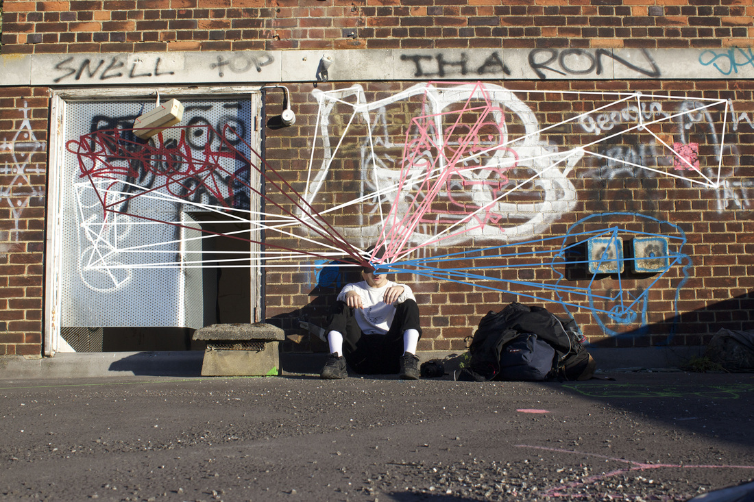
After producing my first 'Xiong inspired' piece i decided that i wanted show the interconnecting links in the subject mind through linking the graffiti and surroundings to his head With this photo, i decided to draw colour-coded connections from the head of the subject to the graffiti in his surroundings. i did this via photoshops line drawing tool and the eye dropper tool to match the colours. The lines are to show the mind processing the colouring and texture surrounding it. A creative mind can visualise beauty even in the most twisted and unpleasant of environments. The image is showing how the subject is taking in this 'beauty in decay'. By connecting the subjects head to the surroundings through these lines i am drawing focus to the foreground as well as the subject allowing the viewer to analyse the whole image. The image has clear references to the formal elements of shape, texture, lines, lighting and shadowing. all these elements are combined into this image to bring contrast to the image and to add to the detail of the image.
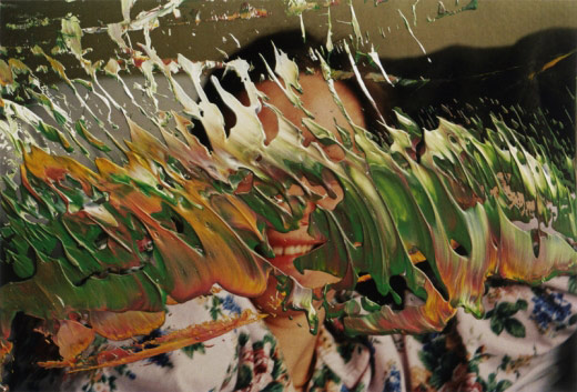
Artist Research: Gerhard Richter
Gerhard Richter:
Gerhard richter (1932) is a german born contemporary, modern artist. Born in Dresden, Germany, he is one of the leading figures in combining contemporary art and photography into sets of abstract paintings. He is most well known for producing works named 'Over painted photographs' using paint as a medium. This isn't his only type of artwork, Richter also produces prints, oil paintings, drawings and sketches. Gerhard paints over select parts of photographs drawing focus to other parts of the images, demonstrating how an image can be manipulated in this way to bring contrast as well as abstract features to his work. The photographs are taken with disposable cameras or found to use for the pieces, he then paints over the image blurring the message behind the image by doing so, producing a surreal piece of art.
The way the paint has been applied is very random and broken, following no particular pattern.
The smudging makes the paintings a bit more complete. When they're not blurred, so many details in an image can seem wrong. The smudging can help make the painting invincible, surreal, and mysterious.
"I blur things to make everything equally important and equally unimportant. I blur things so that they do not look artistic or craftsman-like but technological, smooth and perfect. I blur things to make all the parts a closer fit. Perhaps I also blur out the excess of unimportant information." - Gerhard Richter
This quote by Gerhard Richter himself is a simply genius way of describing his 'overpainted photographs'. i can really understand what he means in this quote and what he aims to achieve by blurring sections of the photographs. By painting over the images he changing the style of the photo and leaving many puzzling unanswered questions for the viewers of his work: Why did he paint over the photograph in this way? what is he aiming to achieve? what does it mean?.. the questions are endless but Richter has done this in a very intelligent manner and leaves you to create your own story about his artistic intentions
Response to Gerhard Richter:
Gerhard Richter inspired piece/s:
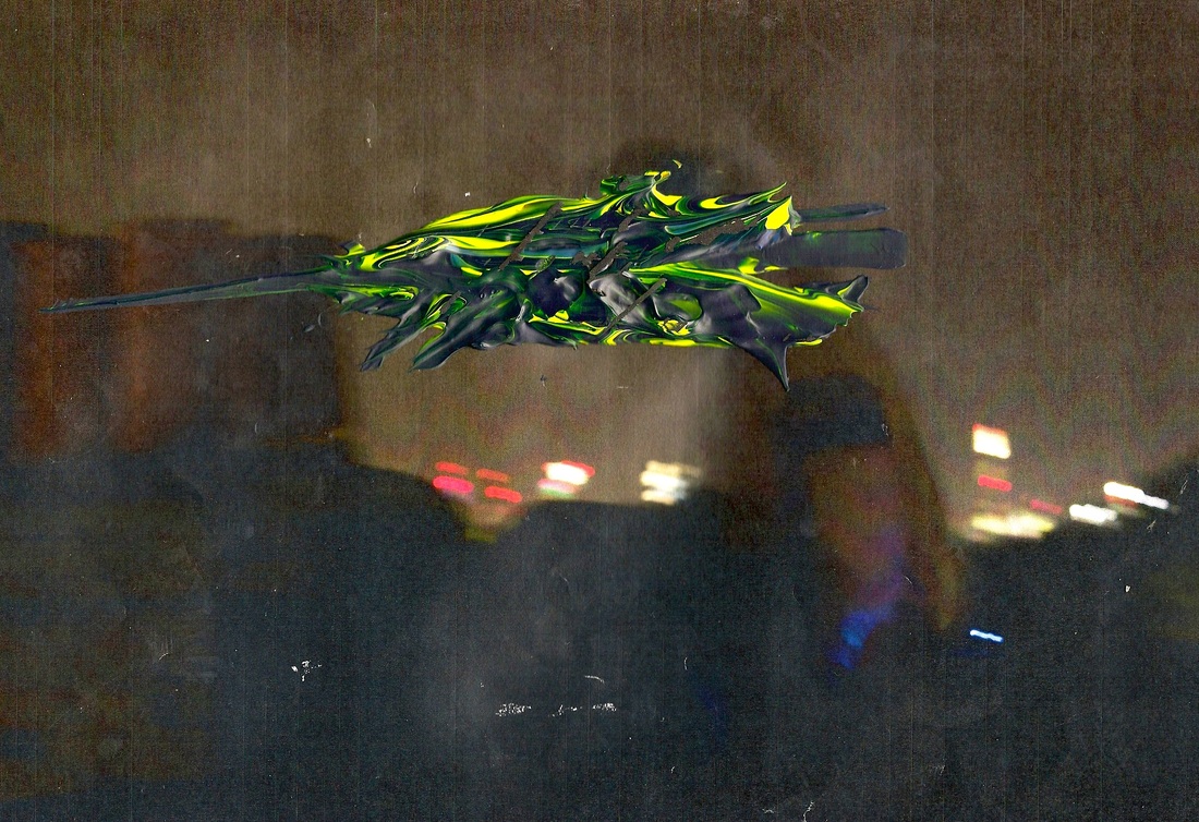
This image was taken on the roof of an abandoned house which i was exploring with a friend of mine (pictured). The Photo was taken in pitch black on the roof of this building. I was told by my friend that i shouldn't use flash while taking photos, in fear of blowing our cover whilst on the roof. i manually adjusted my settings as normal and took this image with the intention of holding my DSLR as steady as i could whilst the shutter took in the surroundings before me. The adrenaline of the whole situation made me feel slightly shaky and so this made holding the camera steady impossible.
I was happy with the outcome of the image as its the best i could have done considering the factors affecting my photography skills at the time: without a tripod, in pitch black darkness, trying to balance on an angled roof of an abandoned house whilst i was also trying to keep low in fear of being seen.
Now, if i had never told you the context behind this piece you would never have guessed that this is the story it has to tell. The same goes for Gerhard Richter works which is something i wanted to convey in my work.
After printing a copy of the image off i began painting. Using both yellow and blue acrylic paints i 'marbled' the paint together so that they wouldn't mix together and make green, instead it made a wispy navy blue and yellow pattern . The pattern relates to the context of the image as its a rather chaotic, with lots going on within it. The situation i was in whilst taking the image was also chaotic and quite tense so by applying the paint in this way i'm drawing links between the two, this aids me to express my work by doing so.
I would install this in a visual display to re-enact the inner city lifestyle in which we live. The image shown would be installed in a set where the photograph is against a large wall in a pitch black empty room.Darkness with light within that would be a key element of my instalment and would show the contrasting effect London city evokes. A projector would be the only source of emitting light in the room, forming its own image onto the wall in which my piece is installed onto. The projector will be screening a time lapse of London city at night from a high point, showing cars fast moving, flashing lights of the city to signify the overall past pace of London life. I would do this to express the chaos within the photo and also to contrast between the dark and light the city obtains. London is a vibrant city but also has a dark decaying side to it, both of which are expressed in my photo and method of installation.
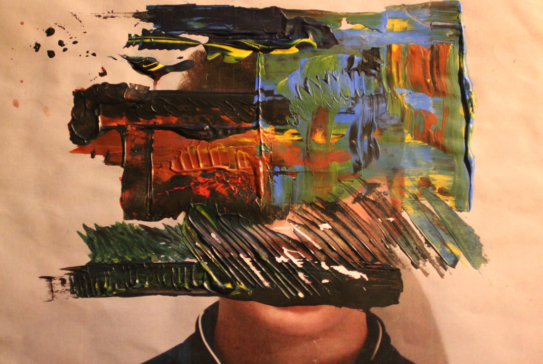
After experimenting with techniques on how to apply the paint to the photograph, i decided on a set technique to use for this image and began painting on top of it. Using a combination of black, red, yellow and blue acrylic paint. I applied the medium with a paint scraper, paintbrush and laid down a series of lines, patterns and textures to achieve a layered result. i created a spectrum of colours through combining colours, complementing one another with a tiered effect.
Through this image i was intending to create a visual through the influence of Gerhard Richter.
I purposely painted over the face of the subject in order to recreate another identity to the piece, blurring the lines of the original portrait.
One of the things i liked most about using acrylic paint as a medium for this set of work was the fact that it added texture to the piece, and through these textures, geometric patterns form as well.
Similarly to Richter's work, i have added layers to my piece and created a new dimension of expression in this piece.
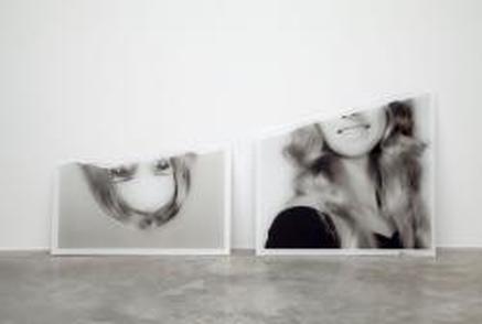
Lucas Simoes Response;
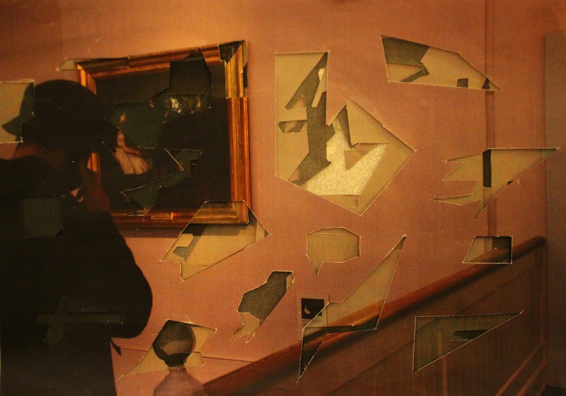
In order to make this photo i took an image of my subject whilst he was strolling through an art gallery.
The piece consists of 5 pieces of paper, all of which have the same image printed onto them. Out of the 5 pieces, 2 are black and white prints, one is a light, grainy black and white colour and the other is a higher quality black and white print which is darker. The other three are colour prints and were all printed using different printers, 2 of which are inkjet prints. I varied the prints in this way to change this ordinary photo into something more, giving it depth and more contrast as a whole.
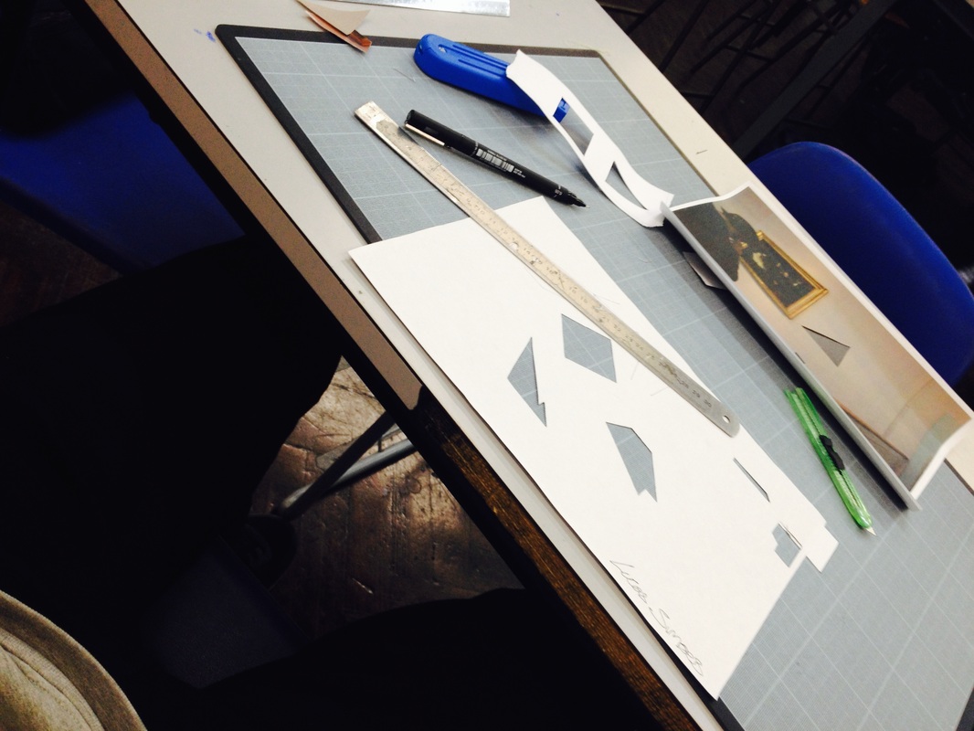
I then cut out irregular and regular geometric shapes into individual sheets of paper one by one, revealing select parts of each image as i did this. When placed on top of one another it reveals the original image in a more abstract manor than just having one photograph. Using this idea of layering i produced the above photograph.
My initial aim for a way in which i could install the image involved layering the images and having glass in between each photograph. However i had no way of doing this as the glass i had previously used to demonstrate the idea was scratched and very dirty, as well as this the shine it produced was too intense to fully be able to see the images between layers. so in the end i had to use blue tack to layer the images on top of on another . This on top of the fact that the craft knife i had used to cut the pieces was blunt led to the piece not having the outcome i desired. White specs on the sides of each cut make this less aesthetically pleasing and detracted the piece from the concept of the layers. As well as this the printer i had available did not do the photograph any justice since all the images printed on it came out grainy and lacking a vibrance of colour.
However, if i had the opportunity to repeat this i would know exactly how to improve the images and the outcome of the piece.:
- Invest in some higher quality prints ordered in from outside of school.
- Buy some layers of thin glass sheet which are exactly A4 paper sized to use as the layers.
- Possibly try and find a frame that would fit the layers of glass and the photographs in.
- Invest in a sharp craft knife to cut the sections out
The piece consists of 5 pieces of paper, all of which have the same image printed onto them. Out of the 5 pieces, 2 are black and white prints, one is a light, grainy black and white colour and the other is a higher quality black and white print which is darker. The other three are colour prints and were all printed using different printers, 2 of which are inkjet prints. I varied the prints in this way to change this ordinary photo into something more, giving it depth and more contrast as a whole.
I then cut out irregular and regular geometric shapes into individual sheets of paper one by one, revealing select parts of each image as i did this. When placed on top of one another it reveals the original image in a more abstract manor than just having one photograph. Using this idea of layering i produced the above photograph.
My initial aim for a way in which i could install the image involved layering the images and having glass in between each photograph. However i had no way of doing this as the glass i had previously used to demonstrate the idea was scratched and very dirty, as well as this the shine it produced was too intense to fully be able to see the images between layers. so in the end i had to use blue tack to layer the images on top of on another . This on top of the fact that the craft knife i had used to cut the pieces was blunt led to the piece not having the outcome i desired. White specs on the sides of each cut make this less aesthetically pleasing and detracted the piece from the concept of the layers. As well as this the printer i had available did not do the photograph any justice since all the images printed on it came out grainy and lacking a vibrance of colour.
However, if i had the opportunity to repeat this i would know exactly how to improve the images and the outcome of the piece.:
- Invest in some higher quality prints ordered in from outside of school.
- Buy some layers of thin glass sheet which are exactly A4 paper sized to use as the layers.
- Possibly try and find a frame that would fit the layers of glass and the photographs in.
- Invest in a sharp craft knife to cut the sections out


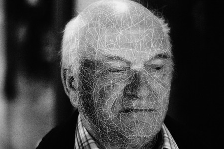
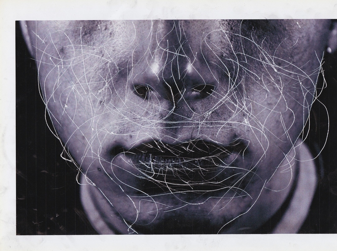
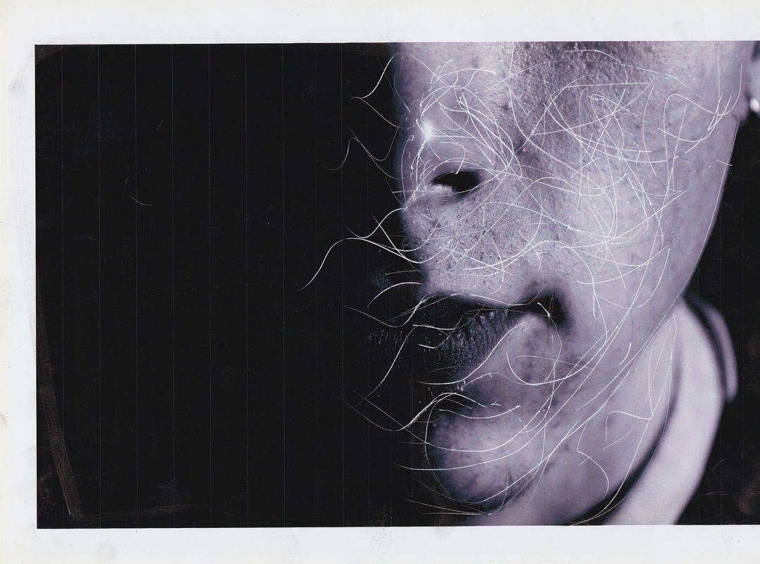
Artist Research: Dryden Goodwin/ Artist link to the photographic object.
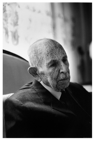
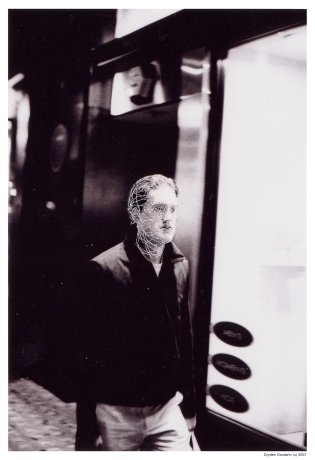
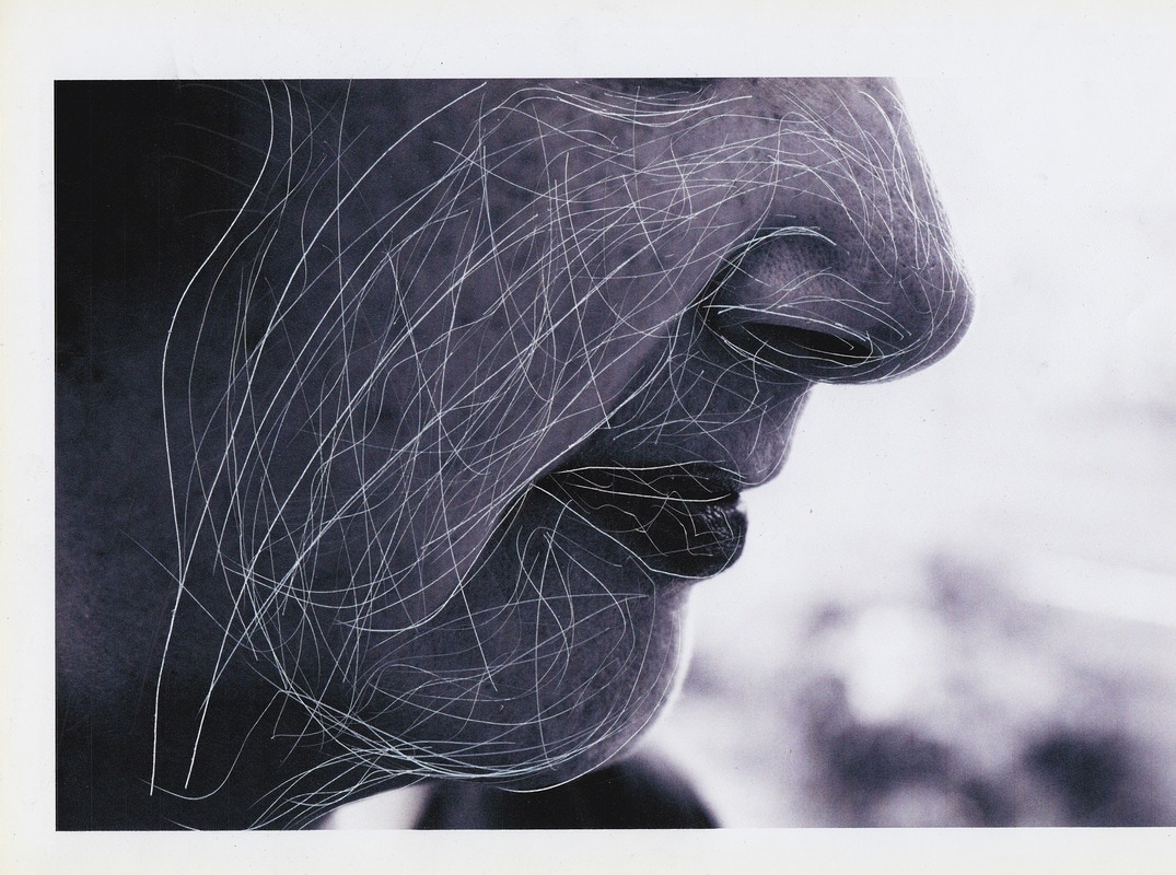
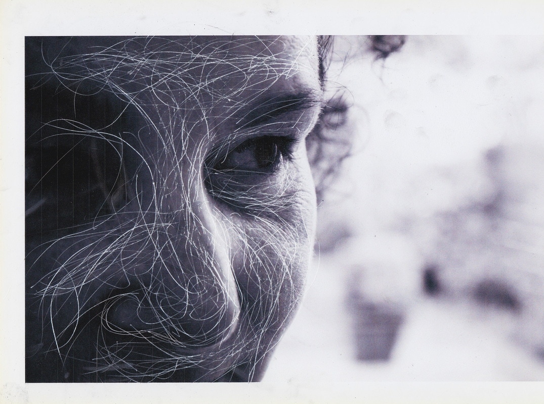
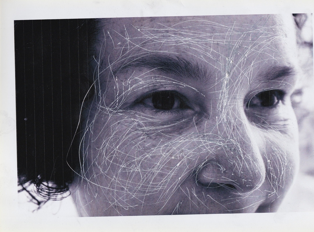
Dryden Goodwin is an artist well known for collaborating art and photography into his work collective. His work is known to have web-like lines scratched into the black and white photographs, these people in the images are strangers and Goodwin aims the black and white image draws focus to the subject, the lack of colour aids this fact. Lighting is also a key theme in this image with there being a strong contrast of light and dark.
The scratches drawn by Goodwin on the head of the subject are almost outlining the shape of the brain, the scratches themselves could be perceived as energy in a sense that the mind is very active, these people are strangers and we could only guess they are thinking about in that moment of time. The fact that he has used an elderly man in the image is relating it to London which also has a long history or 'past' as a city. in my opinion he has used the person almost like a metaphor to show an implicit meaning behind the image. Dryden's description of this piece (The World in London 2012) is that the work:
"explores portraiture and cultural diversity using photography, one of the most accessible and democratic artistic mediums of our times. The project celebrates London as a place where individuals from all parts of the world live side by side, each of them contributing to make London the unique city it is."
- This quote by Dryden also leads me to think that the idea behind this series was to demonstrate the diversity of London city. The title "The World in London" suggests that Dryden sees London as a microcosm of the world. His images in this series depict people from a range of ethnicities, ages and genders, so the content of his work also add to this point.
- Dryden's true aim in this series of work is to demonstrate the individuality of the human race, using London residents as the subject because of its highly multicultural population. In order to do so he draws a different pattern on each of his subjects, paying great attention to detail to their facial features, contouring the parts of their face that are unique to them. Each pattern drawn is personal to.
- Dryden Goodwin is almost highlighting these individuals so that they stand out more in the images. This could mean that he is trying to show that they are unique making them physically stand out more in the picture.
- By scratching so many lines in the head of the human subjects, He distorts their facial expressions and so their emotions at the moment this image was captured is unclear, however, Paying great attention to the facial contours of each individual, he is recognising the diversity of the human race and admiring this idea through his work. He is focused more on the physical side of the subjects rather than the emotional side.
- This image is one of 11 he produced in a set of work called (capture 2001). All the images are very open to your own personal perception and the style in each is very similar. Dryden took photos of passers by for this set of works capturing them in this moment of time so to speak. This idea that its capturing the subject in the moment raises the idea in my mind that some cultures believe photographing people is 'capturing' their sole in the image, something that seems quite ridiculous in this day and age. Dryden 'blurs' the meaning of this photograph by scratching in line onto the heads of his subjects. Web like lines are scratched into the black and white photographs
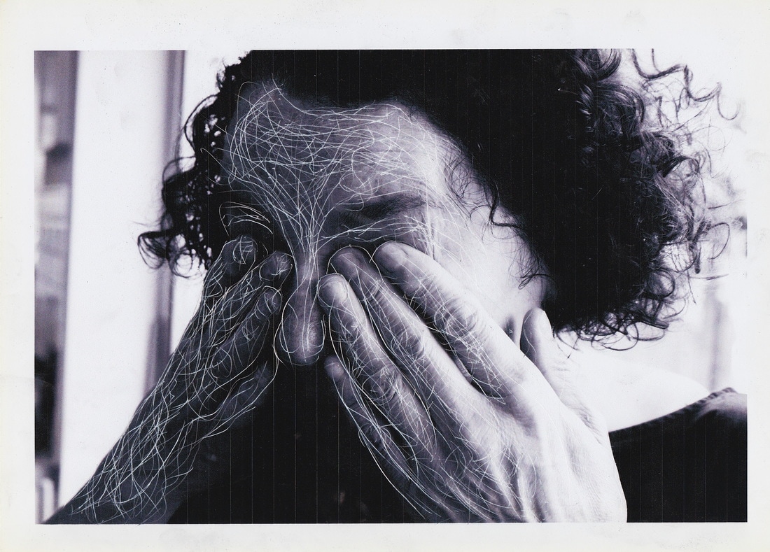
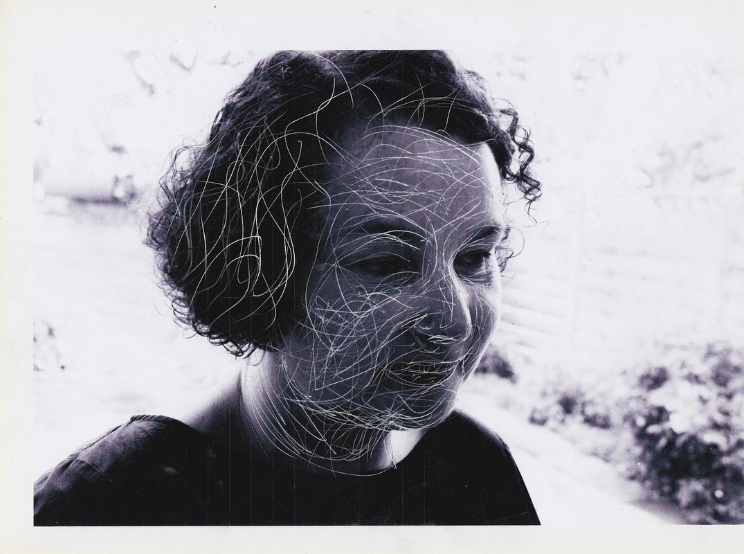
Response to Dryden Goodwin:
- In response to Dryden Goodwin I set about creating an image taking on this idea of
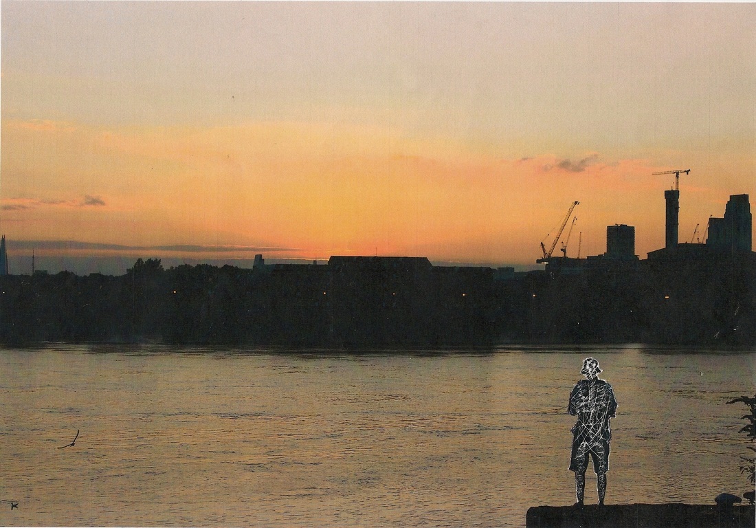
This photograph was taken by myself on the river thames. you can see how Goodwin inspired me to make this piece. i wanted the scratches in the body of the subject to show that he is full of energy inside, his mind is in a state of consciousness taking in his surrounding environment and appreciating the natural beauty of the city of London whilst the sun is setting in the foreground. I used my Canon 600D and my 18-55mm lens to take the photograph. using a craft knife i carefully etched in the anatomy of the body drawing the spine, ribs, hip and leg bones in and then going on to draw 'wisps' of energy represented as white lines in the silhouette of the subject. i think this image has power and it has potential to evoke a strong meaning with the surrounding 'backdrop' looking very scenic and surreal.
If i were to install this work in my own way i would have it within a blacked out room. The image would be encased into the wall with hidden lights surrounding the image so that it seems to be glowing white light slightly. The image would look isolated as the subject in the photo is, and the slight glowing it has would imply that the photograph has energy, similar to that of the person in the photo who appears to be full of energy through the many white lines within his body.
If i were to install this work in my own way i would have it within a blacked out room. The image would be encased into the wall with hidden lights surrounding the image so that it seems to be glowing white light slightly. The image would look isolated as the subject in the photo is, and the slight glowing it has would imply that the photograph has energy, similar to that of the person in the photo who appears to be full of energy through the many white lines within his body.
Evaluation:
- I am not extremely pleased with the outcome of this image.
- Although i took on the idea of treating the photograph as an object that can be manipulated physically, i could improve this idea.
- My first idea would be to have a more personal, close up image of my subject rather than a silhouette. That way the image is more personal to the subject I am photographing as well as showing their individuality, an idea i have taken on from the work of Goodwin.
- On top of this i would print the photograph off using photographic paper and used a better printer. The composition above it simple a4 paper and the printer was quite old so the outcome was not as desired.
- In my next shoot i would like to experiment more with the physical manipulation of photographs with this scratching technique. As well as this i'd like to experiment with this idea of making the photographs personal to the subject like Goodwin and the way he produces these patterns which are unique to each photograph.
First Development:
- After exploring portraiture and responding to the likes of May Xiong and Lucas Simoes, i realised that throughout this unit the two most inspiring artists to me have been Dryden Goodwin and Myra Greene.
- Dryden's use of scratching on pictures of his subjects to signify individuality and diversity amongst people in his series "The world in London is extremely inspiring to me. His use of the photograph as an object which he manually manipulates is also a technique i want to experiment with more myself
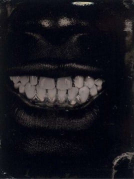
- Myra Greene's "Character Recognition" series challenged the opinions of how people look at her she raises this idea that people generalise her and predict what her nature and personality may be like based on the colour of her skin. Her high contrast, stripped down images, break down her appearance into its rawest form as she explores her facial features.
- Myra and Dydren's work have similarities and differences.
- In my next development/response I will aim to juxtapose the two artists ideas. i want to contrast the personal with the impersonal.
This is Myra Greene's description of her 'Character Recognition' series
Dryden Goodwin's description of his series "The world in London" is:
"The work explores portraiture and cultural diversity using photography, one of the most accessible and democratic artistic mediums of our times. The project celebrates London as a place where individuals from all parts of the world live side by side, each of them contributing to make London the unique city it is."
- My first decision was to edit the photos in the style of Dryden Goodwin,


- Using the blade of a pair of scissors i began etching the photographic paper to create this scratching effect.
Evaluation:
I am much more pleased with the outcome of this response compared the the first one.
The images are a lot more personal and unique, the previous response felt a lot more cold and emotionless.
In each image i paid great attention to the contours of the skin and facial shape of my subject creating 'flowing' lines where the contours were. This is a technique which i was inspired to do by Goodwin in his "The World of London" series. The result is amazing, each pattern is unique to the composition and has a personal feel to it.
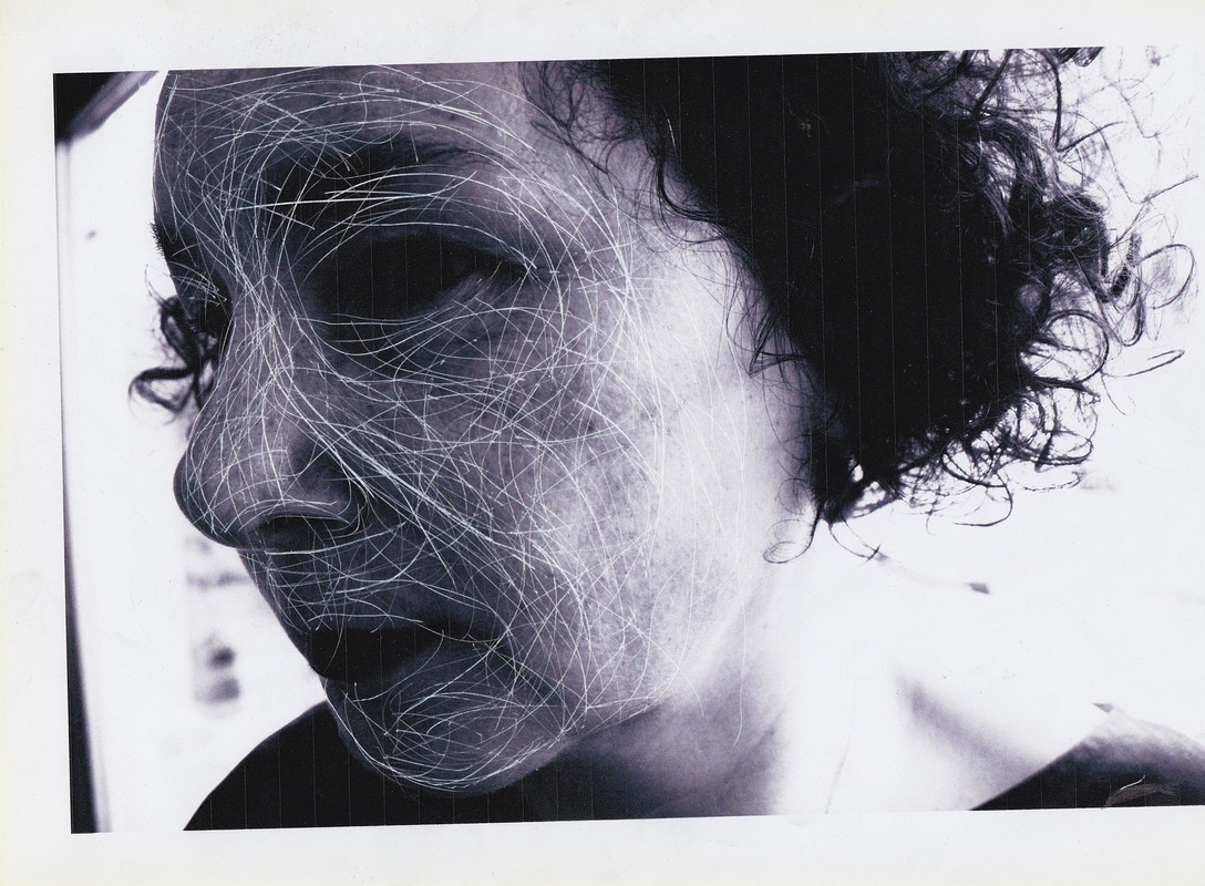
My next step was to combine this work with the work of Myra Greene, an artist i have been massively inspired by in the field of portraiture.
Her use of raw, high contrast images featuring close up and detailed photographs of herself that capture her facial features and small gestures. She challenges racial prejudice and generalisation in the process.
I was inspired by the way she De-personified herself from the photos. The images weren't clear photos of her. However she took a number of detailed and close up images of certain facial features and used it for the viewers to combine mentally. Her photos are aimed to raise a more general ideas and start discussion as they dissect the images true meaning and question their notions of race and identity.
The images are a lot more personal and unique, the previous response felt a lot more cold and emotionless.
In each image i paid great attention to the contours of the skin and facial shape of my subject creating 'flowing' lines where the contours were. This is a technique which i was inspired to do by Goodwin in his "The World of London" series. The result is amazing, each pattern is unique to the composition and has a personal feel to it.
My next step was to combine this work with the work of Myra Greene, an artist i have been massively inspired by in the field of portraiture.
Her use of raw, high contrast images featuring close up and detailed photographs of herself that capture her facial features and small gestures. She challenges racial prejudice and generalisation in the process.
I was inspired by the way she De-personified herself from the photos. The images weren't clear photos of her. However she took a number of detailed and close up images of certain facial features and used it for the viewers to combine mentally. Her photos are aimed to raise a more general ideas and start discussion as they dissect the images true meaning and question their notions of race and identity.
- I then decided to edit the same photographs in the style of Myra Greene.

I realised these images when edited in the style of Myra Greene look almost identical to the Dryden Goodwin style images without the scratching, Therefore i decided to use the images from my last Myra Greene response.


- Through combining the techniques of Myra Greene and Dryden Goodwin together in my own response, i am comparing and contrasting their ideas.
- I am juxtaposing the impersonal, close up imagery of myra Greene's character recognition, with the more intimate style of photos by Goodwin.

- Next i opened up the images i had added the scratch effect to and began experimenting with them on photoshop.
- First i used the invert function on photoshop
- However, i wanted the colours to be strictly black and white for this inverted piece so i then turned the photo black and white in photoshop. The reason for this is because i want the viewer to focus strictly on the shapes forms and textures of the image, so the slight green colour is acting as a distraction in this image.
This is the outcome:
These images have been inspired by Myra Greene's stripped back style of image. The basic black and white colour of the photographs leaves little distraction visually. The scratches on the face of the subject pay great attention to detail to the shapes and forms of his facial structure.


- I want the composition to be a visual investigation of my subjects identity. I have compared and contrasted the personal and impersonal in my last development in which i combined my Myra Greene Response with Dryden Goodwin, in this piece i want to visually dissect what makes my subject unique in terms of his physical appearance.
- To some extent these images resemble pencil drawings..
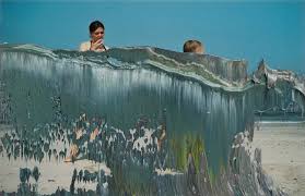
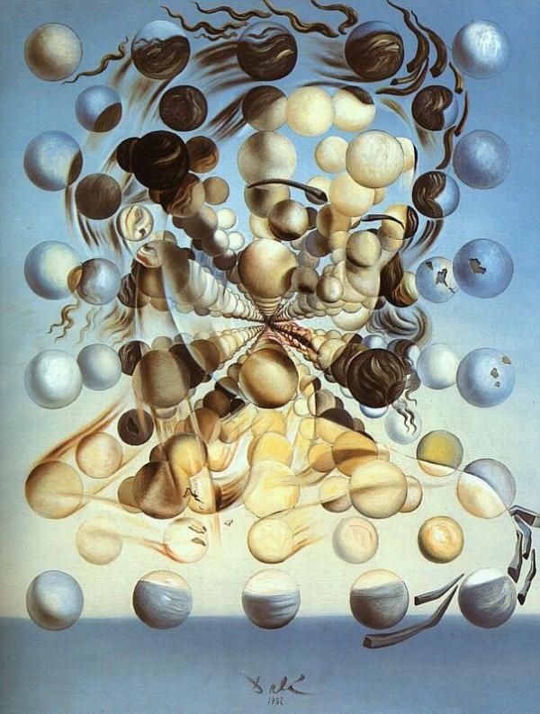
Salvador Dali: Galatea of the Spheres
- This is a portrait of Salvador's wife.
- He dissects her appearance and forms it from a range of planet like spheres levitating amongst the clouds. This representation of Salvador's wife is extremely surreal, something Salvador is very well known for.
- His use of layering to break down her appearance and form this distorted image of her is extremely inspiring. He contrasts colours and forms within the composition creating depth. The of the multiple spheres is an astonishing representation of his wife.
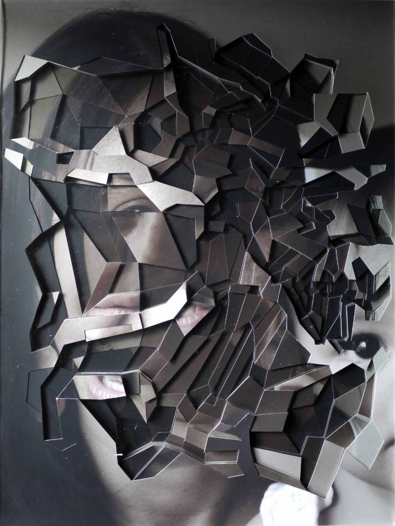
Sasha Gitin:
- Sasha Gitins use of 3 different photographs to produce this portrait image is extremely unique. By combining the images in this manner he has produced this abstract portrait.
- By the looks of the photo, he has used photoshop to rotate, crop and merge three photographs of his subject together.
- I will experiment with layering similar to this to create new portraits of existing images i have taken. However i want to experiment with the idea manually, producing multiple combinations rather than one.
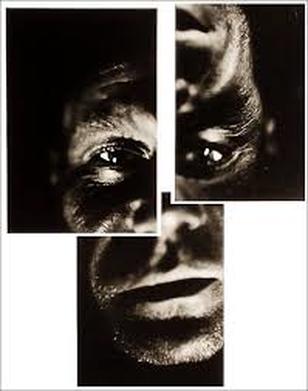
- This inspiration led me to begin experimenting with layering my images and contrasting of light and dark in new ways.


- I began by cutting up these images individually, separating parts of the face.
- After this i began re-arranging photographs and merging them together in an abstract way.
Evaluation:
I'm pleased with the outcome of these images. After layering them in different combinations, i have created rather eerie, but captivating images.
I have successfully developed on the idea of dissecting my subjects face through manual manipulation of the photographs.
However, these images still represent my subject as his features remain unchanged. I have only mixed and matched photographs of him, But at the same time i have produced juxtaposing imagery.
- Each image has a different contrast, mood and texture. When combined they creative an investigative composition into the identity of my subject. Each layer reveals something unique to the other layers.
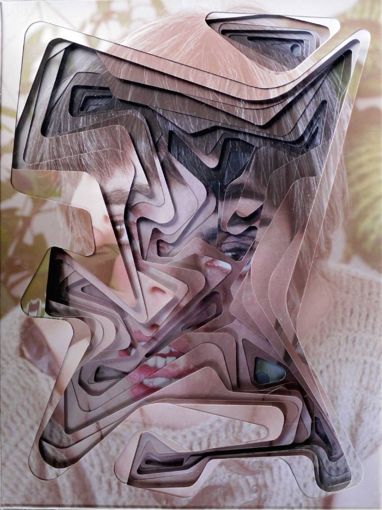
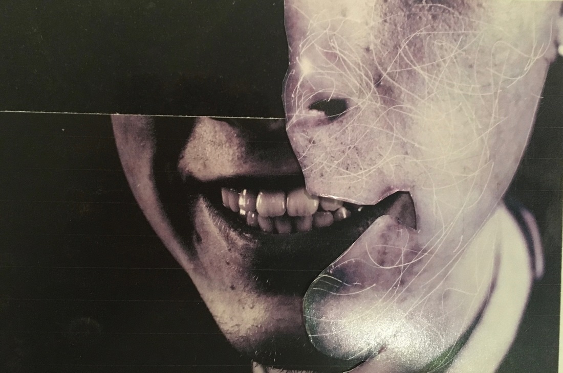
The Final Pieces:
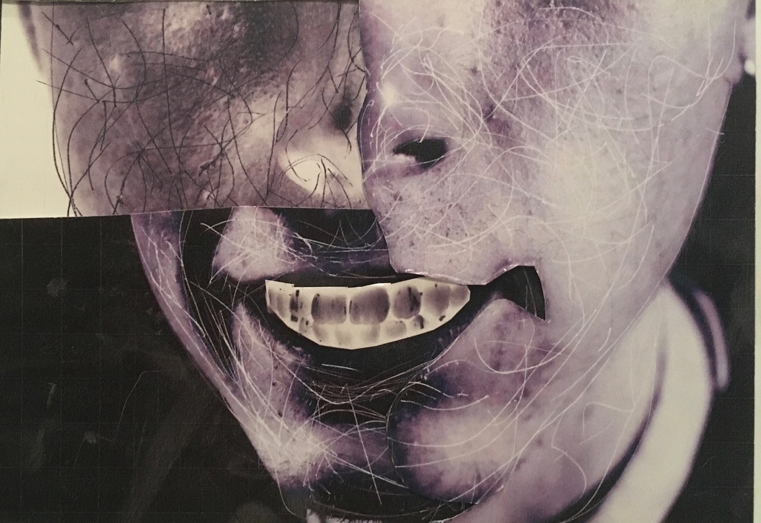
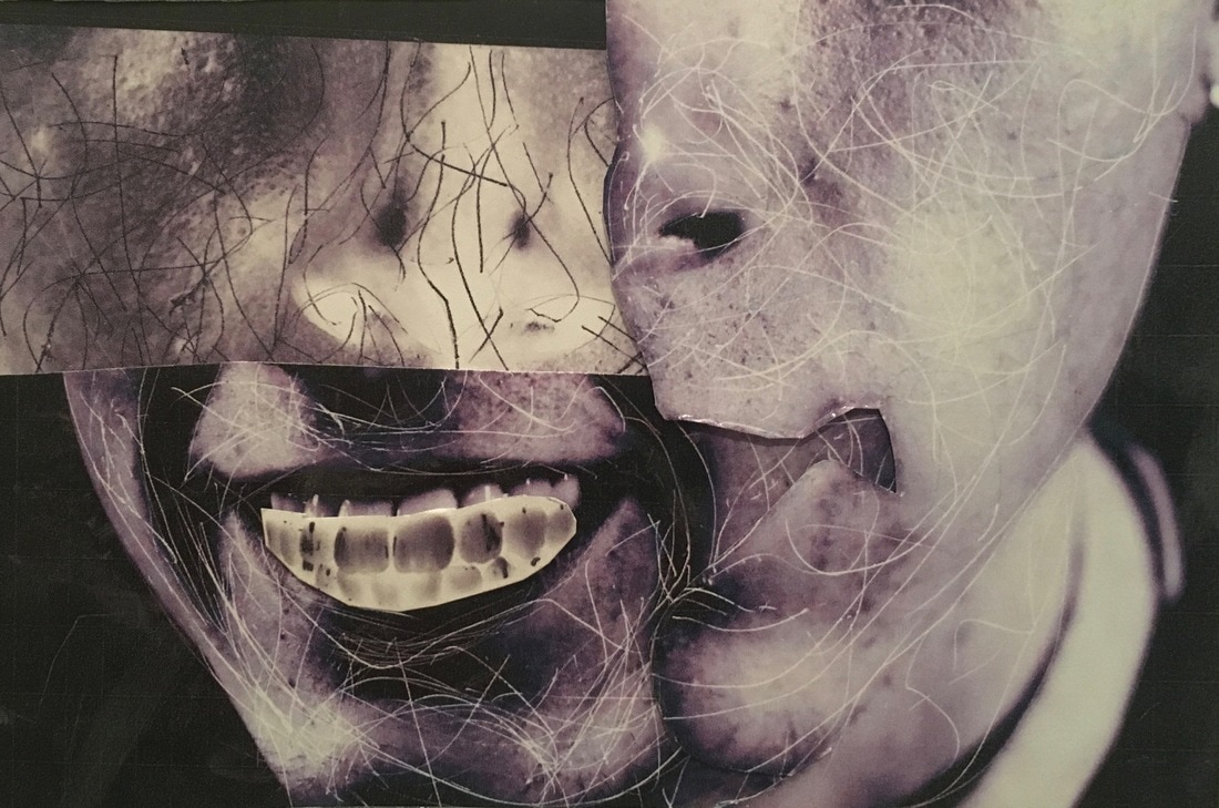
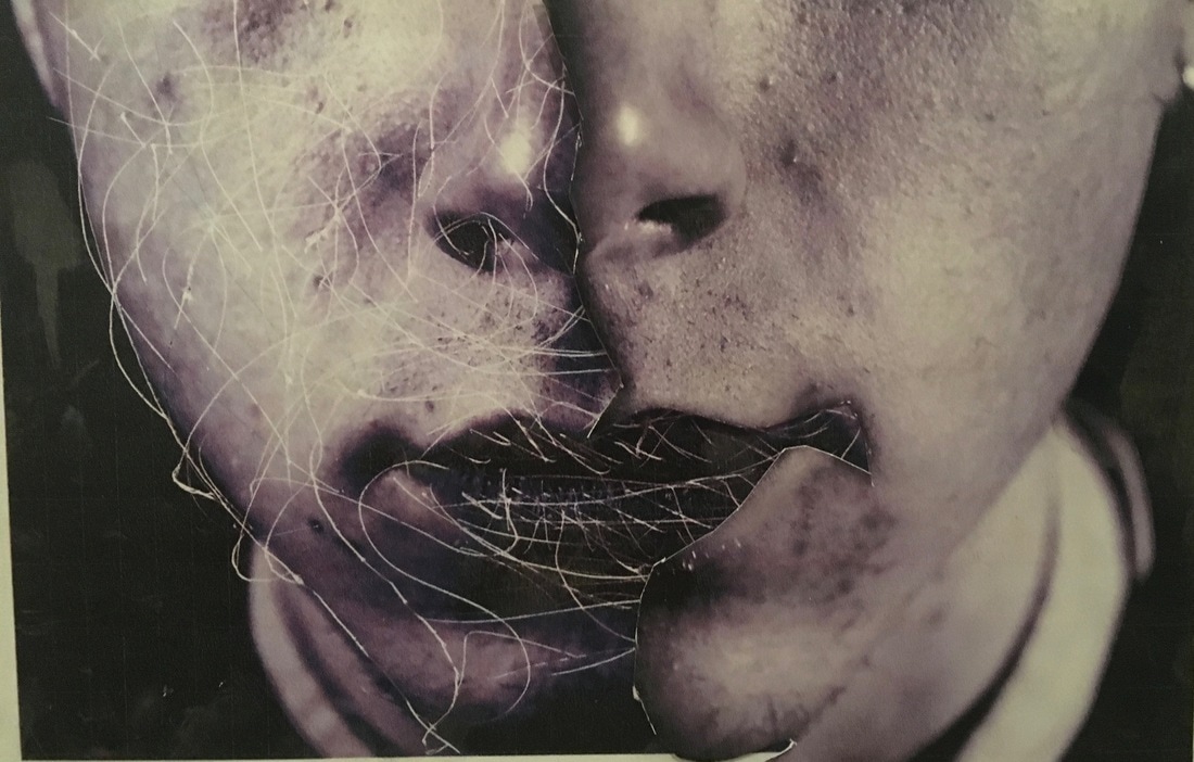
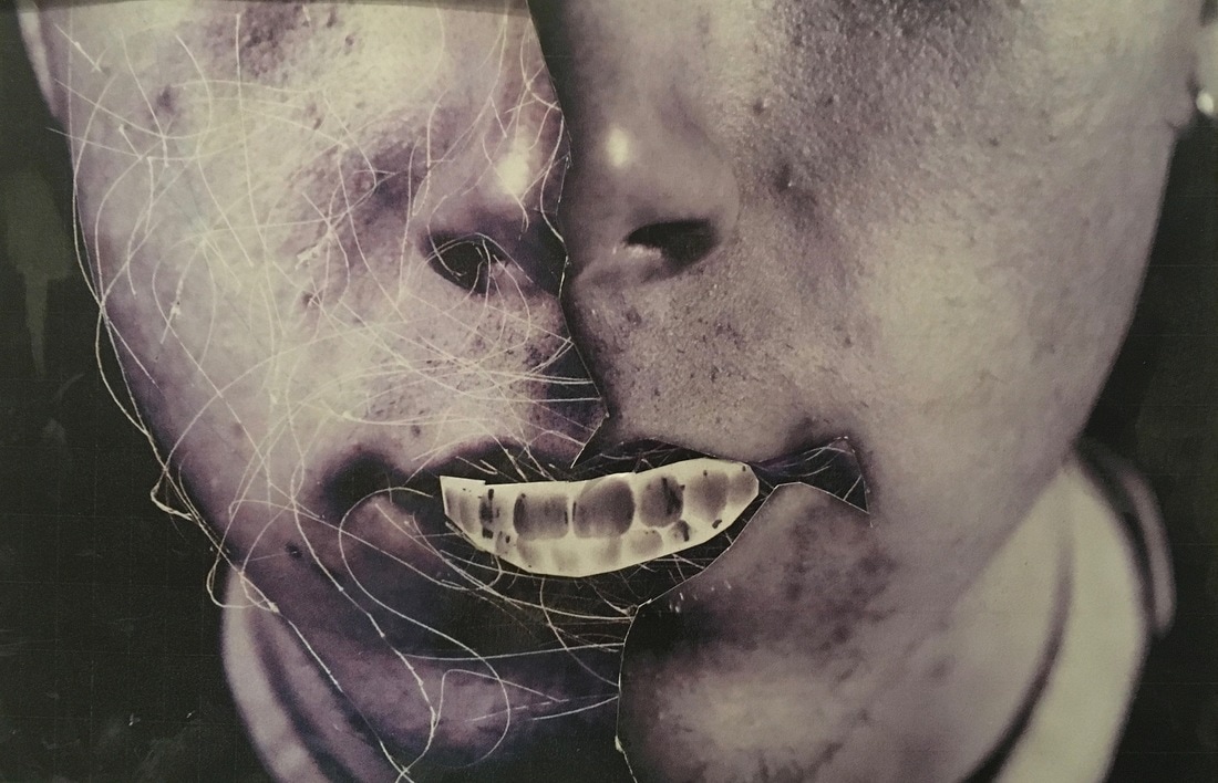
- This image depicts 3 layers of images combined.
- Each layer has been edited in a different way, printed, cut out and mounted over one another.
- The work is inspired by surrealism as well as the work of Myra Greene and Dryden Goodwin.
The strong contrast of light and dark also bring a rather mysterious and quite frightening aspect to the photograph.
The surrealism of the 3 layers in combination is brought out by the positioning of the layers against one another. Brown tones in the photograph remind me alot of Myra Greene's Character recognition series in which she uses an ambrotype. This composition forms together to create an abstract investigation of my subjects physical features in an arguably scientific manner.
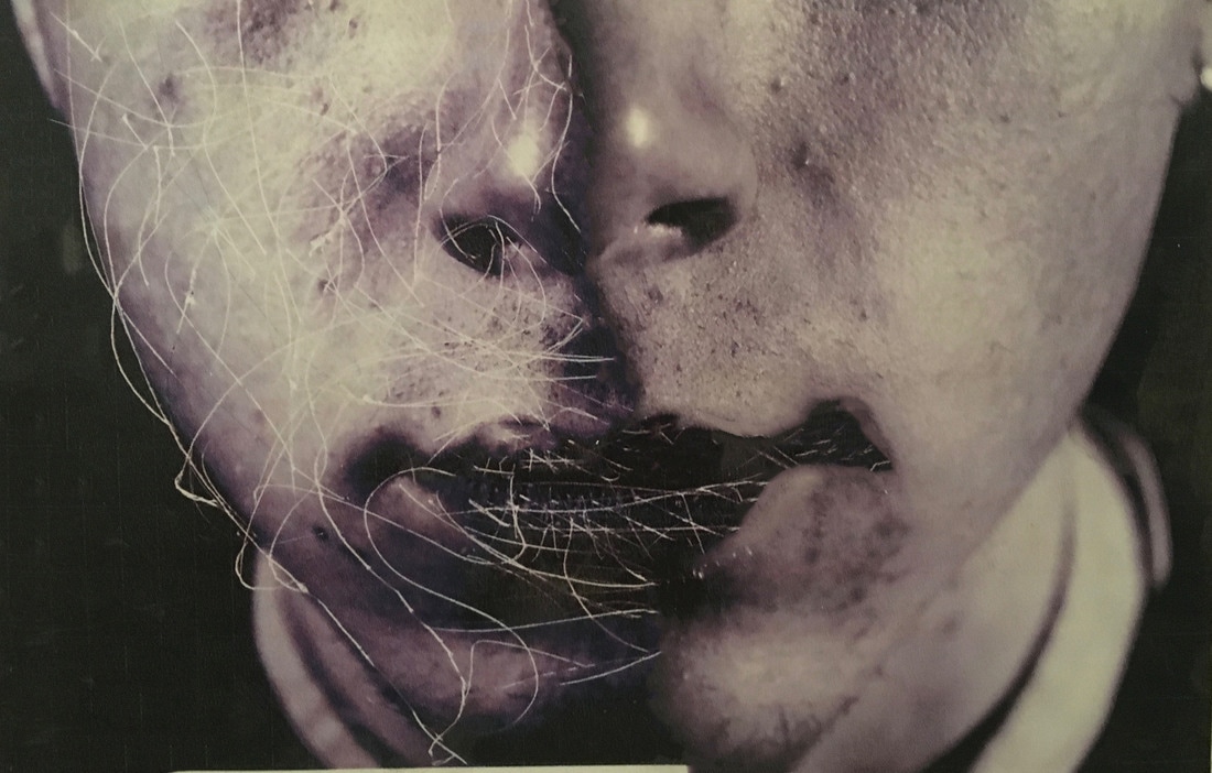
Using photoshop's spot healing brush tool i blended the middle of the photograph were the 'seam' of the paper could be seen against the other photograph. I also use this tool on the lips of my subject for a similar effect.
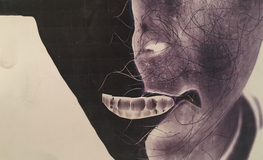
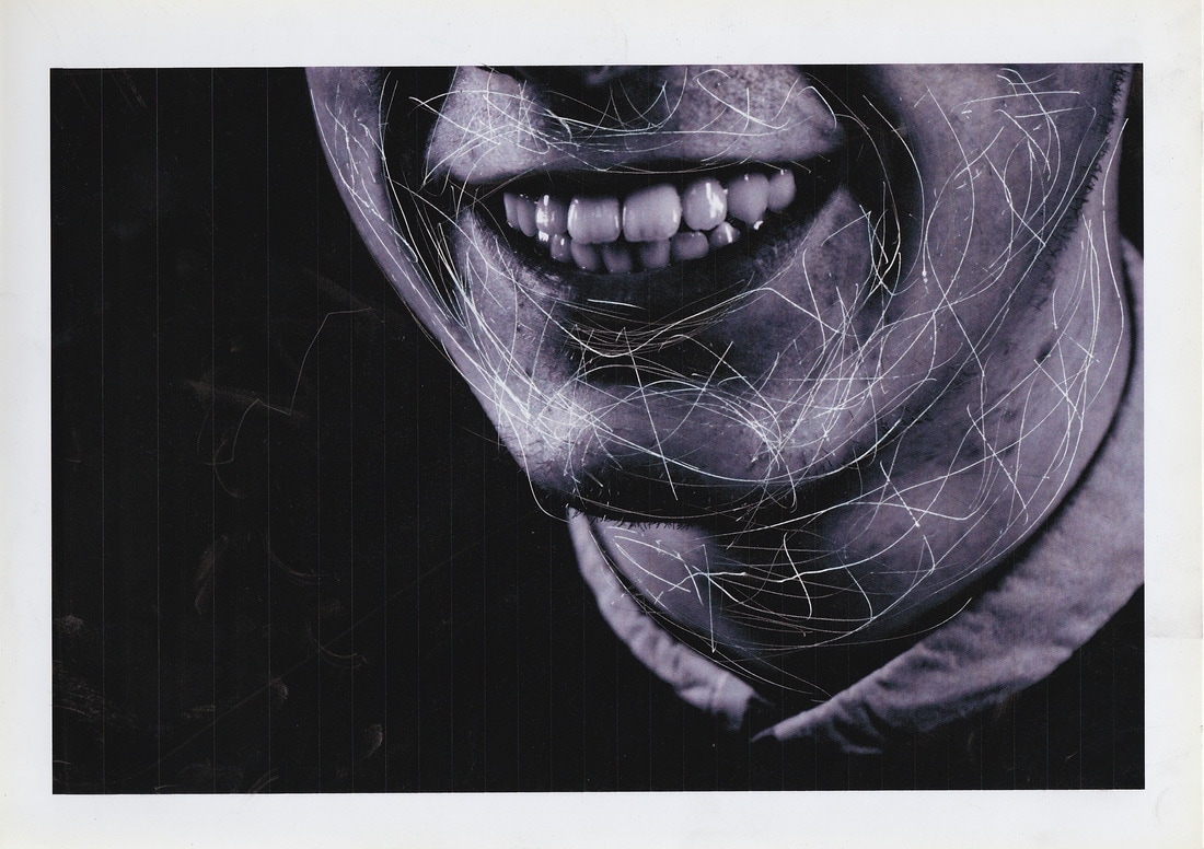
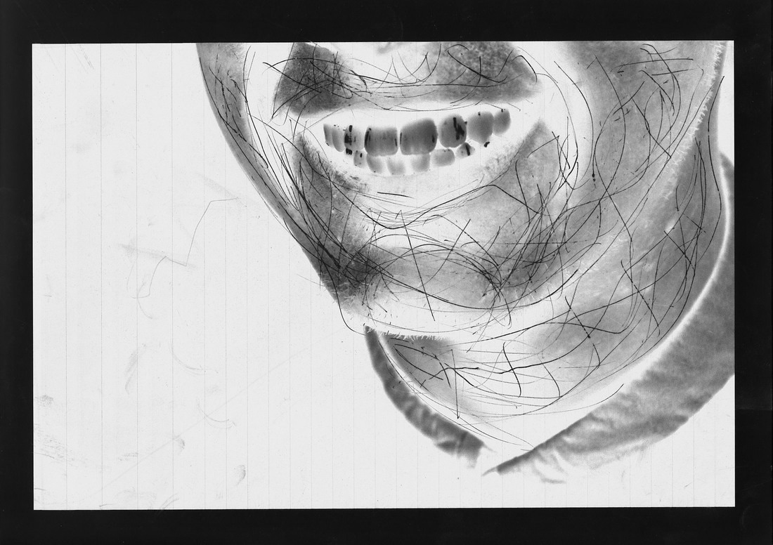
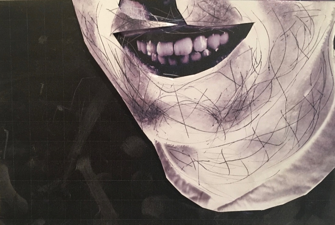
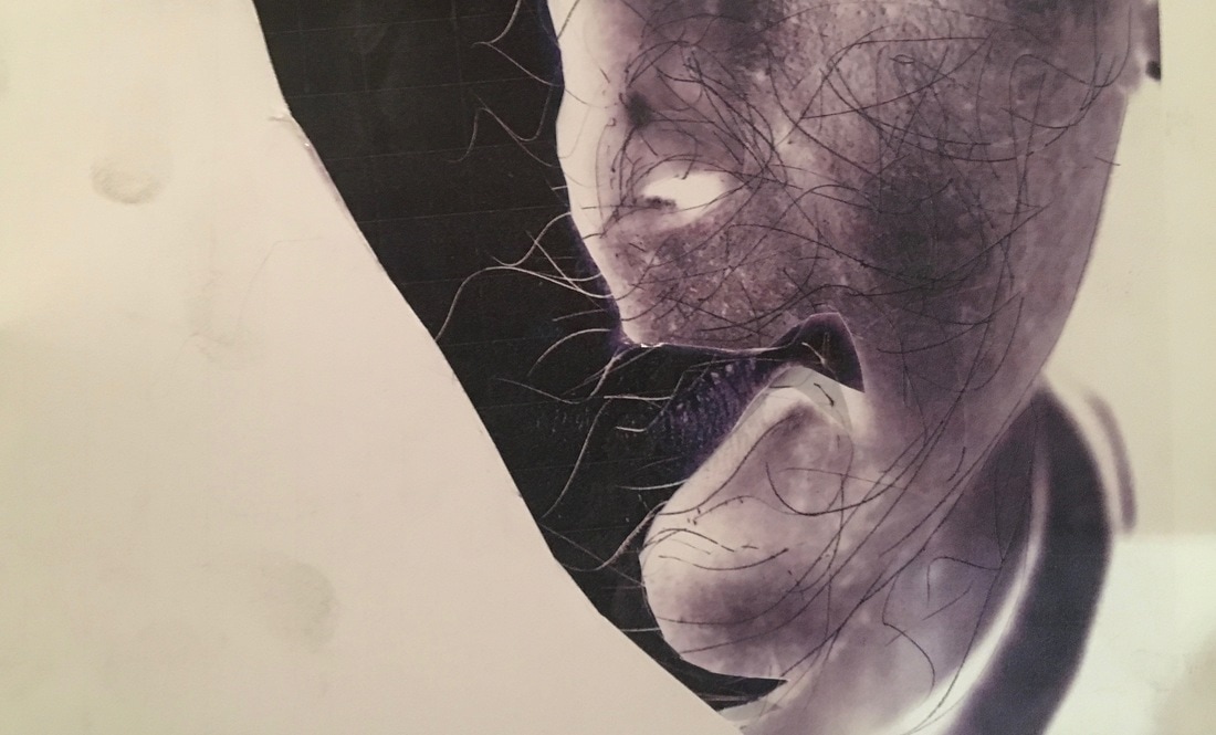
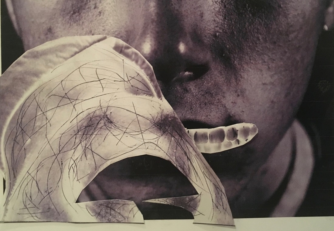
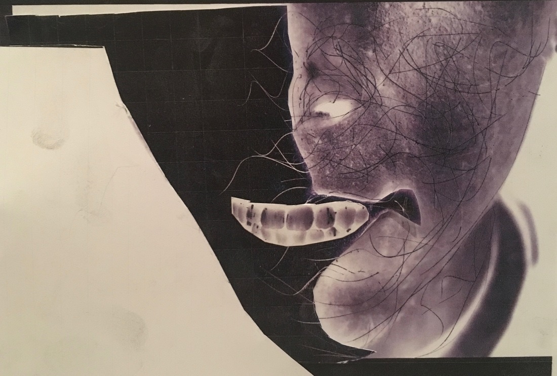
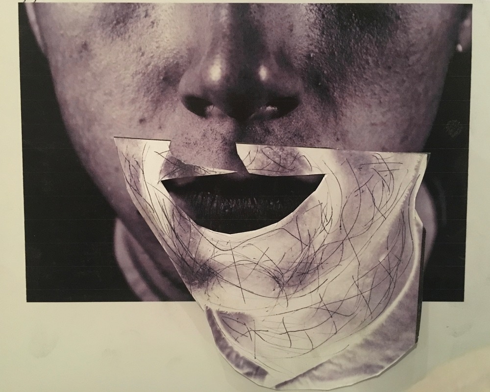
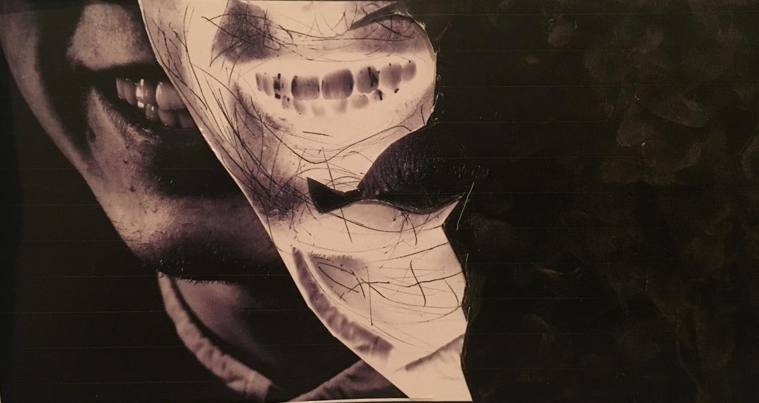
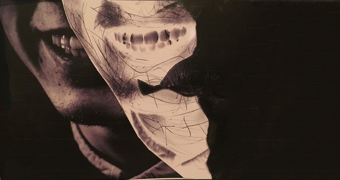
Whilst experimenting with different combinations to produce these portraits i formed this one. I began to become interested in the idea of having a half silhouette, half portrait style image. This is the result.
This is still a portrait. All the features seen on this photograph are the features of my subject. they have been digitally and manually manipulated to form this composition. The contrast of the smooth, jet black colour besides the patchy and scratched brown/grey forms a unique image. The teeth levitate in what should be the mouth position of my subject, in a mysterious and ambiguous manner. This image is a complete strip-down of what was once an ordinary portrait. i have dissected and analysed the face of my subject and refined it down to an abstract representation.
This is still a portrait. All the features seen on this photograph are the features of my subject. they have been digitally and manually manipulated to form this composition. The contrast of the smooth, jet black colour besides the patchy and scratched brown/grey forms a unique image. The teeth levitate in what should be the mouth position of my subject, in a mysterious and ambiguous manner. This image is a complete strip-down of what was once an ordinary portrait. i have dissected and analysed the face of my subject and refined it down to an abstract representation.
- If i were to have these images in an exhibition, i would have them centred in a room within a large glass cabinet in which they would lay out flat on a table like surface.
- The surface would be white and be lit up like a cabinet at a museum exhibiting a scientific artefact. This would add to the idea of the portrait dissection which i have created.
- The photographs would be printed on a transparent acetate sheet rathe than on paper so the shapes and textures are exaggerated more with the aid of the lighting
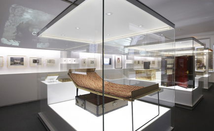
The photographs would be in a cabinet of similar design to this one, but on a smaller scale.
